Technology Widgets
The technology dashboard includes widgets that provide:
• two timeline charts dedicated to:
• technology lifecycle
• technology vendor support
You can change their analysis period.
• several pie charts dedicated to analyzing technologies based on specific characteristics
Chart handling
• To display the number of technologies contained in a chart part, hover over the part concerned.
A tooltip displays the information.
• To get the list of technologies contained in a chart part, click the corresponding part.
 From this list, you can generate instant reports, see Getting the list of objects contained in a report part. You can also export this list in Excel format.
The list of analyzed technologies and their using applications in each chart depends on the applied filters. The charts are automatically updated as soon as a filter is applied.
Technology Lifecycle
The technology lifecycle line chart displays the evolution over time of the number of technologies by status (Preparation, Production, Retirement).
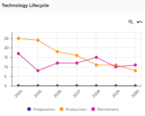
The analysis covers a six-year period around the reference date (from two years before to four years after), which is set to the current date by default.
You can:
• zoom in and move to a different time period, see Zooming in on a period.
• analyze a specific date and get the list of technologies, see Analyzing a specific date.
Vendor Support
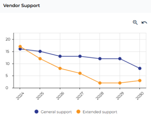
This line chart displays the evolution over time of the number of technologies by vendor support status (General support, Extended Support).
Technologies by Business Capability
This pie chart groups the technologies according to the business capabilities supported by their using applications.
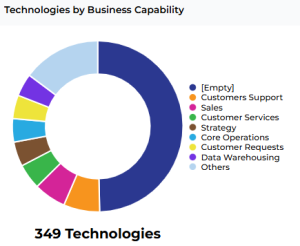 To hide a series in the chart, click its label in the legend (e.g.: click the [empty] label). The chart automatically updates.
Technologies by Type
This pie chart groups the technologies by type.
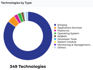
To hide a series in the chart, click its label in the legend. The chart automatically updates.
In the legend, click the [Empty] label to display only the technologies with a type.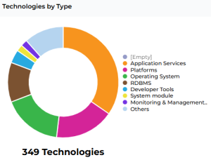
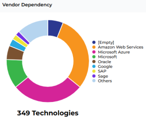
Vendor Dependency
This pie chart groups the technologies by vendor.
Technologies by Process
This pie chart groups the technologies according to the processes supported by their using applications.
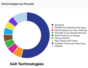 To hide a series in the chart, click its label in the legend (e.g.: click the [empty] label). The chart automatically updates.