Application Widgets
The application dashboard includes widgets that provide:
• a timeline chart dedicated to the application lifecycle.
You can change its analysis period.
• several charts (pie charts, bar charts, or heatmaps) dedicated to analyzing applications based on specific characteristics.
Chart handling
• To display the number of applications contained in a chart part, hover over the part concerned.
A tooltip displays the information.
• To get the list of applications contained in a chart part, click the corresponding part.
 From this list, you can generate instant reports, see Getting the list of objects contained in a report part. You can also export this list in Excel format.
The list of analyzed applications (and their used technologies) in each chart depends on the applied filters. The charts are automatically updated as soon as a filter is applied.
Application Lifecycle
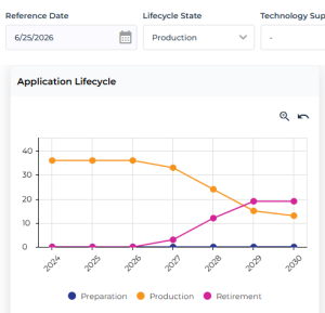
The application lifecycle line chart displays the evolution over time of the number of applications by status (Preparation, Production, Retirement).
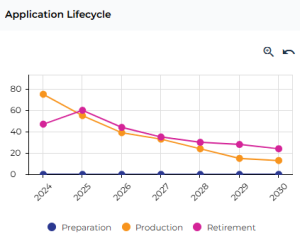
The analysis covers a six-year period around the reference date (from two years before to four years after), which is set to the current date by default.
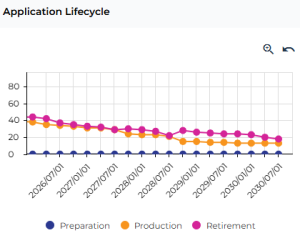
Zooming in on a period
To zoom in on the lifecycle display period:
1. Click Zoom  .
.
.The period is reduced by six months in total, with three months removed from each end.
Using the <Ctrl> key and the mouse wheel simultaneously enables you to zoom in more quickly. To return to the initial display, click Reset Zoom
  .
.2. To move to a different time period, click the chart, hold down the mouse button and drag the mouse.
Analyzing a specific date
To analyze a specific date:
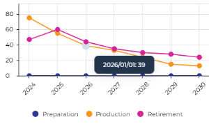
1. Hover over a node.
A tooltip displays the number of applications in this state.
E.g.: on January 1, 2026, 39 applications were in the Production state.
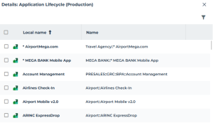
2. Click the node to display the list of applications in this state.
The list of applications displays at the bottom of the edit area.
E.g.: the list of applications that where in production on January 1, 2026 displays.
Modifying the reference date
You can modify the reference date to shift the application lifecycle analysis period.
E.g.: if the current date is 09/01/2026 and you set the Reference Date to 01/01/2030, the analysis period then extends from 01/01/2028 to 01/01/2034.
Filter impact
To restrict the analysis to specific applications, you can apply Life State, Technology Support, and/or By Portfolio filters.
The Lifecycle Status filter is primarily useful for filtering applications in the widgets that display pie charts or bar charts. It also affects the application lifecycle timeline chart, but is less useful for this chart.
Example of applying the Application Lifecycle Status filter set to "Production" as of the defined Reference Date:
The lifecycle chart shows the evolution of application statuses:
• 01/01/2026 (reference date) :
• in "Production": 39
• in “Retirement”: 0
• 01/01/2027:
• in "Production": 33
• in “Retirement”: 6
Between 01/01/2026 and 01/01/2027, six applications moved from “Production”to “Retirement”. This can also be analyzed without filtering applications that are in the "Production" Lifecycle State on the selected Reference Date.
Applications by Type
This pie chart shows the breakdown of analyzed applications by type, based on the applied filters.
Application types: In House Application, Software Package, System, Office System, Middleware
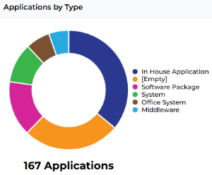
To refine the analysis to specific applications, you can apply Life State, Technology Support, and/or By Portfolio filters.
To hide a series in the chart, click its label in the legend (e.g.: click [empty]). The chart automatically updates.Applications by Hosting Model
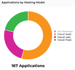
This pie chart shows the breakdown of analyzed applications by hosting model, based on the applied filters.
Application hosting model: On-Premises, Cloud (SaaS, IaaS, ou PaaS)
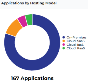
To refine the analysis to specific applications, you can apply Life State, Technology Support, and/or By Portfolio filters.
To hide a series in the chart, click its label in the legend. The chart automatically updates.
E.g.: click On-Premises to display only the breakdown of Cloud applications.
Applications by Business Capability
This bar chart shows the breakdown of analyzed applications by business capability, based on the applied filters.
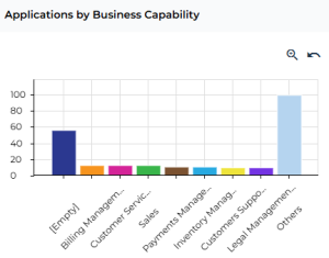
To refine the analysis to specific applications, you can apply Life State, Technology Support, and/or By Portfolio filters.
Vendor Dependency
This pie chart shows the vendor dependency of the analyzed applications as of the selected reference date (based on the applied filters).
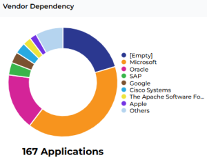
To refine the analysis to specific applications, you can apply Life State, Technology Support, and/or By Portfolio filters.
To hide a series in the chart, click its label in the legend (e.g.: click [empty]). The chart automatically updates.Applications by Process
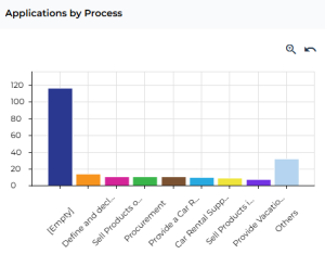
This bar chart shows the breakdown of analyzed applications by process, based on the applied filters.
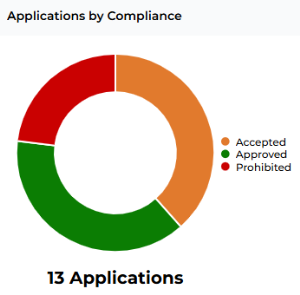
Applications by Compliance
This pie chart shows the breakdown of analyzed applications by compliance, based on the applied filters.
Compliance: Approved, Accepted, Prohibited, Unknown
E.g.: here only the applications belonging to "Europe Applications Portfolio" portfolio are analyzed.
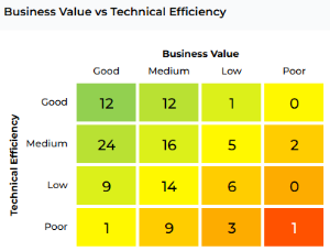
Business Value vs Technical Efficiency
This heatmap shows business value versus technical efficiency as of the selected reference date (based on the applied filters).
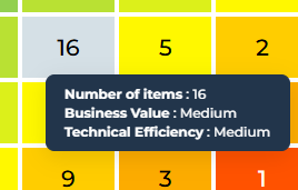
To display the cell contents:
1. Hover over the cell concerned.
A tooltip displays the corresponding values and the number of applications concerned.
2. Click the cell concerned to display the details of the applications it contains.
The list of applications displays at the bottom of the edit area.
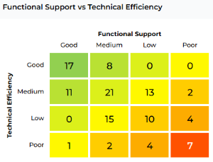
Functional support vs Technical Efficiency
This heatmap shows technical efficiency versus functional support as of the selected reference date (based on the applied filters).