3 Desktop component elements
A desktop comprises Containers and desktop components (Parameterized Tools).
3.1 Container types
In your desktop you can insert the following Container types:
• Container of Tool: this Container is a tool recipient.
• Container of Sub-Containers: this Container is a recipient designed to receive other Containers of Container of Sub-Containers or Container of Tool type.
3.2 Container of Sub-Containers
A Container of Sub-Containers can be of type:
• Border Layout
• Accordion
• TabPanel
• Portal
• Hbox
• Vbox
3.2.1 Border Layout
The Container of Sub-Containers of Border Layout type can comprise one to five Containers. It is represented as here:

The Center Container is mandatory.
The Top, Left, Right, and Bottom Containers are optional.
3.2.2 Accordion
The Container of Sub-Containers of Accordion type comprises a stack of pages containing desktop components. It can be used for example in a Left Container. It is represented as here:
3.2.3 TabPanel
The Container of Sub-Containers of TabPanel type comprises tabs. It can be used for example in a Left Container. It is represented as here:

3.2.4 Portal
The Container of Sub-Containers of Portal type comprises widgets and is defined by a number of columns for the widget list. It can be used for example in a Center Container for the MegaParameterized tool used for widgets.
3.2.5 Vbox and Hbox
The Container of Sub-Containers of Hbox (or Vbox) type are simple containers used for example for a left to right display (or a top to down display).
3.2.6 Container attributes
Each Container can be customized by means of its attributes. Attributes of a Container are defined in its Properties page, Characteristics tab. Some attributes vary according to the Container type:
• General attributes:
o name in user interface
_GUIName
 The name of the Container in the user interface is specified only in the case of a Container of Containers. If the Container contains a tool, it is the tool name that is displayed.
o icon in user interface
MetaPicture
The icon in the user interface is specified only in the case of a Container of Containers. If the Container contains a tool, it is the tool icon that is displayed.o display or not the title and image of the container in the user interface
Display Mode
Default value: "Name and image" for a container of tools and "none" for a container of containers.
o position of title (top, bottom, left, right)
Title Position: Top (default value), Bottom, Left, Right
o type of Container (frame, accordion, tab, portal, vertical box, horizontal box, none)
Container Layout: Border Layout, Accordion, TabPanel, Portal, Vbox, Hbox, (none)
o position relative to parent (desktop or Container in the case of a Container of Border Layout type) (top, bottom, left, right, center)
Position: Top, Bottom, Left, Right, Center
o style sheet
CSS:
o Body CSS Class: additional CSS class for the Container body
o Css sensitive to language: to make the Container CSS sensitive to the current language, default: false
o Container CSS Class
o current overloading enables to define a macro that overloads the emitted current.
This is particularly interesting when you use the component pattern, and you want to display the type information instead of the component itself.
Current Overloading: macro connection
• Dimension (width, height, minimum height, minimum width)
Dimension attributes depend on Container type:
Left Container: Width, minimum Width
Right Container: Width, minimum Width
Top Container: Height, Minimum Height
Bottom Container: Height, Minimum Height
The center Container has no Dimension attribute, it adapts to desktop dimensions depending on other Containers.
• Portal settings (for a Portal type Container)
o Number of columns for the widget list
Portal – Number of columns (default value: 2)
Portal – Number of columns (default value: 2)
o Initialize with default widgets: indicates if the panel must be initialized with the default widgets defined on the Profile. Otherwise, tools must be explicitly added through desktop parameterization, macros or the end-user UI.
Initialize with default widgets (default value: true)
Initialize with default widgets (default value: true)
o persistent state: indicates if the panel tools list must be saved and restored when the user logs in again.
Enable persistent state (default value: true)
Enable persistent state (default value: true)
o end-user widget selection UI: indicates if the panel should show a UI allowing the end-user to choose widgets to add to the container.
Enable end-user widget selection UI (default value: true)
Enable end-user widget selection UI (default value: true)
o editable mode
Disable Editable Mode (default value: false)
Disable Editable Mode (default value: false)
o add a toolbar at the top
Toolbar at top (default value: false)
Toolbar at top (default value: false)
• Behavior attributes:
These attributes simplify desktop readability.
o closable, collapsible, collapsed, hidden, maximizable
Is Closable, is Collapsible, Is Collapsed, Is Hidden, Is Maximizable (default values: false)
o default container, container that receives tools that do not have candidate container to receive them
Is Default Container (default value: false)
o drop for objects authorized or not in its component(s)
Accepts Dropped Items (default value: false)
o current sensitive
Is not current sensitive (default value: false)
o resizable
Is Resizable (default value: false)
o current emission
No current Emission (default value: false)
o refresh on activate
Refresh On Activate (default value: false)
o collapse mode, for a collapsible container which is a direct child item of a border layout container
Collapse Mode:
o No value (default): when collapsed, a placeholder header is injected into the layout to represent the Container and provide a UI to allow the user to re-expand the Container.
o Header: the Container collapses to leave its header visible as when not inside a border layout
o Mini: the Container collapses without a visible header
o behavior on close: defines the behavior when the container is closed by the cross
Behavior On Close (hidden, collapsed, closed, default value: none)
• Available Desktop Container contexts
Context Display Mode attribute defines the way the container is displayed in a context (for example at initialization). The context applies on tools and macros: EmitCurrent in a context (floating toolbar, Activity feed)
Context Display Mode (Opened, Closed)
• Desktop components (MEGA Parameterized Tool):
MEGA Parameterized Tool attributes enable insertion of already-parameterized tools.
Examples:
o Administration tree
Administration MetaTree Component
o Collaboration tree
Collaboration MetaTree Component
o Controls and Risks tree
Controls and Risks MetaTree Component
o Diagrams tree
Diagrams MetaTree Component
o Properties page
Docked PropertyPage Component
o Documentation tree
Documentation MetaTree Component
o Main toolbar undo/redo tool
Undo/Redo
For example, desktop components of tree type are implemented by the MEGA Tool "MetaTree Tool":
Example: the MEGA Parameterized Tool "Documentation MetaTree Component" is implemented by the MEGA Tool "MetaTree Tool".
3.2.7 Container specific behaviors (Mode)
For each Mega Parameterized Tool included in a container you can define either:
• a specific behavior according to a mode.
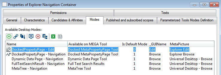
The Mega Parameterized Tool specific behavior is defined in the container Properties page, Modes tab. For each tool for which you want to define a specific behavior in the Container, the Mode parameter enables to overload the default behavior.
The mode contains specific settings dedicated to specific tools that enable to define specific behaviors.
The mode contains specific settings dedicated to specific tools that enable to define specific behaviors.
For example, in the HOPEX Explorer desktop, where the browse mode is the default the “Explorer Navigation Container” includes the “Docked MetaPropertyPage Tool” which is editable in Edit mode and not editable in Browse mode.
• a standard behavior available for any mode
The other tools for which you do not want a specific behavior according to a mode.
3.3 Tools
Tools (MEGA Tools) enable viewing and/or integration with repository data. A MEGA Tool cannot be used directly in a desktop, but only via a desktop component (MEGA Parameterized Tool).
3.3.1 Examples of tools

3.3.2 Characteristic attributes of tools:
• Asynchronous: the tool can be loaded in parallel on the desktop. There is no need to wait for the desktop to be loaded to load the tool (example: ToolbarTool)
Is Asynchronous
• Batch Tool: the tool executes without user interface, indicating whether display should be managed or not.
Is Batch Tool
3.3.3 Use examples
For examples of use of the MetaTree Tool tool, see Giving a title and/or icon dynamically to a Container.
3.3.4 Navigation dedicated tools
Navigation dedicated tools are available (to replace Docked MetaPropertyPage Tool and Docked Tree Tool). A navigation tool receives, via a property page, a unique component: either a navigation tree or a navigation list (including alternated list):
• Docked ListView Tool: displays a list or a set of lists via an alternated list
• Docked TreeListView Tool: displays a tree in a tree list format

These tools include the same parameters as the docked Properties panel, but their context is kept in the breadcrumb, and they also benefit from the floating toolbar.
Use Docked ListView Tool / Docked TreeListView Tool instead of Docked MetaPropertyPage Tool so that:
• after filtering a simple list, when navigating back to the list, the list is still filtered.
• after expanding a tree, when navigating back to the tree, the tree is already loaded.