3 FORMS properties page design
3.1 Basic principles and initialization
A Forms MetaPropertyPage is implemented by one of the two following macros:
_PropertyPageStandard: this implementation is used in "Characteristics" pages.
_PropertyPageExtension: this implementation is used in other cases.
These implementations use the _parameterization text defined on the MetaPropertyPage, and more specifically the [Template] paragraph.
They also use the MetaAttributeGroup associated with the MetaPropertyPage: the page is automatically populated by the properties defined in this MetaAttributeGroup
In addition, the _MetaPropertyPageStandard will automatically add to the form:
• the object name
• its owner
• the MetaAttributes defined in the accessed MetaAssociation (if the object is seen from a MetaAssociation) and not associated with a specific MetaAttributeGroup of the MetaAssociation.
These implementations also use other sections of the _parameterization text, enabling definition of page behavior.
The name of the properties page is the GUIName of the _PropertyPage, except for the Characteristics page of which the name is predefined. If not specified , the GUIName of MetaAttributeGroup is used.
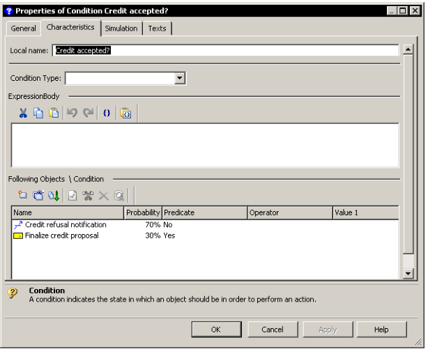
The following example indicates programming of the condition page shown below.
[Template]
AttGroup=Group(Bar),Pos(Top)
FObjGroup=Group(Bar),Pos(Bottom),Name(Following objects)
ExprGroup=Group(Bar),Pos(Middle),Name(ExpressionBody)
FObj=Map(Following objects)
TypeAtt=Item(Condition Type),In(AttGroup)
FObjList=Item(Following objects),Contains(FObj),In(FObjGroup),Control(ListView),Title(No) ExpressionAtt=Item(ExpressionBody),In(ExprGroup),Control(Text),Title(No)
Page minimum size can be defined in another section of the parameterization text:
[Page]
MinWidth = <width>
MinHeight = <height>
<width> and <height> are specified in DialogUnits.
This parameterization can be essential if you want to define specific deformations of elements at page resizing: in this case, the minimum page size is used as the basic size in the parameterization.
For information, DialogUnits is a unit independent of font size. In this unit, a medium character of the font used occupies a rectangle 4(width) x 8(height). To obtain the effective size of the page, you need to know the medium character size of the font used to display the form.
Note: As MinWidth and MinHeight are different in Windows and Web Front-Ends, adjustments must be performed accordingly.
For information regarding conversions, refer to Microsoft documentation: https://learn.microsoft.com/en-us/previous-versions/windows/desktop/bb226789(v=vs.85)
3.2 Properties page logic model
3.2.1 AttributeControl
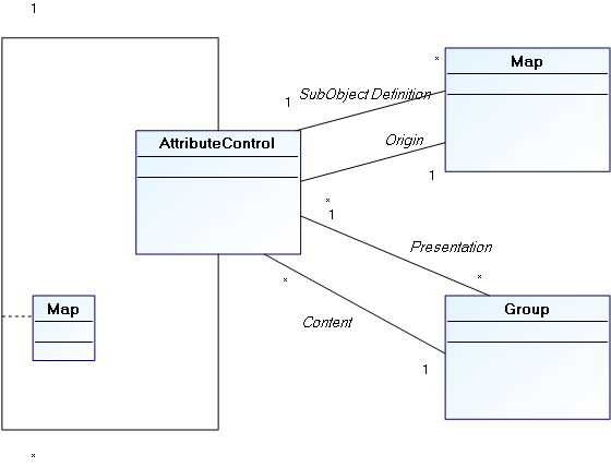
A page is defined as being an AttributeControl hierarchy. In the model of the above object, the page is itself an AttributeControl.
An AttributeControl is therefore a page element. It relates to a MEGA object and is associated with a metamodel concept representing information on this object.
There are three main AttributeControl types:
• Implicit AttributeControls
These are automatically associated with MetaAttributes, TaggedValue (or more generally AbstractProperties) and MetaAssociationEnd _LegAttributes, depending on their type and format. They therefore reference properties directly defined on the object.
Implicit AttributeControls are suitable in the vast majority of cases to adequately display object properties, as well as most extensions (AbstractProperties or MetaAssociationEnd). These extensions are not directly associated with the object, but are defined in the System repository and must have a value for the object. The keyword XRef(True) enables indication of an element as extension, and directs the template analyzer to the correct AttributeControl type to be displayed.
• Explicit AttributeControls
These propose specific data entries on object properties, or display of calculated data obtained from the object and defined by a metamodel concept (for example a matrix, an HTML formatter or a MetaTree), or display of presentation elements (titles, comments) referencing system repository elements without direct reference to the displayed occurrence (for example codeTemplates or resources).
• Composite AttributeControls
These are explicit AttributeControls of which definition is complex and included in the template. This definition can reference system repository objects, which will be associated with the composite element by a composition map. For example, to define a ListView, you may explicitly define its columns, which are mainly MetaAttributes: The latter will be cited as the composition map element associated with the ListView.
3.2.2 Maps
Maps are used to logically group AttributeControls. They are associated with Page type AttributeControls. There are two types of map:
• object maps
• composition maps
3.2.2.1 Object maps
These enable redefinition of the object associated with an AttributeControl. In this way it is possible to display in the same form properties from several distinct objects. These maps are explicit elements of page type AttributeControls, indicating the list of objects to which the page relates.
A map of this type points to a specific object, and does this in several ways:
Pilot maps: these are commanded by a composite AttributeControl (for example a ListView or a TreevVew). In this case the Pilot(AttCtlName) keyword associated with the map indicates the AttributeControl that will pilot it. The object of the map therefore corresponds with the object selected in the piloting control. When the selection changes, all AttributeControls of the page are reinitialized with the new object of the selection. If no object is selected, map elements are deactivated. In a map of this type, the identifier used in the Map(ident) keyword is not used.
Unique collection maps: these maps have a collection as identifier. In this case the first element of the collection is considered as the object of the map. If the collection is empty, map elements are deactivated.
Maps on object: these maps are for calculated pages, since they reference an explicit object of the repository, by keyword Child(childID). The object pointed by the map must be connected to the object of the page by the collection identified in the Map, and correspond to the absolute identifier supplied.
Maps on root: identified by the keyword Root(Yes) , these maps point to the repository root, and are therefore independent of the displayed object.
Context maps: these maps enable use of connections to tools displaying pages. For wizards, the "Context" name implicit map points to the collaborative object of the wizard.
3.2.2.2 Composition maps
Composition maps enable definition of content of a composite AttributeControl: for example, columns of a ListView or branches of a TreeView are defined asAttributeControls, defined in a composition map. This map will then be associated with the MetaAttributeComposite. These maps do not have a real existence in the object model of the form, since they merely participate in definition of the hierarchy of the AttributeControls.
3.2.3 Groups
Groups are used to define appearance of a form. They are associated with Page type AttributeControls.
Groups defined for the page are assembled vertically in a defined order. A certain number of groups are implicit and are created automatically when Attributes are included.
The page analyzer first lists the composition of the MetaAttributeGroup (if this exists). We then search in the configuration for any possible elements that could overload it. If there is no overload, or if the overload does not specify a group, these attributes are arranged in standard groups as follows:
Naming groups (short name, long name) are associated by default with the NameGroup implicit group as follows:
• Extensions are associated with the ExtensionGroup implicit group
• Texts are arranged in a control associated with the text group
• Attributes derived from the association are associated with the LinkGroup implicit group
• Other attributes are associated with the standard group.
NameGroup, ExtensionsGroup and LinkGroup groups can be used in the parameterization: you can then associate specific elements.
Groups are positioned in the page in the following way, Pos(xxx) being a syntactic element enabling definition of the general position of a group. It should be noted that Groups of the same position are ordered alphabetically according to name.
Properties page group positioning
NameGroup
PosGroups (Top)
StandardGroup
PosGroups (Middle)
ExtensionsGroup
PosGroups(Extension)
LinkGroup
PosGroups (Bottom)
TextGroups
The text group is always positioned at the end; only the last zone displayed can be resized vertically, and texts are the most likely elements for resizing. However, if you want to display a ListView that can be resized, it can be positioned alone in a Group in 'Bottom' position. For example, this is what is proposed by the condition page above. It explicitly positions the ExpressionBody text in another group so the ListView will effectively be the last zone displayed.
3.3 Specifying templates
3.3.1 Syntax
Page programming is carried out in the _Parameterization text, which is a configuration text: it must therefore conform to configuration text compatible syntax. The [Template] paragraph of this text is used.
All elements included in this paragraph should be defined in a single line.
 Each element is named to conform to configuration text syntax (name = definition). The name is never included in the properties page, but is used to order groups.
It is essential that the order of parameters of each element be respected.
Syntax of elements is detailed below. Elements in bold (red) are keywords; optional parameters are between curly brackets. Alternative elements are between curly brackets separated by vertical bars
For certain elements it is possible to specify positions and sizes. Characteristics should always be expressed in Dialog Units.
Elements recognized by this syntax are:
3.3.1.1 Conditions
Conditions enable conditioning of the appearance of groups or of elements. The condition relates to the properties dialog box object occurrence.
Condition relating to the form object:
<Name> = Condition(<Bool-Expression>)
Condition related to the object pointed by a map:
<Name> = ConditionFrom(<MapName>[:{True|False}],<Bool-Expression>)
If the map does not point to any object, the Condition is evaluated as False, unless otherwise specified after the colon.
Syntax of conditions is described in section 2.5.3.
3.3.1.2 Groups
These enable positioning of elements with respect to each other. In addition, it is possible to condition appearance or deactivation of the elements included.
Elements appearing in the same group are canonically presented in their order of declaration. It is however possible to include them in the order defined by the metamodel using the MetaClass/MetaAttribute, MetaClass/TaggedValues and MetaClass/MetaOppositeAssociationEnd links using the following option:
[Page]
NoGroupOrder = 1
The groups are declared in the template using the following syntax:
<Name> = Group(<Aspect>)[,Pos(<Position>)][,Name(<Field>)][,At(<column>[,<line>])]
[,Size(<width>,<height>)][{,HiddenOn(<ConditionName>)|,DisabledOn(<ConditionName>)}]
[,Initially(<ConditionName>)]
<Aspect> :: {Bar|Frame|VisibleBar|Hidden }: Characterizes physical representation of the group - single bar at top, frame around attributes or nothing. VisibleBar indicates that the bar is visible, even if the group is the first on the page. Groups of Frame can be collapsed in Web Front-End.
<Position> :: {Top|Bottom|Extensions|Middle}: Characterizes overall positioning of group in page. Default is Middle.
<Field>: Field relating to any MEGA occurrence of which the name, preferably translatable, will be displayed in the page as the group name. You can also include a simple character chain, which will be non-translatable.
<column>: Numerical value in Dialog Units indicating horizontal shift of elements included in the group. This data can be included alone.
<line>: Numerical value in Dialog Units indicating vertical position of the top of the group.
<width> <height>: Group height and width. As for <line>, these parameters are optional and need only be used when the specifier wishes to precisely control the position of a group. If not specified, group size is calculated as a function of the cumulative size of groups included, and group position as a function of other groups present in the page.
<ConditionName>: Name of a previously defined condition. If the condition is not fulfilled, the group and its entire content are either masked (HiddenOn), or deactivated (DisabledOn). The keyword Always can be used instead of a condition. Applied to the keyword Initially, the condition indicates the initial appearance of a collapsible group (this is only effective in Web Front-End).
3.3.1.3 Maps
<Name> = Map(<Field>){,Root(Yes)|,Cookie(<Field>)|,Child(<Field>)}
[,Visibility(<Visibility>)][,Advisor(Yes)][,Pilot(<ItemName>)]
<Field> : field referencing a MEGA object
<Visibility> : {Always|IfExist|IfFrom}: Enables conditioning of display of Map elements. Default is Always, and Map elements are then systematically displayed (they are disabled if the connected object is not found). If not specified, the elements obtained defined from this Map are masked if the connected object does not exist (IfExist case) or if the object cannot be seen from the MetaAssociationEnd opposite the specified MetaAssociationEnd (IfFrom case). In this case the Map points to the parent object.
For composition maps, no parameterization (including <Field> of the map) is taken into account. These maps serve only to group AttributeControls defined for a composite AttributeControl, and it is the latter that uses the elements associated with it as required.
For the other maps, <Field> specified after the map keyword represents the Collection enabling access to the object pointed by the map from the form object. This collection is therefore generally a MetaAssociationEnd, a Query or any form of Abstract Collection accessible from this object. The object pointed is determined as for the following API function:
obj.GetCollection("<Field>").Item(1)
When the Collection contains several elements, the result is therefore unspecified, except if the keyword Child indicates the occurrence to which the Map should point.
In this case, the object pointed is determined as for the following API function:
obj.GetCollection("<MapField>").Item("<ChildField>")
This use is however generally reserved for pages generated dynamically, since such an identifier is rarely available at specification.
The keyword Advisor(Yes) enables definition of a Map that is not directly use to display elements but that causes the page refresh when a modification is detected in the collection with which it is associated.
The keyword Refresh(Yes) indicates that the collection must be reselected at page refresh. It must be used when the collection associated with the Map is a request or a calculated association, and when its content might change while the form is displayed.
The keyword Pilot(<ItemName>) enables to indicate the form element, which will define the object pointed by the map.
When an object is selected in the element, this notification is processed by the map that modifies, as appropriate, its pointed object. Only elements that enable selection of an element can be pilots, either listViews, treeViews, or Metatrees.
Maps also enable access to objects not directly associated with the form object:
The keyword Root(Yes) indicates that the map points to the repository root:
obj.GetCollection("<Field>").getRoot
The keyword Cookie enables referencing of a context object. By compatibility, this keyword enables access to the collaborative object of a wizard (Context.cookieObject. In this case the Cookie corresponds to the identifier of the MetaClass MetaWizard (~DutIllKV5X40[MetaWizard]), and the identifier of the Map corresponds to that of the collaboration of the cookie.
This access mode has however been replaced by the Context implicit map, which enables access to this object without needing to know the identifier of the collaboration.
The keyword Visibility(<Field>) enables definition of a Map pointing to the parent object of the form object, when the latter is obtained from a collection. In this case <Field> must correspond to the identifier of the accessed MetaAssociationEnd.
The FromLeg implicit map indicates the associative object of the form object; when the latter is obtained from a Collection (obj.getRelationship). By using it you can include MetaAssociation generic attributes in the page.
By compatibility, the keyword LegObject is synonymous with Map.
3.3.1.4 AttributeControls
AttributeControls enable definition of page content, or composite elements of this page. Within the same Map (keyword From), all AttributeControls must have distinct <Field> identifiers, since it is not desirable to display the same element in the same form several times (at update in the two elements, we cannot determine which value will finally be used). If necessary, the keyword Duplicate(Yes) enables explicit specification of a duplicate.
When the AttributeControl is not defined in a map, either a composite or calculated element will appear, but more generally a property of the form object. Elements defined in the MetaAttributeGroup associated with the page are implicitly added; if an element is redefined here (its <Field> then corresponds to the identifier of a property listed in the MetaAttributeGroup), it replaces the implicit element: In this way you can therefore modify implicit display of an intrinsic property of the form object. If an implicit element appears in the page and is not connected to a MetaAttributeGroup, this may mean that it appears in a page other than that actually defined: You should therefore check that these two pages are not present simultaneously in the form, or that redundancy of the elements is not problematic (which is the case for example when one of the two elements is read-only).
When the element concerns a property of the object concerned, it is not generally necessary to include the control type to be displayed, this latter being deduced from the metamodel.
The keyword XRef(True) offers this implicit processing of properties not directly associated with the object (for example TaggedValues). This keyword indicates that the interpreter of the page can consider that the definition of the <Item> is accessible in the repository (for example via the GetPropertyDescription API function) and that it can be used to determine the implicit control type to be used.
<Name> = Item(<Field>)[,From(<MapName>)][,Duplicate(Yes)]
[,{Contains|Remoting}(<MapName>)]
[,In(<GroupName>)]
[,Control(<ControlName>)]
[,At(<left>[,<top>])][,Size(<width>,<height>)][,MaxSize(<width>,<height>)]
[,In(<GroupName>)]
[,Control(<ControlName>)]
[,At(<left>[,<top>])][,Size(<width>,<height>)][,MaxSize(<width>,<height>)]
[,VClip(<VClipMode>)][,HClip(<HClipMode>)]
[,Visibility(<Visibility>)][,Name(<NameField>)]
[,Visibility(<Visibility>)][,Name(<NameField>)]
[,Title(<TitlePos>)][,At(<left>,<top>)][,Size(<width>,<height>)]
[,Param(<Param>)]
[,Param(<Param>)]
[,{HiddenOn|DisabledOn}(<ConditionName>)]
[,Mandatory(<ConditionName>)]
[,XRef(True)]
<Field>: References the MEGA element mapping the object. This can generically be a MetaAttribute, a TaggedValue, a MetaAssociationEnd. For implicit AttributeControls, the corresponding value must be accessible by the API function obj.getProp("<Field>"). For explicit or composite AttributeControls, other object types are possible, and use of <Field> depends on the control type.
<MapName>: Name of a Map relating to the element. It must be explicitly defined, but can be implicit (map Context map or FromLeg map)
The From Map indicates that the AttributeControl does not relate to the object, but to the object pointed in the map
The Contains Map is used on composite AttributeControls and enables definition of the list of its component AttributeControls. Implicit maps cannot be used in this case.
(compatibility): The Remoting Map indicates that the AttributeControl pilots a map; in this case the Control should not be specified, since the keyword only operates for Control(DropDownSelection). This specification has been replaces by keyword Pilot defined on the Map.
<GroupName>: Name of the Group in which the element will be physically located. The group must be defined before the element if it is explicit.
<ControlName>: Identifies the name of the type of graphic element to be used. The list of controls and their specificities are define in chapter 3.5. This parameter is not necessary in the case of an implicit control (property defined on the object, or external reference indicated by keyword XRef(True).
<left>, <top>: Horizontal and vertical coordinates, relative to the group, expressed in DialogUnits (except exceptions). The vertical coordinate can be omitted; in this case the horizontal coordinate expresses shift relative to the group. These coordinates are optional, the element being positioned below the previous element by default.
<width>, <height>: Element height and width, expressed in DialogUnits. If not specified, a default size appropriate to control type and property characteristics is used.
<VClipMode>, <HClipMode>: These parameters enable management of deformation of a control at page resizing.
VClipMode enables definition of vertical deformation. It can have the following values:
No: No vertical deformation – distance from top of element to top of page is fixed.
Yes: Deformation proportional to that of page: distance from top of element to top of page is fixed, as is distance from bottom of page to bottom of element.
TopToBottom: Equivalent to Yes.
Bottom: No vertical deformation of element, distance from bottom of element to bottom of page is fixed.
Center: No vertical deformation of element, distance from bottom of element to middle of page is fixed.
TopToCenter: Distance from top of element to top of page is fixed, as is distance from bottom of element to middle of page. Vertical deformation of element in proportion half of page deformation.
CenterToBottom: Distance from top of element to middle of page is fixed, as is distance from bottom of element to bottom of page. Vertical deformation of element in proportion half of page deformation.
HClipMode enables definition of horizontal deformation. It can have the following values:
No: No horizontal deformation. Distance from left limit of element to left of page is fixed.
Yes: Distance from left limit of element to left of page is fixed, as is distance from right limit of element to right of page. Stretch of element is therefore proportional to that of page.
LeftToRight: Equivalent to Yes.
Right: No horizontal deformation. Distance from right limit of element to right of page is fixed (element remains aligned on right).
Center: No horizontal deformation. Distance from left limit of element to middle of page is fixed (element remains centered horizontally).
LeftToCenter: Distance from left limit of element to left of page is fixed, as is distance from left limit of element to center of page. Stretch of element is therefore in proportion half of page deformation.
CenterToRight: Distance from left limit of element to center of page is fixed, as is distance from right limit of element to right of page. Stretch of element is therefore in proportion half of page deformation.
Clipmodes must be defined with great care. An incorrect specification can cause overlap or covering of elements.If you use clipmodes on several group elements, you must explicitly define minimum page size: this is the size on which elements are based to be correctly positioned. In Web Front-End, the size of the group in which the element appears is taken into account for element docking, if it is specified.
If clipmodes are not specified, standard behavior depends on control type. Most controls are of fixed maximum size and are resized horizontally when this maximum size is greater than effective page size. Composite controls and texts are resized by default to the maximum allowed by page size when they are located at the end of the page.
<Visibility>: Determines presence or absence of the element as a function of the user view of the metamodel. It can have the following values:
Standard: Applies the mapping visibility level (default value)
Always: Overrides systematic display
Admin: Displays only in extended view
Hidden: Systematically hides the zone and should therefore be used as overload of an unwanted attribute.
<NameField>: Enables replacement of the title of the element. Can be a field, and in this case the name of the referenced MEGA object will be displayed as zone title. A 'hard' non-translatable character chain can also be included. By default, the title of the zone is the name of the concept used as <Field>.
<TitlePos>: Indicates position of the zone title related to the zone. It can have the following values:
Up: The title is positioned above the element
Left: The title is positioned to the left of the element
No: The title is not displayed.
Positioning is ignored if title coordinates are explicitly given by the At and Size parameters defined immediately after. If these parameters are not defined, titles are aligned and sized to the maximum title size of the group concerned so that group elements can themselves be aligned.
<Param>: Optional configuration specific to control type. Can be a character string or a reference to a Parameter (in this case the parameter name is preceded by ‘@').
<ConditionName>: Name of a previously defined condition. If the condition is not fulfilled, the zone is either masked (use with HiddenOn), or deactivated (use with DisabledOn). However, unlike masking of groups, zone location remains reserved in the case of HiddenOn. If the page is not Synchronized (in this case, application of the condition does not cause page redesign). Keywords Always or Never can be included instead of a condition.
Applied to keyword Mandatory and to a modifiable element, the condition enables definition of whether the obligation constraint should be applied to the element.
Conditions are reassessed when displayed objects are modified in the repository, or when you modify their value (in the case of synchronized pages). If the value of a condition changes at these updates, the page can be redesigned.
By compatibility, the keyword Attribute is synonymous with Item.
3.3.1.5 Parameters
Can be used in the Param() field of an element when this field is long, complex, or includes brackets.
The chain supplied begins at the first bracket (after Param) and ends at the final bracket of the line.
In this case, the Parameter name should be included, preceded by @.
Example:
MyParam = Parameter(Long Parameter, with (Parenthesis) and « specials chars[>)
MyAtt = Attribute(…) …,Param(@myParam)
3.3.1.6 Inclusions
In page parameterization, reference can be made to another parameterization. This enables:
• factorization of elements common to several parameterizations.
• making page content dependent on elements specific to the form object.
• calculation of part of page content using a Macro.
Origin of inclusion is defined in parameterization by the keyword Origin.
Static inclusions use a parameterization included in a system repository object explicitly cited in the inclusion. In this elementary case there is no origin.
In dynamic inclusions, the system repository object in which we read the parameterization is deduced from the displayed object.
Inclusions can call a macro that will generate the parameterization to be included.
The lines of definition obtained by inclusion are inserted in the template of the page in the position where the keyword is located.
This device is recursive.
<Inclusion> = IncludeProfile(<ObjField>)[,DefaultOf(<InclusionName>)]
[,From(<MapName>)][,In(<GroupName>)]
[,Origin({FromLeg|Service|Object|ServiceList|Value|Macro})]
[,Text(<TxtField>)][,Paragraph(<PrgName>)]
<ObjField>:
If the inclusion does not depend on an Origin, identify the system on which the parameterization will be queried. This object is not necessarily a _PropertyPage. If not, use of this identifier depends on the origin.
<InclusionName>: Indicates that this inclusion is only effective if the <InclusionName> dynamic inclusion has found no system object on which to read a parameter. It therefore enables definition of a default content.
<From>:
When the inclusion depends on an origin, enables calculation of the origin from the object pointed by the map rather than the form object.
When the inclusion depends on an origin, enables calculation of the origin from the object pointed by the map rather than the form object.
<GroupName>:
Includes elements of the inclusion for which no group was defined in the specific group.
Includes elements of the inclusion for which no group was defined in the specific group.
<TxtField>:
Identifies the text in which configuration is included as appropriate. By default, this is the _Parameterization.
Identifies the text in which configuration is included as appropriate. By default, this is the _Parameterization.
<PrgName>: Name of the paragraph in which configuration will be read. By default, this is the Template paragraph.
The keyword Origin enables determination of the calculation mode allowing us to obtain the parameterization. It can have the following values:
• FromLeg: in this case we read the parameterization text on the MEGA object corresponding to the description of the form object. (in API: obj.gettypeobject.getID ). In particular, this allows us to include elements relating to the MetaAssociationEnd from which we observe the form object.
• Service: in this case, <ObjField> is a MetaAssociationEnd or a property of object type, and we read the parameterization from the object corresponding to this property, (in API: obj.getProp("<ObjField>") if it is specified and belongs to the system repository.
• Object: in this case parameterization is read directly on the form object (in API: obj.getID). This is only possible of the observed object is in the system repository.
• ServiceList: parameterization is similar to Service, except <objField> here is a Collection identifier allowing us to obtain system repository objects from the form object. Parameterizations of accessed objects are concatenated when there are several of these (in API: for each srv in obj.getCollection("<ObjField>") …)
• Value: in this case <ObjField> is a listed property; when the value of this property for the form object corresponds to an listed value (MetaAttributeValue or more generally Abstract PropertyLiteralValue), we read parameterization on this occurrence of the literal value.
• Macro: in this case <objField> is a macro. The macro should implement the following function:
Function InvokeOnObject(
obj As MegaObject,
idText,
Page as MegaPropertyPageStandard) As String
obj being the form object, idText the identifier of the requested text (_Parameterization by default, or <TxtField> if specified, and Page the page in preparation.
This macro should send a character string which will be analyzed as a parameterization text. The paragraph [Template] (or [<PrgName>] if specified) of this text will be included in the parameterization.
3.3.2 Other options of standard pages
On a standard page you can define options that enable definition of its general behavior. These parameterizations can be declarative in the _parameterization text of the Page, or programmatic (see 3.4.1 and 3.4.2.4)
[Dialog]
CommandHandler=<MacroID>: Enables definition of a Macro that will be connected to the page and can listen to notifications from AttributeControls or the form (see 3.4.3)
[Page]
CheckVisibility = 1 (default) or 0: This option enables conditioning of page display due to the fact that its content is not empty at creation of the form. It should be deactivated if content of the page is calculated dynamically, but also for performance reasons; calculation of page content can be costly, and if this option is activated, should be carried out at creation of content (therefore at initialization) and not at display of the page. This option should also be deactivated if presence of the page is determined by the product or the ViewPort, and not by its content.
ReloadOnActivate = 0 (default) or 1: If activated, indicates that the page should be recalculated each time it is redisplayed. This can be useful when page content is determined dynamically and can vary depending on updates made from other pages.
ImmediateUpdate = 0 (default) or 1: When this option is inactive, the page is validated transactionally, that is the object is not updated with values modified in AttributeControls by clicking a button of the form (OK or Apply) or the wizard (Previous, Next or Finish. Otherwise the object is updated as soon as the AttributeControl is modified; in certain cases however this modification is effective only after a certain delay (Web Front-End) or when the modified AttributeControl loses focus.
IsSynchronized = 0 (default) or 1: If activated, indicates that the page is synchronized; in this case the conditions in its parameterization are evaluated with values in the form rather than with the effective values of the object attributes. This option is pointless if ImmediateUpdate = 1, since in this case these values coincide.
ActiveControl = 0 (default) or 1: When this option is activated, the validity control of an AttributeControl is executed at its modification; otherwise it is not executed until validation. This option is pointless if ImmediateUpdate = 1.
ContinueApply = 0 (default) or 1: If this option is activated, the page can be validated even if certain of its AttributeControls have detected errors. This mode can be indispensable in the case of a docked form without buttons, since in this case it can be impossible to close the form.
LabelTemplate = string: Enables redefinition of a page name. This string can contain a reference to an object of the system repository (in the form of a field), and in this case the name of this object will be used as the page name.
3.3.3 Synchronized pages - Immediate pages
3.4 Programmatic access to forms
This section describes possibilities of accessing page content by API code, so as to be able to specify a specific style on the form.
3.4.1 Executing a form by API
A form can be directly executed from APIs by the PropertiesDialog method. This method applies to the object that is the form object:
myObject.PropertiesDialog [option]{[,option]}
The following options are exclusive and enable determination of form content:
"PropPage=<Field>" displays the <Field> page in the form. By default, the ShowContextMenu option is deactivated.
"ViewPort=<Field>" displays the form of the object, conforming to PropertyPageViewPort <Field>. By default, the ShowContextMenu option is activated.
"Loader=<Field>initString" displays the form defined in the <Field> macro (see 2.3.2). By default, the ShowContextMenu option is deactivated.
The following options enable modification of form appearance or behavior:
"ApplyMode=Continue": enables continuous mode activation. In this mode, page modifications can be applied and the form closed, even if there are errors. This can be indispensable in docked mode.
"Immediate={0|1}": activates immediate mode; in this mode, application of the modification is instantaneous.
"Title=caption": enables modification of the form title.
"CheckAction={0|1}": enables display (1) or not (0) of the button for actions related to workflow of the form object (as appropriate) in the button/status bar.
"TabStyle={styles}": enables modification of tab display style (Windows Front-End) (see 2.3.2 ).
"ShowContextMenu{0|1}": enables activation (1) or deactivation (0) of display of object menu from the form title bar.
"HideStatus={0|1}": hides (0) or shows (1) the form button/status bar. If hidden, the form automatically passes to mode Immediate=1 – in absence of button it is not possible to apply modifications consistently outside this mode.
"ActivePage=pageid": enables definition of the initial page of the form.
"DefaultSize=width,height": enables definition of default size of the form (in pop-up mode).
"Position=left,top": enables definition of the position of the form in pop-up mode (Windows Front-End only).
As many arguments can be transmitted to the method as there are options. It is nevertheless possible to include several options in the same argument, separating these by a semicolon. The following two commands are therefore equivalent;
myObject.PropertiesDialog "ApplyMode=Continue;Title=my caption"
myObject.PropertiesDialog "ApplyMode=Continue" , "Title=my caption"
This is not however possible for the Loader= option, the initString string being totally free and can therefore contain semicolons.
The above options concerning form pages can be specifically redefined on each of the pages (see 3.3.2).
3.4.2 Access interface
3.4.2.1 Access to form content
You usually access interfaces relating to properties pages via a handler, that is via functions called at processing during execution of a form or wizard. It is however possible to directly access the component of a form using the PropertiesDialog function.
Set oList = oObject.PropertiesDialog([option]{[,option]}[,] "Description")
The string "Description" must be the last parameter.
The oList object returned is an enumerator enabling listing of form pages. The enumerated objects are MegaPropertyPage components.
3.4.2.2 MegaPropertyPage
The MegaPropertyPage enumerated above have the following properties:
.getId: GUID of the page (corresponds to the GUID MetaPropertyPage property of the page when it corresponds to a MetaPropertyPage).
.GUIName: page name that can be displayed in the user interface language.
.name: page name in the user language.
.Default: True if the page is the default page (active tab of form).
.IsTab: if True, the page in question is not a page with content, but a tab containing sub-pages.
.level: level of the page in hierarchy of tabs. If higher than 1, the page appears in a tab.
.ParentId: when the page is in a tab (level > 1), contains the identifier of the page containing the tab.
.sourceID: identifier of the MetaPropertyPage corresponding to the page. When the page is calculated, it does not correspond to a MetaPropertyPage, and in this case the identifier (if it exists) is the identifier of the system repository object that motivated appearance of the page; this is generally a MetaAttributeGroup.
.TypeID: identifier of _Type associated with the page.
.Component: when the page is a described page, returns the corresponding MegaPropertyPageComponent component. Otherwise returns Nothing.
3.4.2.3 MegaPropertyPageComponent
The MegaPropertyPageComponent object enables access to page content via an informal MegaObject (ie. it does not correspond to an occurrence of the MEGA repository) describing the page as an AttributeControl.
.Content enables access to this MegaObject.
.QueryVerb indicates if this MegaPropertyPageComponent implements the requested method. By this means, you can determine if it is a MegaPropertyPageStandard: in this case the connect function (for example) is implemented, and therefore QueryVerb("Connect") returns True.
3.4.2.4 MegaPropertyPageStandard
When the page is a standard page, the MegaPropertyPageComponent is therefore also a MegaPropertyPageStandard. It is using this component that wizard triggers access content of pages. It implements the following functions and properties:
Functions:
.Refresh(Optional reset as Boolean) requests the page to refresh. By default, this consists of requesting refresh of the AttributeControls it contains. If reset is present and is True, the page is totally recalculated. It is preferable to avoid using this option unless absolutely necessary, since the calculation can be costly and cause loss of contextual data.
At refresh of an AttributeControl:
• either the AttributeControl value was modified from the last application of updates: in this case the value is not modified, so as not to lose the entry made by the user.
• or the AttributeControl was not modified, in which case the displayed value is recalculated.
.Connect(connection As Object) enables association with the page of a component which can listen to notifications sent by AttributeControls.
.Disconnect(connection As Object) enables dissociation of a component associated by Connect.
.SetModify(val As Boolean) enables forcing of status of the page to be “modified” or “not modified” depending on the value val. In Windows Front-End in particular, the effect of this can be to "gray" or "ungray the "Apply" button: if after a SetModify(False) no form page is in "modified" state, the button will be grayed. It will be ungrayed at a SetModify(True).
.SetButton(button As String,Action As String) enables modification of appearance of the button of a form or wizard displaying the page. This function should be used with care, since buttons of wizards and forms are not identical:
For a wizard, buttons are named CANCEL, PROCEED, NEXT, PREV.
For a form, buttons are named CANCEL, OK, APPLY, HELP.
Possible actions are:
SHOW: shows button
HIDE: hides button
ENABLE: activates button
DISABLE: deactivates button
FOCUS: gives focus to button (if possible, and Windows Front-End only)
DEFAULT: defines the button as default button (Windows Front-End only)
TOCLOSE: applied to CANCEL button in a form, and in Windows Front-End only, renames the "Cancel" button to "Close" and deletes the "OK" and "Apply" buttons. To be used when an irreversible action has occurred (in this case it is no longer possible to cancel).
.OnCommand(Cmd as String) as String: enables simulation of sending a notification to the page. This function should only be used in specific contexts – for example to interact an updateTool with a dialog Handler (see 3.4.3 and 3.4.4). The command can contain a string in JSON format, and in this case the notification is considered as a DesktopCommand. It can also simulate a specific notification sent by an element of the page, in which case it is of form "ntfname:itemname". The value returned depends on the notification.
The following properties are accessible in read-only:
.getId As String: returns CLSID of the page. Equivalent to MegaPropertyPage.getId.
.getPageId: returns identifier of the MEGA object modeling the page. This is generally a MetaPropertyPage identifier, but not necessarily so.
.getRoot As MegaObject: returns repository root.
.template As MegaObject: returns the object on which the page was activated.
.isConnected As Boolean: indicates that the page has connections that can listen to notifications.
.labelTemplate As String: page title.
The following properties can be modified at form initialization (for example in a wizard), with the exception of statusMessage and isContinue properties, which can be modified at any time. If not, they can be consulted at any time. In most cases you can define these properties statically in page parameterization (see 3.3.2), but they can be overloaded in this way.
.transactional As Boolean: if True, the page is transactional and updates only at an explicit command (for example a click on "Apply" or "OK" buttons, or in a wizard “Previous”, “Next” or “Finish” buttons. Otherwise, update is carried out at each modification of an AttributeControl.
.activeValidation As Boolean: if True, the validity control of the page is carried out at each modification of an AttributeControl. Otherwise, it is only carried out at validation. Pointless in the case of a non-transactional page.
.statusMessage As String: indicates to the page container an error message or status to be displayed, as appropriate.
.isSynchronized As Boolean: Indicates that the page must be synchronized, that is that conditions defined in its template apply to data assigned in AttributeControls, and not to effective value of the object associated with the form. Pointless in the case of a non-transactional page.
.isContinue As Boolean: indicates that the page accepts validation, even if certain of its AttributeControls detect an error.
The following properties are not accessible at processing of a notification (see 3.4.3)
.currentControl as MegaObject: returns the AttributeControl sender of the notification.
.currentSelectedItem as MegaObject: when the sender AttributeControl is a list, a tree, or more generally an element handling a list of objects, and when the notification in progress references an element selected in this list, then this element is accessible using this property.
.currentNotification as String: returns the name of the current notification.
3.4.2.5 AttributeControl MegaObject and associated model object
The object model of a page (and more generally of a form) can be accessed via a hierarchy of MegaObjects. These objects do not correspond to occurrences of the database. The list of properties, methods and collections defined for these MegaObjects is not defined in the repository, so they can be accessed by their name without risk of incompatibility.
3.4.2.5.1 Properties defined for this MegaObject
Nature (String): name of AttributeControl type corresponding to the element (see 3.5).
Kind (Integer): completes nature of AttributeControl. This is a bit field containing in particular the following values:
ReadOnly: 0x2000 (8192): indicates that the element is read-only.
Numerical: 0x0100 (256): indicates that the element corresponds to a numerical value.
WidthDefault: 0x0100 (2048): Indicates that the element manages display of default value.
Mandatory: 0x4000 (16384): indicates that the element is mandatory.
NoEdit: 0x0400: indicates for a composite element with a data entry zone (ComboBox, EditButton…), that this zone is read-only.
ResetOnRefresh: 0x0200 (512): This flag is for drop-down lists and elements displaying a menu, and indicates that the menu or content of the list can change if the element has undergone modifications, and therefore needs to be recalculated.
ValidateInput: 0x8000 (32768): indicates that the updated value in the element must be specifically checked when the page is in active validation mode.
ItemName (String): element internal name. This name is stable and unique and corresponds to the name of the element declared in the template. In the case of an implicit element, this name is based on the absolute identifier of the implicitly listed property. The name can be used when you are querying an element in a collection using the Search function. It is also used to build the name of notification functions relating to this element.
Style (Integer): bit field defining element style.
Styles relating to element docking:
CLIPLEFT 0x00000002 dock at left (default)
CLIPRIGHT 0x00000004 dock at right
CLIPTOP 0x00000008 dock at top (default)
CLIPBOTTOM 0x00000010 dock at bottom
CLIPMLEFT 0x00000020 dock at left and at middle
CLIPMRIGHT 0x00000040 dock at right and middle
CLIPMBOTTOM 0x00000080 dock at bottom and middle
CLIPMTOP 0x00000100 dock at top and middle
NOVCLIP 0x00001000 ignore vertical docking
NOHCLIP 0x00002000 ignore horizontal docking
BOTTOMALL 0x00080000 dock at bottom if element is last on page
Styles relating to element title:
NOTITLE 0x00010000 element without title
TITLEUP 0x00020000 element with title above
SETTITLE 0x08000000 reserved for RadioButtons, to calculate their size
Styles relating to positioning and size:
AUTOPOS 0x00000800 element position has been calculated
AUTOSIZE 0x00004000 element size can change dynamically and is calculated by the element itself
SCREENUNITS 0x00008000 element size expressed in pixels and not in DialogUnits
BORDERED 0x00100000 element has border
Styles relating to element availability
DISABLED 0x00400000 element is deactivated
HIDDEN 0x00800000 element is hidden
MANDATORY 0x04000000 element entry is mandatory
Other styles
DEFAULTED 0x00040000 indicates that element manages default value
COMPUTEDHELP 0x20000000 indicates that element help must be calculated
ALWAYSUPD 0x10000000 indicates that element must be systematically validated, even if it has not been explicitly modified
DYNAMIC 0x01000000 indicates that element visibility can change during data entry
REMOTING 0x02000000 indicates that element can pilot other elements
ClipMode (String): property calculated from Style and describing docking mode. This string is empty if no docking is defined for the object, otherwise it takes the form:
"vertical":"<Vclip>","horizontal":"<Hclip>"
If vertical or horizontal docking is not defined, the corresponding element is not present in the string.
Vclip can be "TopToBottom", "Bottom", "Center", "TopToCenter", "CenterToBottom"
Hclip can be "LeftToRight","Right","Center","LeftToCenter","CenterToRight"
ID: element identifier. This identifier is based on the dynamic identifier and cannot be used to make information relating to this element persistent.
MapID: identifier of the Map in which the element is defined. This identifier allows you to find the Map in the collection associated with the parent AttributeControl of the element.
GrpID: identifier of the Group in which the element is positioned. This identifier allows you to find the Group in the collection associated with the parent AttributeControl of the element.
Name (String): element title in user language.
GUIName (String): element title in interface language.
HTMLTitle (String): element title in HTML format in interface language. This title can be "rich".
Order (Integer): element order umber, corresponding to the element dynamic identifier. It determines order of access to elements at browsing by tab key.
Width, Height, Left, Top (Integer): indicate position of the element relative to its group, as well as its size. This data cannot be specified if positioning is automatic (ie. not defined explicitly) or if its size corresponds to default size. This data is supplied in DialogUnits (see 3.1) except in special cases.
TitleRect (String): when title position has been explicitly defined, this property contains a JSON indicating this position. The JSON takes the form:
{ "x" : x, "y" : y, "width" : w, "height" : h }
If one of these properties is not defined, it does not appear in the JSON.
If this property is not defined, the space occupied by the title is included in the size of the element.
SourceID: contains the absolute identifier defined for the element. Generally corresponds to the absolute identifier of the displayed property, and more specifically to the identifier associated with the element in the template by Item(<SourceID>).
ObjectID: identifier of the object with which the element is associated. This is the form object if the element is not in a Map; otherwise it is the object pointed by the Map.
Options (String): contains options defined for the element. This value generally corresponds to parameterization contained in the Param() field in the element definition.
This property can be modified: certain control types can adapt their behavior at modification of this parameterization.
Value (String): value displayed by the element. If the element does not explicitly a value - this is for example the case for a CheckBox or RadioButtons – it contains the value of the property associated with the element for the source object. For composite elements not proposing a consistent value, this property cannot be used for specific purposes.
This property can be modified.
TargetID: contains an absolute identifier relating to the value displayed in the element, when this has a sense, and in particular:
When the element is designed to display a MEGA object, or more generally an attribute of object type, TargetID contains the identifier of this object.
When the element displayed has an enumerated value attribute, TargetID contains the identifier of the enumerated value.
When an element is updated by value, TargetID corresponds to identifier null if this value has not been identified as an enumerated object or value. This comparison is only made at validation of the element.
This property can be modified.
Data (String): character string containing information relating to the current value of the element. Its content depends on the control type and is generally presented in JSON format.
This property can be modified.
Format (Integer): bit field specifying nature of the element value, and information enabling use or specification of this value.
FORMAT_IDABS 0x0001 value corresponds to an object identifier and must be synchronized with TargetID
FORMAT_TRANSLATION 0x0010 value is not in current language
FORMAT_NEUTRAL 0x0020 value is in "Neutral" language
FORMAT_USERLANGUAGE 0x0040 value (enumerated) is in user language
FORMAT_HASDEFAULT 0x0080 for an enumerated attribute, the value (empty) indicating an unvaluated property is replaced by the value (default)
FORMAT_NUM_FLOAT 0x0100 value is a floating comma number
FORMAT_NUM_SIGNED 0x1000 value is a signed number
FORMAT_NUM_DURATION 0x2000 value is a number representing a duration
FORMAT_NUM_PERCENT 0x2000 value is a number representing a percentage
FORMAT_NUM_EFFECTIVE 0x8000 value is an unformatted floating comma number
Read Only (Boolean) or short form RO: indicates that the element is read-only or deactivated.
Length (Integer): when the element displays a character string, indicates maximum string size. This property can be used to limit data entry or determine element size if this is not provided.
HelpKey (String): character string enabling determination of content of help associated with the element.
ErrorMessage (String): when the value of the element is invalid, or more generally an error has been detected related to this element, this string contains the corresponding error message.
IsDirty (Boolean): indicates that the element has been modifies and requires validation.
IsDefaultValue (Boolean): when the element manages default value, indicates that the current value corresponds to the default value.
IsInitialized (Boolean): indicates that the element has been initialized. Otherwise, the page has not yet been displayed and the values of properties that depend on the form object (for example Value, TargetID, Data) cannot be used.
Tick (Integer): numerical value incremented each time the element is modified.
Group, GroupGUIName (String): name of the group in which the element is located.
GroupOrder (Integer): order number of the group in which the element is located. Enables ordering of page elements.
ControlID (String): contains CLSID of the update Tool attached to the element.
3.4.2.5.2 Methods defined for this MegaObject
GetObject as MegaObject: object with which the element is associated. This is the form object if the element is not in a Map; otherwise it is the object pointed by the Map.
myCtl.GetObject.GetID corresponds to myCtl.ObjectID. We pass via this function when the element object is informal, since in this case we cannot use GetObjectFromID to access this object with its identifier only.
Search(itemIdent{,optional mapoption1, mapoption2 }) as MegaObject: When the element is a page or composite element, this function finds a sub-element according to its name (itemName).
It is also possible to find an element using its SourceID with an identifier (internal format) or a field as itemIdent argument. In this case several page elements can have the same SourceID, in particular if they are in different Maps. In this case you can specify the Map in which to search.
Search(sourceID, "MapID", mapID)
Otherwise, or more explicitly if you write:
Search(sourceID, "AnyMap")
the function returns the first element of the page with this sourceID.
You can recursively search for a sub-element from a composite sub-element by using an itemName path made up follows:
ItemNameMain>SubItemName
Refresh(optional Reset as Boolean) refreshes the element; if Reset, the element is recalculated.
Page as MegaPropertyPageStandard: when the element is defined in a Standard Page, this function returns the component corresponding to this page.
Component as Object: certain elements have an evolved access level, implemented by a specific component accessible via this function. For example, SubPages enable access via this function to the MetaPropertyPage component associated with the SubPage (when it is instanced).
3.4.2.5.3 Collections defined for this MegaObject
GetCollection("AttributeControl"): returns the list of sub-elements of the element.
GetCollection("Map"): when the element is a page (or SubPage), returns the list of maps defined on the page. These maps are described by an AttributeControlMap MegaObject described below. You can search for a map in this collection using the MapID property of an AttributeControl ( mapCollection.Item(attcontrol.MapID) )
GetCollection("Group"): when the element is a page, returns the list of groups used in this page. These groups are described by an AttributeControlGroup MegaObject described below. You can search for a group in this collection using the GrpID property of an AttributeControl ( mapCollection.Item(attcontrol.MapID) )
3.4.2.5.4 Main properties of AttributeControlMap MegaObject
ID: map identifier. This identifier is dynamic and cannot be used to make information relating to this element persistent. It corresponds to the MapID property of AttributeControls defined in this map.
Name as String: name of the map as defined and used in the template.
TargetID: absolute identifier associated with the map.
PilotID as String: when the map is piloted, contains the itemName of its pilot.
3.4.2.5.5 Properties of AttributeControlGroup MegaObject
ID: group identifier. This identifier is dynamic and cannot be used to make information relating to this element persistent. It corresponds to the GrpID property of AttributeControls defined in this map.
Name: name of the group as defined and used in the template.
Order as Integer: group order number, enabling definition of order of groups in the page.
GUIName: group title.
HTMLTitle: group title in HTML format.
SourceID: when the group title has been defined from a repository object, contains the identifier of this object.
Style as Integer: bit field indicating group style.
STYLE_BAR 0x10000 : separator not collapsible
STYLE_FRAME 0x20000 : frame, collapsible
STYLE_ALWAYS 0x40000 : separator present, even if in first position
STYLE_CLOSED 0x80000 : group is initially closed
Size as String: contains initial size of this group when defined, otherwise returns an empty string. The returned string corresponds to the following format:
"width" : w, "height" : h
If one of these two values is not defined, it does not appear in the string.
3.4.3 Dialog Handler
The dialog Handler system enables improvement of specific interaction possibilities on a properties page by allowing you to add interactions at events occurring when editing the form. These interactions are made using an interaction component implemented by a macro, and connected to the page.
Connection can be:
• either declarative in parameterization of the PropertyPage (see 3.3.2)
[Dialog] CommandHandler=<MacroID>
• or by code - in wizards – using the Connect function of the MegaPropertyPageStandard component (see 3.4.2.4)
When the macro is connected, it can carry out processing on notifications from AttributeControls of the page, or on events relating to the form or page.
3.4.3.1 Notifications
Sub On_ctlName_ntfName(Page as MegaPropertyPageStandard)
When it is implemented, this method is called when the AttributeControl of which the itemName property is ctlName sends the notification ntfName.
At this call:
Page.currentControl corresponds to the notification sender element. Therefore Page.CurrentControl.ItemName corresponds to ctlName
If the sender manages an object list and if the notification concerns the element selected in this list, Page.currentSelectedItem corresponds to the selected object.
Page.currentNotification corresponds to ntfName
If this method is not implemented, the OnCommand method (see below) is then called.
Sub OnCommand(Page as MegaPropertyPageStandard,ntf as Integer,ctl as Integer)
This method is called each time a notification sent by an AttributeControl of the page is not specifically processed by a method.
ntf is a notification identifier number. Standard notifications are named and their name is accessible via Page.currentNotification.
ctl corresponds to the Order property of the sender AttributeControl. It can change if the page is built dynamically, or if elements can be hidden and the page is synchronized or in immediate mode. For these reasons, it is preferable to use Page.currentControl.itemName, corresponding to the name of the element as defined in the template, to determine the notification sender.
At this call:
Page.currentControl corresponds to the notification sender element.
If the sender manages an object list and if the notification concerns the element selected in this list, Page.currentSelectedItem corresponds to the selected object.
3.4.3.2 Other events
Sub PropertyPage_Initialization(Page as MegaPropertyPageStandard)
This method is called at page initialization.
Function CheckPropertyPage(Page as MegaPropertyPageStandard) As String
This function is called before each page validation. It allows you to indicate an error preventing page validation. In case of an error, this function returns an explanatory error message. If there is no error, it returns nothing or an empty string.
In case of error, validation is cancelled and no update is carried out.
Function OnPropertyPageApply(Page as MegaPropertyPageStandard) As String
This function is called after each page validation. In particular, it allows you to carry out supplementary updates. It is possible to indicate an error preventing page validation. In case of an error, this function returns an explanatory error message. If there is no error, it returns nothing or an empty string.
In case of error, if the page is not in continuous mode, if we are in:
• a form, it is not closed,
• a wizard, the transition is stopped and we remain on the page.
Sub PropertyPage_OnDesktopCommand(Page as MegaPropertyPageStandard, JSONCommand As String)
This function is specific to Web Front-End and enables sending of a notification from Desktop to the form or wizard, if scopes of tools will allow this. The notification is only sent on the active page of the tool.
3.4.4 UpdateTools
An UpdateTool is a component designed to manage update of a property (MetaAttribute, _AbstractProperty or MetaAssociationEnd seen as an attribute).
This component is only invoked through an AttributeControl, whether in a form, a wizard or an in-place data entry; it is not designed to parameterize display of an attribute in a regeneration.
An UpdateTool enables:
• definition of the AttributeControl to be used to update the property.
• definition of options and complements of this AtrributeControl, as could be done in page template configuration.
• definition of content of the drop-down list, when the attribute type includes one.
• if appropriate, definition or completion of the menu and processing of commands, or implementation of button processing.
• definition of the value effectively displayed by the element.
• definition or completion of validation of the element, in particular update of the repository induced by this validation, and application of specific controls.
An updateTool cannot be associated with a varchar type property (text). Updates of these properties are defined by their associated _type.
3.4.4.1 Implementing an updateTool for a property
An updateTool is implemented by a Macro. To be recognized as such, this component must contain the function.
Function AttCtl_GetDefaultKind() As String
This macro should be associated with the property according to the property type. If it is:
• a MetaAttribute, the MetaAssociationEnd "MetaAttributeUpdateTool" should be used.
• a MetaAssociationEnd _LegAttribute, the MetaAssociationEnd "_LegUpdateTool" should be used.
• an Abstract Property (for example a TaggedValue), the MetaAssociationEnd "Update Tool" should be used.
3.4.4.2 Defining AttributeControl type
The first role – the only mandatory role – of an updateTool is to define the type of AttributeControl that will be used to update the property.
• If this type does not depend on the edited occurrence, and if it is not necessary to define options, you can simply implement the function AttCtl_GetDefaultKind()mentioned above.
• Otherwise, you must add the function to it:
Function AttCtl_GetKind(Context As MegaUpdateToolContext) As String
Unlike the previous case, this function enables different behavior according to the edited object, and specification of options forAttributeControl, using the context component MegaUpdateToolContext.
These two functions should return a character string of form:
<ControlName>{:<option>}{,<option>}
ControlName is the name of the AttributeControl type (see Error! Reference source not found.)
Possible options are:
• type complements such as lists in the Kind property of the AttributeControl MegaObject (see Error! Reference source not found.),
• options that specify the AttributeControl use context:
ManageReadOnlyMenu: in the case of an EditMenu, indicates that the updateTool takes into account the fact that the object or property is read-only and adapts the menu or its behavior to this fact. By default, the framework considers that read-only is not managed and specific commands of the updateTool are not inserted in the menu.
ManageValueID: in the case of an attribute with enumerated values, indicates that the TargetID property, systematically corresponding to the enumerated value absolute identifier, is perhaps used to update the attribute when it is of the corresponding type.
SingleOnly: indicates that the AttributeControl does not operate in multiselection mode and that attribute entry should be deactivated in this case.
In the AttCtl_GetKind function it is also possible to modify AttributeControl style and options.
3.4.4.3 MegaUpdateToolContext component
MegaUpdateToolContext enables access to updateTool context. It includes:
- the following objects:
.MegaObject As MegaObject: occurrence to be modified. In the case of an entry derived from MultiSelection, this is a calculated MegaObject aggregating the collection of selected objects.
.AttributeID As Variant: attribute identifier (resp. Abstract Property or MetaAssociationEnd) to which the updateTool relates.
.GetRoot As MegaRoot: access to properties page MegaRoot.
.AttributeControl As MegaObject: returns the component corresponding to the element controlled by the updateTool. This component is AttributeControl type (see Error! Reference source not found.) and provides direct access to the page element, as well as the page itself (where appropriate).
.ComboListCollection As MegaCollection: when the element manages a drop-down list, this collection corresponds to the list of elements appearing in the list. It is designed to be populated by the updateTool in the AttCtl_FillCombo function (see below).
- the following properties:
.EditText as String: value displayed when the element contains a text area (in editing or read-only). This property can be modified and corresponds to .AttributeControl.Value.
.IsInPlaceMode As Boolean: is True if the element is invoked in the context of in-place entry. This property can be accessed after object initialization: The type of element displayed can differ if you are in in-place mode.
.IsMultiSelection As Boolean: is True if the element is invoked in the context of multiselection entry. This property can be accessed after object initialization, for example when the updateTool does not know how to manage multiselection and in this case wants to force mode to "read-only".
.ValueID: where appropriate, contains an identifier corresponding to displayed value, corresponding to .AttributeControl.TargetID; this identifier can correspond to the identifier of an object (when the property is object type) or to that of a MetaAttributeValue (when the object is enumerated). The updateTool may have to explicitly manage the displayed value (EditText) and the identifier pointed (ValueID), in particular when implementing a command modifying the value of the element. This is the case for elements of object type, for which it is highly desirable to have the identifier if known, as well as the name to be displayed. It should be noted that modification of EditText results in invalidation of ValueID: The latter should therefore be updated after EditText.
In the case of Web Front-End, update from a combined list does not update the value of this variable if the property concerned is not of Object type.
.ValueTypeID: When updateTool implements a generic MetaAssociationEnd, attribute or object type abstract property, you can use this property to consult or update the MetaClass type of the target object. Where appropriate, this property can be used to create the standard menu of the element.
- the following functions:
.Invalidate: notifies that the element has been modified. Among other things, this enables ungraying of the "apply" button in properties pages.
.SetDirty: should be used at menu command or button press processing, when you want to indicate to the element that the current value should be considered as having been modified and therefore that the element should be updated.
.Recompute(Item as String): invalidate the menu (if Item contains "Menu") or drop-down list (if Item contains "DropList") of the element and results in menu recalculation at the next invocation (ie. click on menu or drop-down list button. It is possible to transmit ("Menu,DropList") as parameter.
.AddAccelerator(key as String,cmd as Integer{,altkey as String}): (Windows Front-End only) can be used in the AttCtl_GetAccelerators function of the updateTool, to define accelerators (key combinations triggering actions when the element has focus).
key corresponds to the keyboard key,
altkey indicates the combined keys and can contain values "ALT", "SHIFT" and "CONTROL" (value "ALT,CONTROL" - for example – is also included) ;
cmd is the number identifying the command and transmitted in the AttCtl_AcceleratorInvoke function when the corresponding accelerator is activated.
3.4.4.4 Generic functions
These functions concern initialization, display and update of an element. If they are present in the updateTool, they are invoked whatever the element type.
Function AttCtl_SetText(Context,editText) As Boolean
This function is called at supply of the element, and can be used in particular when you want to display on the element a value not corresponding to the effective value of the property.
The editText argument corresponds to the value that will be displayed if the updateTool does not carry out any processing. This argument can be modified, and if the function returns True, then the text display area is updated with the new value.
Function AttCtl_SetDefaultText(Context,editText) As Boolean
This function is called when you want to display the element default value (for elements with default value view system). Its operation is identical to that of AttCtl_SetText.
Function AttCtl_UpdateText(Context,editText) As Boolean
This function is called after element validation, when we are preparing to display the new value after element update. Its operation is identical to that of AttCtl_SetText.
Functon AttCtl_UpdateCheck(Context,Status,ErrorMessage) as Boolean
This function is called at element validity check – when the page is in "ActiveValidation" mode. It should not execute any update.
In the case where the check detects an error, this error should be documented by updating the ErrorMessage argument with a character string explaining the error; this string will then be displayed to the user. If there is no error, an empty string should be returned, or the argument not modified.
The Status variable contains the return code, which in this case can be:
STATUS_ERROR (1): an error has been detected. If ErrorMessage is not empty, then STATUS_ERROR is automatically activated.
STATUS_NOCHANGE (2): indicates that the element will not result in property update.
If this function does not return value FALSE, standard validity checks of the property are called.
Function AttCtl_Update(Context,Status,ErrorMessage) as Boolean
This function is called at element validation; it should execute validity checks, then update the property – except if element default update is suitable.
In the case where the check detects an error, this error should be documented by updating the ErrorMessage argument with a character string explaining the error; this string will then be displayed to the user. If there is no error, an empty string should be returned, or the argument not modified.
The Status variable contains the return code, which in this case can be:
STATUS_ERROR (1): an error has been detected. If ErrorMessage is not empty, then STATUS_ERROR is automatically activated.
STATUS_NOCHANGE (2): indicates that the element will not result in property update.
STATUS_OK (4): the property has been correctly updated (in this case False should be returned so that standard update is not executed).
If this function does not return value False and status is not STATUS_ERROR, property standard update is called.
3.4.4.5 Specific functions implemented by UpdateTool
Function AttCtl_FillCombo(Context,ComboListColl) as Integer
If present, this function is called to populate the drop-down list of an AttributeControl.
To do this:
Add in ComboListColl collection the values you want to include in the drop-down list.
This collection is a collection of enumerated Values, corresponding to the type used in MegaObjects accessing the compiled Metamodel, as used in particular by the GetPropertyDescription(<propID>).Values collection.
These MegaObjects have in particular the properties:
Rpbid: identifier in base 64. For properties of object type, this identifier is assigned at selection in the drop-down list to ValueID, and is therefore used to update the property at validation (except of course if validation is specifically handled by the updateTool). Otherwise, where appropriate, this is the identifier of a MEGA enumerated value.
InternalName: internal value, used as standard to execute update for attributes not of object type. For an object type attribute, this can be a field referencing the listed object.
GUIName: name displayed in the drop-down list.
So that elements will be effectively integrated in the list, they can be:
- MegaObjects representing enumerated values obtained from a description. It is only in this case that you can display bitmaps, derived from modeling of enumerated values (note: there are no bitmaps in ComboEditMenus)
- MegaObjects explicitly created in the collection, not directly corresponding to repository objects, and not outliving this collection.
Return value can take the following values:
0: call default processing: typically, the default enumerated list corresponds – for the enumerated properties – to the following code
Context.getRoot.getPropertyDescription(Context.AttributeID).Values
For _legAttributes, the default code supplies the drop-down list by means of favorite candidate query if it has been defined.
1: display list from collection - case of a standard enumerated property
2: display list from collection, taking account of absolute identifier of the enumerated value - applicable to properties of object type
-1: as 1, if you want to display (Default) rather than (Empty) to indicate empty value in the combo
-2: as 2, if you want to display (Default) rather than (Empty) to indicate empty value in the combo
Note: if there is inconsistency between the return value and the property type, behavior risks being not as expected. In Windows Front-End, an error will be activated if the properties pages debugging option has been activated.
The following example enables management of an object type property of which the target is compatible with the 'Org-Unit' MetaClass. The list is supplied with all repository org-units. Note that this code is similar to standard code supplying a drop-down list from a favorite candidate query (in this case the query is used in GetCollection in place of the "Org-Unit" MetaClass).
Function AttCtl_FillCombo(oContext As MegaUpdateToolContext,oFillCollection As MegaCollection) As Integer
Dim oOrgUnit
for each oOrgUnit in oContext.MegaObject.GetRoot.GetCollection("OrgUnit")
Dim oAdded
Set oAdded = oFillCollection.Create(oOrgUnit.GetID) ' assignment of absolute identifier of org-unit to value created.
oAdded.GUIName = oOrgUnit.ShortName
oAdded.InternalName = oActeur.MegaField() ' warning, internal value should not exceed 20 characters… We can put simple counter in this case since in the case of an object the internal value is not used
Next
AttCtl_FillCombo = 2
End Function
Function AttCtl_ImplementsMetaCommand(Context) As String(or Integer)
Presence of this function indicates that the updateTool will handle all or part of the AttributeControl pop-up menu – and therefore applies only to elements that have such a menu.
It is first possible to redefine the capability applicable for the element (see Error! Reference source not found.). To do this, the function can return either a numerical value corresponding to the required capability, or a character string containing keywords LINK, LIST, SEARCH, NEW, EMPTY to activate the corresponding capabilities Integrate link specification (0x20), List (0x1), Search (0x2), Create (0x8), NoEdit (0x1000).
It is then possible to add specific commands in this Popup menu by implementing in the updateTool the functions allotted to MetaCommandManager, in particular:
Sub CmdCount(obj,count)
Sub CmdInit(obj,num,name,category)
Sub CmdInvoke(obj,num)
On calling these methods, the updateTool context is made available to the macro implementer by the AttCtlContext property of PropertyBag of the global MegaMacroData
This system enables insertion of specific menu commands. It does not however enable insertion of pop-up sub-menus corresponding to object menus as the standard ChildMenu does; this possibility is offered by a specific system. You should:
1. Define capability in the form of a character string and insert in it the keyword SPECIFICCHILDMENU.
2. Implement in the updateTool the following function:
Function AttCtl_GetMenuObject(Context,Indice,Name As String) As MegaObject
This function should return the MegaObject of which you want to display the menu.
It is possible to specify Name with the pop-up menu label; if this is not done, the pop-up will have as label the name of the MegaObject description.
Several object sub-menus can be inserted; the function is called as many times as it returns a MegaObject different from the previous one; the Index argument is incremented at each call (initial value is 1).
The following is an example of updateTool displaying a menu, applicable to a MegaIdentifier type property.
'MegaContext(Fields,Types)
'Uses(Components)
Option Explicit
Function AttCtl_GetDefaultKind()
AttCtl_GetDefaultKind = "ComboBoxMenu:ValidateInput"
End Function
Function AttCtl_ImplementsMetaCommand(AttCtlContext As MegaUpdateToolContext)
AttCtlContext.ValueTypeID = "~BEy8SnY(yKk0[City Planning Area])"
AttCtl_ImplementsMetaCommand = 7
End Function
Sub CmdCount(obj,count)
count = 3
End Sub
Sub CmdInit(obj,num,name,category)
name = "Command " & num
category = 4
End Sub
Sub CmdInvoke(obj,num)
Dim AttCtlContext as MegaUpdateToolContext
Set AttCtlContext = MegaMacroData.GetBag.AttCtlContext
Dim oR
Set oR = AttCtlContext.MegaObject.GetRoot.GetCollection("Acteur").SelectQuery( -
"Invoke Command #" & num & " on Attribute " & -AttCtlContext.AttributeControl.Page.GetID,True)
if oResult.Count = 1 Then
AttCtlContext.ValueID = oResult.Item(1).GetID
AttCtlContext.EditText = oResult.Item(1).ShortName
end if
End Sub
Also applicable in the case where an AttributeControl can give access to a PopupMenu, it is possible to define and manage accelerators, that is keys able to execute commands when pressed while AttributeControl has focus; these accelerators are only currently available in Windows Front-End:
Function AttCtl_GetAccelerators(Context)
This function enables definition of accelerators. To do this use the AddAccelerator function of Context. The return value of this function is not significant, and in VbScript a Sub can be used.
When an accelerator has been defined, the following function is called to activate it:
Function AttCtl_AcceleratorInvoke(Context,cmd) as Boolean
Return value of this function is optional and, if specified, indicate the the AttributeControl has been modified (value True) at accelerator call.
Function AttCtl_OnPush(Context) as Integer
This function is called when a button is clicked (if this button does not open a pop-up or drop-down). For controls of "Button" type, this function is only called if the "NoCall" option is defined.
It is also called for an Image type control, if the action has not been deactivated (by option Click=Inactive) or handled by a menu (Click=PopupMenu). In this case the data field of the AttributeControl can contain click coordinates in form "cursorPos" :"line,col" .
If return value is not null, this indicates that the updateTool has processed the command. If it is positive, this indicates that the element has been updated by the command.
3.4.4.6 Processing notifications sent by the element
When an AttributeControl is modified or must handle events, it can notify the updateTool if the latter implemented the function
Function AttCtl_OnCommand(Context,ntfCode,item) as Boolean
item is a numerical value indicating notification context, and ntfCode the notification code, when context is an interface element. In Windows Front-End, notifications relating to elements are retransmitted to the updateTool, and Windows documentation contains the list. In Web Front-End, only certain notifications are sent, interactions being less detailed. Only notifications valid in Web Front-End are listed below. Note here that there can be significant differences between Web Front-End and Windows Front-End:
• in Web Front-End, you do not send detailed interactions specific to internal operation of Windows.
• successive notifications can be sent in a different order.
• in Web Front-End, it is not always possible to interact with the rest of the form at an internal notification – in particular Page.Refresh will only operate the notification comes from an effective client command.
For this, it is recommended to act only on clearly identified notifications and to be aware – if appropriate – that the code may not operate in Web Front-End.
3.4.4.6.1 Internal notifications
These notifications are not necessarily sent at an interaction. They can also be sent at page creation. This is why during their processing, execution of actions using the rest of page content should be avoided (for example refresh operations), the rest of page content not necessarily being operational at the time of notification.
Item values for these notifications are:
• ITEM_INIT (0x8000 – 32768) sent at element initialization.
• ITEM_SET (0x8007 - 32775) sent when the element value has been modified, either at a direct interaction or by code.
ntfCode is 0 if the element is reinitialized (not specified)
• ITEM_READONLY (0x8006 - 32778) notification sent when element read-only property has been changed – This notification is only currently effective for EditMenus.
ntfCode is 1 if the element is deactivated.
3.4.4.6.2 Notifications resulting from user action
Item values for these notifications are:
ITEM_DROPDOWN (1) notification concerning element drop-down list. In this case, notification code to be used is:
CBN_SELENDOK (9) This notification is sent when a new element has been selected from the drop-down list
ITEM_MENU (2) notification concerning element pop-up menu. In this case, notifications to be used are:
MNU_DROPDOWN (7): sent before pop-up menu display
MNU_ENDOK (9): sent after menu display, when a command has been executed.
MNU_ENDCANCEL (0xA – 10): sent after menu display, if no command has been executed.
ITEM_EDIT (3) notification concerning edit area. In this case, notification code to be used is:
EN_CHANGE (0x300 – 768) – sent when content of the area has changed.
ITEM_BUTTON (4) notification concerning button. In this case, notification code to be used is:
BN_CLICKED (0) – button has been pressed.
ITEM_TITLE (5) should not normally be used.
3.4.4.7 Multiselection MegaObject
When an updateTool is instanced in a multiselection framework, it has (context.MegaObject) a virtual MegaObject calculated from the list of selected objects.
In addition, the Context.IsMultiSelection property is True.
On this object, the GetProp() function calculates the property value according to that of the listed objects: if a value is identical on all objects, then GetProp()returns this value. Otherwise, the value is considered as unspecified. Unique or indexed properties (such as the absolute identifier for example) are not therefore significant for the multiselection object.
Regarding the SetProp() function, it applies the update on all objects of the selection; it is therefore not possible to update a unique index.
If the updateTool implementer needs to explicitly know the list of selected objects, this can be obtained from the multiSelection MegaObject using the ad hoc collection megaObject.GetCollection("~p1qjEch)GnxA[SelectedObjects]")
However, other collections accessible from this MegaObject are empty (in particular they are not created from collections of selected objects, as properties are).
3.5 AttributeControl types
This section covers the different control types that can be displayed in a page. For each of these controls, the following is explained:
• Parameterization options, which can be specified in the Param() keyword.
• Use of properties and, as appropriate, collections and methods of the MegaObject corresponding to this type of element.
• Explicit notifications sent by this type of element.
3.5.1 Implicit AttributeControls
These types are automatically associated with properties depending on their type and format. Under certain constraints, it is possible to redefine the control displaying a property.
Unless otherwise indicated, all the elements listed below are presented preceded by their title.
3.5.1.1 Edit

This type is the default type used for a modifiable property. Its default size is adjusted to the declared length of the property and the number of characters that can be entered.
The value displayed is the external value of the attribute.
Properties:
Value corresponds to the displayed value.
Notifications sent:
Change: sent when edit zone content has been modified.
3.5.1.2 Static

This type is the default type used for a read-only property. Its default size is adjusted to the declared length of the property.
The value displayed is the ‘'display' value of the attribute.
Properties:
Value corresponds to the displayed value.
3.5.1.3 CheckBox

Default type for Boolean properties. By default, it has the NOTITLE style, and the title value is displayed in the static zone located after the button; default size of the element is calculated depending on the size of this title.
By default, this control uses the internal value of the property to execute update; to do this, it considers that this internal value is the number 1 for check value and 0. This control therefore operates natively with boolean type properties, short et long. In other cases, correct operation can only be assured with a CheckOn option.
This control has only two values, and does not distinguish unspecified properties from ‘False' properties (which correspond to value 0). If you wish to distinguish these values, use 3StateCheckBox type.
Option:
CheckOn=<UnCheckValue>/<CheckValue>: This option enables display of a property with only two valid values in the form of CheckBox, and this whatever its format. It is particularly adapted to simplify entry of attributes with two enumerated values. To do this, specify (in ASCII format) the value playing the "uncheck" role and the value playing the "check" role.
Properties:
Value: corresponds to ASCII value "0" or "1".
Notifications sent:
Click: sent when we click the box.
3.5.1.4 DropDownList
Drop-down list, used as standard for closed list enumerated properties. This element does not therefore allow entry of a value, which can only be modified from a drop-down list.
When the value of the property does not correspond to an available enumerated value (this can also occur if the enumerated values are filtered), the effective value of the property is nevertheless added to the drop-down list content. In principle, it should be possible to activate an entry without modifying the previous value, and this in any circumstances.
When the property is mandatory, the value (None) is not proposed.
The displayed value corresponds to the external value of the property; this value is normally presented in the user interface language, but it can be parameterized so that this display is in the current language by activating the "Keeps user language" indicator (0x40) in its ‘Extended properties' MetaAttribute.‘
Default size of this zone is calculated according to the size of the external values of the list of enumerated values.
Properties:
Value: displayed value.
TargetID: absolute identifier of the enumerated value corresponding to the displayed value.
Notifications sent:
SelEndOK: sent when a new value has been selected in the list.
3.5.1.5 ComboBox
Drop-down list combined with edit zone, used as standard for open list enumerated properties. The value presented in the edit zone does not necessarily correspond to an enumeration value.
It is possible to directly enter the value to be modified in the edit zone; when it corresponds to an external or internal value of the enumerated values declared on the property, the physical update is executed with the internal value of the latter. The language used for external enumerated values can be parameterized by the "Keeps user language" indicator in their ‘Extended properties' MetaAttribute (see 3.5.1.4).
Default size of this zone is calculated according to the size of the external values of the list of enumerated values, and the size of the attribute itself.
Properties:
Value: displayed value.
TargetID: absolute identifier of the enumerated value corresponding to the displayed value, if applicable. When the displayed value has been directly modified in the edit zone, and as long as the zone has not been validated, this value is null. It is at validation, most often at update, that comparison is made between an enumerated value and this entered value.
Notifications sent:
SelEndOK: sent when a new value has been selected in the list.
Change: sent when the edit zone has been modified.
3.5.1.6 ComboBitmaps
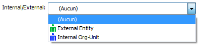
Drop-down list associated with an image. This type of element is associated with enumerated properties when the "Activate images" indicator (0x4000) has been activated in their ‘Extended properties' MetaAttribute.
Operation is similar to a DropDownList (3.5.1.4). The image displayed is defined in the enumerated value.
3.5.1.7 DatePicker
Edit zone associated with date entry via a calendar. This type of element is associated with properties of date type.
The date is displayed in external format.
This element can be used to edit times using the TimeFormat option.
This element operates correctly only with Date type properties.
Option:
TimeFormat: entry of a time.
Properties:
Value: value of date entered in ASCII format (GMT yyyy/mm/dd hh:mm:ss )
3.5.1.8 EditMenu (and other controls designed for object type properties)
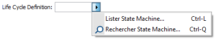
Edit zone associated with a button enabling opening of a pop-up menu. This type of element is associated with properties of object type (including in particular _legAttributes). These properties can also be associated with StaticMenus, ComboBoxMenus, DropDownListMenus, even ComboBoxes or DropDownLists, depending on parameterization of their capacity, as well as the definition of candidate queries. This parameterization also enables definition of menu content.
The edit zone displays as standard the short name in display format of the object pointed by property when it exists; otherwise the ASCII value of the absolute identifier pointed is displayed.
3.5.1.8.1 Specification of update capacity and possibilities
Capacity (Capacity) is a MetaAttribute defined on the _AbstractProperty MetaClass and the _LegAttribute MetaAssociationEnd enabling piloting at metamodel level of behavior of the modification tool concerned. This attribute is a bit field for which the following values are defined:
• List (1): presence of "list" menu command. If the entry zone has been modified, List presents only those objects with names beginning with the value entered in the edit zone.
• Search (2): presence of the "search" menu command, which enables object selection using the MEGA standard query tool.
• ChildMenu (4): presence of the menu of the associated object as a sub-menu.
• Create (8): presence of "create" menu command.
• NoEdit (4096 - 0x1000): the edit zone is read-only. If the element is not required, the "delete" menu command is added.
• Integrate link specification(default) (32 - 0x20): in the case of a _LegAttribute, specifications defined on the MetaAssociationEnd relating to an entry, and in particular candidate definition, are taken into account for presentation of the element.
• Ignore link specification (16 – 0x10): in the case of a _LegAttribute, specifications defined on the MetaAssociationEnd relating to the entry are ignored.
• AutoCreate (256 – 0x100): when the user has modified the edit zone of the element, and therefore the element does not make explicit reference to an existing object, validation of the element results in creation of an object whose name corresponds to the entered value.
• AutoList (128 – 0x80): when the user has modified the edit zone of the element, and therefore the element does not make explicit reference to an existing object, but the name entered in this zone can correspond to repository objects, the list of these objects is proposed at validation.
When taking into account of MetaAssociationEnd entry specification has not been deactivated, we search on this latter:
• value of MetaAttribute LinkOptions. If this value is odd (bit 1 activated), the Search menu is hidden.
• the list of Candidate queries which have been associated with it, as well as the value of the "Favorite" MetaAttribute defined on this link. If we find a favorite Candidate query (that is with value "yes" in the "Favorite" MetaAttribute), the control presented displays a drop-down list button enabling listing of occurrences defined by the favorite candidate query. The other candidates will be the subject of specific menu elements: if we select these menu elements, the corresponding query will be executed, enabling object selection.
When the property cannot be modified, or when user rights on MetaAssociationEnds are restricted, the menu and the capacities used are correspondingly adapted; if the zone cannot be modified, only the ChildMenu will be presented as appropriate.
The type of element presented therefore depends on these specifications, and in particular on:
• the presence of a menu enabling selection or consultation of the object presented in the element.
• the definition of a favorite candidate query, which will display drop-down list behavior (and therefore possibly a second button).
• the fact that the edit zone is read-only or not.
Menu | favorite query | read-only | control type |
Yes | No | no | EditMenu |
Yes | No | yes | StaticMenu |
Yes | Yes | yes | ComboBoxMenu |
Yes | Yes | no | DropDownListMenu |
No | Yes | yes | ComboBox |
No | Yes | no | DropDownList |
3.5.1.8.2 Target MetaClass
The behavior and appearance of the element menu depends on the MetaClass of the property target object. In the case of a MetaAssociationEnd, this MetaClass corresponds to the opposite MetaClass. In the case of a MetaAttribute of Object type, you can define this MetaClass using the "Referenced MetaClass" MetaAssociation. In the case of an Abstract Property of Object type, it is the MetaAssociation (Property Object / MetaClass) that enables definition of this MetaClass.
When the target MetaClass is defined, the search, listing and query tools will be confined to this MetaClass.
If the target MetaClass has not been defined in the metamodel of the displayed property, it can be specified in the parameterization of the element using the Target option. This option also enables specialization of an element to a specific concrete MetaClass, in this case a generic MetaAssociation.
If the target MetaClass is not defined, we consider that the object can be of all MetaClasses of the repository. In this case, the AutoCreate and AutoLink capacities cannot be effectively used.
3.5.1.8.3 Editing name and automatic behavior
When the editMenu zone is not read-only, the user can enter a name in this zone. This enables:
• specification of the search key of the "list" command.
• initialization of the object name in the "create" command.
• update execution by finding the object whose name corresponds to the entered value.
This name can however be ambiguous. On the one hand it is assimilated in the short name of the object, and can therefore correspond to several objects when the target MetaClass has a namespace. on the other, when the target MetaClass is abstract, objects of different MetaClasses can have the same names.
Validation of an entry zone in this way has therefore been globally confined to concrete target MetaClasses without namespace; when there is risk of ambiguity, zone validation is refused and the element is considered as invalid.
It is however possible to alleviate this behavior using AutoLink and AutoCreate capacities. AutoLink enables removal of ambiguity by proposing at zone validation a dialog box listing all objects corresponding to the name entered in the element; update is executed with the object explicitly selected in this list. AutoCreate enables automatic object creation if there is no object corresponding to the selected name. It is preferable to combine AutoLink and AutoCreate so as not to create the object until possible ambiguities have been resolved.
3.5.1.8.4 Options
It is possible to redefine all or part of the capacities defined in the metamodel using options on the element:
Target=<MetaClassId> enables redefinition or specification of the target MetaClass.
Capabilities=<HexaNum> enables redefinition of capacity of the property. HexaNum is understood as a hexadecimal number.
DefaultList=<QueryId> enables definition or redefinition of the query to be used to supply the drop-down list, as appropriate. This query is not necessarily a candidate.
3.5.1.8.5 Properties
Value: displayed value. It corresponds, if its content has not been modified by the user, to the short name of the object pointed by the element in Display format. If the pointed absolute identifier does not correspond to an existing object of the repository, Value contains the ASCII value of this identifier.
TargetID: absolute identifier of the object pointed by the element. When the user modifies content of the edit zone, this property is deleted. When a menu command allowed explicit selection of a new object, this property contains the identifier of this new object. When capacity allows, the sub-menu relating to the object menu (ChildMenu) corresponds to the repository object pointed by this property. When specified, this property is used to validate the element. Otherwise, and in the absence of AutoLink or AutoCreate capacity, element validation uses the value defined in Value, considering it in external format. This value can be used consistently if it corresponds to the ASCII value of an absolute identifier.
3.5.1.8.6 Notifications
Change: sent when the edit zone has been modified.
3.5.1.9 StaticMenu
Element associated with properties of object type, with specific capacities. See 3.5.1.8
3.5.1.10 ComboBoxMenu
Element associated with properties of object type, with specific capacities. See 3.5.1.8
The first button enables expand of a drop-down list.
The second enables menu opening.
3.5.1.11 DropDownListMenu
Element associated with properties of object type, with specific capacities. See 3.5.1.8
The first button enables expand of a drop-down list.
The second enables menu opening.
3.5.2 Explicit AttributeControls
These types are never proposed as standard, and are therefore always defined in the framework of a template or an updateTool. They enable either proposal of alternative entries for certain property types, or definition of form presentation elements (titles, comments, images).
3.5.2.1 3StateCheckBox

CheckBox with third state including ‘not specified' state. Can be used if you are concerned by being able to de-specify the attribute, or if you want to explicitly manage a required boolean attribute.
Options, properties and notifications: see 3.5.1.3.
3.5.2.2 RadioButtons
The RadioButtons type can replace the DropDownList type (see 3.5.1.4). The main difference is the fact that the list of enumerated values, which serves to build the list of buttons displayed, is requested just one time at element creation, and cannot subsequently be modified.
This element is presented by default without title.
When element size is not specified:
• Element height is deduced from the number of buttons to be displayed.
• Width is calculated according to the number of text characters associated with each button, as well as the number of characters of the title. Since this calculation is made in DialogUnits and cannot therefore take account of characteristics of the displayed font, the effective width may not be appropriate.
3.5.2.3 EditButton

This type is a simplified version of an EditMenu, which enables execution of only one command.
A parameterization of this element enables use of this button for file or directory selection, using FileSelection and DirectorySelection options.
In others, use of an updateTool or dialogHandler is necessary to implement the command corresponding to button press.
Options
• Icon=<idPicture>: enables replacement of <…> of button by a medium-sized image extracted from the indicated MetaPicture.
• Bitmap=<idPicture>: enables replacement of <…> of button by a small image extracted from the indicated MetaPicture.
• FileSelection: button press enables file selection. In this case you can use the following options to specify required operation:
Open indicates that we want to open an existing file; if not, we want to indicate a file to be created or modified (Save mode by default).
FileExists=YES|NO (NO by default) indicates if the file should exist. This option is superfluous in Open mode.
DefaultExtension<xxx> enables definition of file default extension.
Filter<xxx{;yyy …}> enables definition of filtering on file extensions listed in defining acceptable file extensions.
PathExist=YES|NO (default YES): when in Save mode and we enter the file name in the edit zone, enables check that directories specified in the path should exist (case YES). In the case of validation, detects an error if the path references non-existent directories.
In Windows Front-End, button press displays the file selection Windows user interface, in Save mode or in Open mode depending on the selected option.
In Web Front-End, this check enables piloting of a file upload to the server (Open mode).- in this case the value of the property (available on the server) will contain the name of the downloaded file - or a download in the case of Save - in this case the value of the property will contain the name of the file to be downloaded; if this element is used in a wizard and has not been explicitly downloaded during execution of the wizard, the download starts automatically when the wizard finishes.
A wizard using this type of element could therefore operate in the same way, whether in Web Front-End or Windows Front-End, in:
• Open mode, we could consider that the value corresponding to the property is the name of an existing file which we could then open.
• Save mode, we could use this property as being a file name to be created (or modified) by the system process; at termination of the wizard, the file will be available to the end user (who has specified the directory in Windows Front-End, or it will be downloaded in Web Front-End).
By code, it is possible to indicate a root directory using the "root" field of the Data property. This directory will be used in Windows Front-End to initialize the user interface directory.
DirectorySelection: button press enables directory selection. In this case you can specify using the PathExist=YES|NO option if we must check the existence of the specified path or not. This parameterization does not function in Web Front-End.
Properties
• Value: value displayed, except if FileSelection option is activated and we are in Web Front-End: in this case the value will correspond to the uploaded or downloaded file (this file name not known from the user interface).
• Data: in this case FileSelection or DirectorySelection, this property can contain a string in JSON format containing a "root" value corresponding to the initial directory.
Example: { "root" : "D:\MyDirectory" }
If this variable is not in JSON format, we consider that it contains the directory name.
This value is consulted at Windows user interface opening, enabling file or directory selection.
Notifications:
• Change: sent when the edit zone has been modified.
• Click: sent when the button is clicked.
3.5.2.4 HelpComment
This element is used to display a help or explanation in a form. It is designed to display a text on several lines. It can display rich text. It does not enable data entry and is read-only.
This text can be the comment of a system repository object; in this case the element identifier corresponds to the identifier of this object, and can therefore point an object of any type.
It can also, by option, display a text. In this case the element identifier corresponds to that of the text to be displayed.
In Windows Front-End, it can enable navigation to other system repository comments if the system objects are referenced in the form of a field in the initial text.
This element is presented by default without title.
Options:
TextMode: indicates that the element must display a text of the object pointed by the element; this text corresponds to the element identifier. Otherwise, the comment of the system object corresponding to the element identifier is displayed.
The following options are not taken into account in Web Front-End:
Edge: displays the comment in the form of a simple framed text. In this case the following options are ignored, and navigation by field is deactivated.
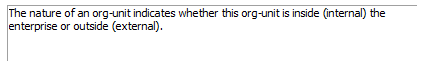
Border: the comment is framed.

Icon or Info: the help icon is displayed alongside the comment.
Icon and Border can be associated.
Properties:
Data: text content in ASCII format.
Value: text content in HTML format.
3.5.2.5 Button

Display of a clickable button enabling execution of an action.
If the element identifier points to an _Operator of method type, or a macro implementing a method, the method is executed when the button is pressed.
This element is presented by default without title. The name displayed in the button corresponds to the value of the title, except if the button displays an image.
Options:
NoCall: the method is not called when the button is pressed. Used when the action triggered by the button is processed by the Click notification, and not by the method.
Icon=<idPicture>: enables replacement of the name displayed in the button by a medium-sized image extracted from the indicated MetaPicture.
Bitmap=<idPicture>: enables replacement of the name displayed in the button by a small image extracted from the indicated MetaPicture.
When the button displays an image, the size of the button should correspond to that of the image, and is therefore expressed in pixels. The button is therefore SCREENUNITS style. If the size of the button is specified in the template, it will be considered as a size in pixels.
Units=Dialog: in the case where the button displays an image, enables sizing of the button in DialogUnits by deactivating the SCREENUNITS style; this can be used if the button must be aligned with other elements. In this case its size can conform to that of the other elements.
Notifications:
Click: sent when the button is clicked.
3.5.2.6 MegaEditCheck

A MegaEditCheck includes 3 areas:
• a value, which could be editable
• a check box, which could be clickable
• a label.
It is without exception necessary to implement an UpdateTool to be able to use a MegaEditCheck. Without this, a MegaEditCheck behaves like a simple edit area: label value is not specified and check box is not used.
To consult or modify label and check box values, the Data property of the AttributeControl should be used.
This property describes the value and status of these areas in the form of a character string.
It is of form
"label":"<Label>","check":"<checkValue>","show":"<showValue>"
• <Label> corresponds to the string displayed in the label static area.
• <checkValue> corresponds to check box value and can be C (checked), U (unchecked) or I (indeterminate).
• <showValue> enables configuration of check box display and can be E (enabled), D (Disabled) or H (Hidden). In this last case, the check box is not visible.
As indicated in paragraph Error! Reference source not found., it is possible to modify only one of these elements. For example AttCtl.Data = """check"":""C""" forces check mark display without affecting the values of “label” or “show”
If you want to access specific information of the Data string, you can use a MegaToolkit function: JSONStringSearch
Set myToolkit = myRoot.CurrentEnvironment.Site.Toolkit
CheckValue = myToolkit.JSONStringSearch("{" & AttCtl.Data & "}", "check")
CheckValue contains C, U or I.
Properties:
Value: edit area content
Data: check box and label content and value (see above)
Notifications:
Change: sent when the edit zone has been modified.
Click: sent when the check box is clicked.
3.5.2.7 Viewer
A viewer enables display of an HTML Formatter in a page; it is presented in the form of an HTML browser inserted in the page.
By default, the identifier associated with the element corresponds to the identifier of the formatter; this formatter is launched on the object pointed by the element.
You can also directly launch a macro to generate this HTML content by means of DirectMacro option. In that case the identifier associated with the element corresponds to the identifier of the macro to be executed. This macro must implement the Generate or GenerateStream method which will be call to generate the HTML content of the viewer.
Sub Generate(obj As MegaObject, ctx As MegaObject,data As String,strout As String)
Sub GenerateStream(obj As MegaObject,ctx As GenerationContext,data As String,stream)
Data corresponds to the Data value of the AttributeControl.
This system enables to specify viewers that run on informal objects, associative objects, or whose content can depend on the association browsed from the object pointed by the element, as appropriate.
Formatter execution is asynchronous.
The element is displayed by default with its title above.
It has style BOTTOMALL and therefore is deformed to use all the page when it is the last element.
Being an HTML component, this element offers great freedom in what can be displayed. However, it is advisable to consult HTML formatter documentation if you want to trigger interactions that can operate in Web Front-End and in Windows Front-End.
However, if you want to use a viewer to display systems designed to execute updates, it is advisable to avoid direct update execution, which is not easy in Web Front-End. By configuration it is possible to synchronize updates from the viewer with form validation. The principle used is to designate a Macro to handle updates from the viewer at form validation. To do this, an interaction mode between the viewer and its container is defined.
Interactions are by means of a callback function, which should be presented in the header of the HTML document. This function has (javascript) as prototype
function onContainerCmd(prm,attctl)
prm is a character string indicating the interaction type
attctl is a parameter referencing the viewer container in Web Front-End. In Windows Front-End, this parameter is empty. In particular it enables identification of whether the use context of the HTML document is Web Front-End or Windows Front-End.
Calls to this function are carried out if the following options are present:
Initialize: the callback function is called at initialization of the form, with value prm = "initialize".
Refresh: indicates that the viewer should not be recalculated at refresh; instead of recalculation, the onContainerCmd function is called, with value prm = "refresh".
Appliable: indicates that callback should be called at form validation; the onContainerCmd function is called, with value prm = "apply". By default, this function is only called if the element is ‘‘dirty', that is considered as modified. It is however systematically called at each form validation if the alwaysCall option is specified. In the current version, this option is essential for Web Front-End operation.
The onContainerCmd("initialize" function is systematically called when any of the options enabling callback call is specified.
When calling onContainerCmd("apply", it is possible to specify the Data property of the element to control updates to be executed.
To be usable, this property must contain a JSON format character string including the macro to be called on the server:
"applyMacro":"<MacroID>"
At validation on the server, if this field is found in the Data property of the element, the <MacroID> macro is instanced and we call on this macro the function
Function InvokeOnObject(object,idText,Page)
Where object is the object of the AttributeControl, context the component corresponding to the AttributeControl, and param the JSON string corresponding to the Data value containing data allowing the macro to know updates to be executed.
To specify the Data property from the onContainerCmd("apply",attctl) function, proceed differently according to whether you are in Windows Front-End (attctl = "") or Web Front-End context.
• In Windows Front-End, you can directly update the AttributeControl using the context object:
external.ContextObject("PageContext").SetData(result.data)
• In Web Front-End, the value returned by the onContainerCmd function should be a JSON format string. Present in this string can be the fields:
o data: is assigned to the Data property.
o reload: causes reloading of the formatter if assigned to True.
o errorMessage: is assigned to the ErrorMessage property and cause – if not null – an error on the page.
The context component, accessible in Windows Front-End from the external object and in the InvokeOnObject function of the validation macro, has the following properties:
.setData(string): updates the data property of the AttributeControl.
.setDirty(bool): generates an “Update” notification if true and positions the dirty value.
.setError(string): updates the ErrorMessage property of the AttributeControl. If this string is not empty, indicates that the element is in error and the form cannot be validated.
.refresh(): refreshes the viewer.
.notify(action): generates a notification on the page.
The following example proposes an implementation enabling generic update of object properties via a viewer.
To do this, consider that the validation macro uses an ApplyParameter field of JSON Data. This property should be an object table, each object containing the following fields:
id: <identifier of property to be updated>
value: <property value>
format: (optional) update format
The validation macro is implemented in javascript to use a JSON format parameter as simply as possible It browses the table defined above and executes the corresponding update.
//Language:javascript
function InvokeOnObject(obj,device,param){
obj.getRoot().print(param);
var vparam = eval("(" +param + ")");
obj.getRoot().print(vparam.applyMacro);
for(var i = 0; i < vparam.applyParameter.length; i++) {
var itemObj = vparam.applyParameter[i];
obj.getRoot().print("ID=" + itemObj.id + ", VALUE=" + itemObj.value + ", FORMAT = "+ itemObj.format);
obj.SetProp(itemObj.id, itemObj.value , itemObj.format);
}
}
This macro having been defined, you must now create an HTML document able to manage this interaction. This document is displayed and will enable update of ShortName and Cardinal MetaAttributes of a MEGA object (for example a Site, an Operation, an Org-Unit or any other MetaClass using the Cardinal MetaAttribute).
The HTML document of this example is of form:
<hmtl>
<head>
<script language='javascript'>
function onContainerCmd(prm,attctl) {
var fieldVal1 = document.forms[0]['input1'].value;
var fieldVal2 = document.forms[0]['input2'].value;
var result = {'reload': 'true','errorMessage':'null','data':
{'applyMacro':'#MACROID#','applyParameter':
[{'id':'~MtUi79B5iyF0[Cardinal]','format':'','value':fieldVal1}
,{'id':'~Z20000000D60[Short Name]','format':'','value':fieldVal2}
]}};
if(attctl==='')
external.ContextObject(""PageContext"").SetData(result.data);
alert('test:'+prm+':'+attctl);
return result;
}
</script>
</head>
<body>
<form>
<table border='0' align='CENTER'>
<tr><td><b>Cardinal :</b></td><td><input id='input1' type='text'
value='"#CARDINAL#"' /></td></tr>
<tr><td><b>Short Name :</b></td><td><input id='input2' type='text'
value='"#SHORTNAME#"'/></td></tr>
</table>
</form>
</body>
</html>"
In this HTML, #MACROID# should be replaced by a field representing the absolute identifier of the validation macro, #CARDINAL# by the value of the Cardinal MetaAttribute for the form object - oMegaObject.GetProp("~MtUi79B5iyF0[Cardinal]") and #SHORTNAME# by the value of the short name - oMegaObject.GetProp("~Z20000000D60[Short Name]")
This HTML document generates a warning at validation.
For operation
Options:
HideStatusBar: in Web only. Hides the status bar (and therefore the button enabling element refresh).
Initialize, Refresh, Appliable: indicates presence of an onContainerCmd(prm,attctl) callback function in the HTML document header, enabling interactions between the HTML document and the form.
alwaysCall: when the Appliable option is defined, indicates that the validation macro must be called, even if the component is not considered as being modified. This option is currently necessary for Web Front-End validation operation, since it is not possible to dynamically modify component status.
Properties:
Value: HTML content of viewer (currently non-operational)
Data: contains a string in JSON format containing data on interaction between the HTML document and the validation function (see above).
Specific component
The specific component accessible from the AttributeControl object includes the interaction functions described above.
SetData(string): attctl.component.SetData string corresponds to attcl.data = string
SetDirty(bool)
SetError(string): attctl.component.SetData str corresponds to attcl.errorMessage = str
Refresh()
Notify(action)
3.5.2.8 ComboLinks

This element enables creation of the "owner" of an object. It therefore handles the problem of a data entry containing exclusive MetaAssociationEnds, from card-max to 1. The MetaAssociationEnds list included in the drop-down list is discriminated by an _operator of "compound" type, the MetaAssociationEnds presented being tagged "deep" for this operator.
This element is not designed to be overloaded.
Properties:
Value: edit area content (corresponds to short name of associated object)
TargetID: Identifier of associated object
SourceID: identifier of selected MetaAssociationEnd.
Notification:
Change: sent when associated object is changed.
3.5.2.9 Shape

The Image AttributeControl enables display of an image, possibly followed by a static area.
It enables representation of an object; to do this you can define a specific object for this element.
Click on an image can trigger an action, which can be to display the object menu.
The image displayed is a MetaPicture format 32x32, corresponding
• to the image of the object associated with the element with the ImageFrom:Object option
• to the image associated with the property of the element with the ImageFrom:Attribute option. In this case, if the property is MegaIdentifier type, it is considered as containing the identifier of a MetaPicture which is then displayed. If not, it should be an enumerated property of which we display the MetaPicture associated with the enumerated value corresponding to the value of the property.
The static area is not displayed if the Value:void option is specified. If not, it corresponds
• to the title of the area with the ValueFrom:Title option
• to the value of the property of the element with the ValueFrom:Attribute option
• to the value of a property of which we specify the field with the ValueFrom:<PropID> option
When the area displays its title, or when the Value:IncludeTitle option is specified, the value of the static area is concatenated with the title.
When we click the image, no action or notification is triggered with the Clik=Inactive option. The Click=PopupMenu option displays the object menu.
If you want to display by this element an object seen from the main object of the page, creation of a map is not necessary. You need only specify the collection browsed with the option
FromCollection:<CollectionID>{TypeName|ClassName} and associate with the element the absolute identifier of the object to be displayed. Most often this requires call to a page generator (see 3.3.1.6). In this context it is possible to include the name of the object type (TypeName) or the name of its MetaClass (ClassName).
This element is present by default without title; it being possible to include the title in the value. Its default style is SCREENUNITS, meaning that its size is expressed in pixels in the configuration (unless otherwise specified).
Options:
FromCollection:<CollectionID>{TypeName|ClassName}: displays image of an object seen from the collection
Click={Inactive|PopupMenu}: disables the click notification, or displays the object pop-up menu
Value :{void|IncludeTitle}: specifies display of the static area: hidden or preceded by the element title.
ValueFrom:{Title|Attribute|<PropID>}: specifies the displayed value (area title, element attribute, or particular property of the object indicated by its <PropID>) field.
ImageForm:{Object|Attribute}: specifies if the image is the image of the object or corresponding to the image associated with the property of the element.
Units=Dialog: enables dimensioning of the image in DialogUnits by disabling the SCREENUNITS style; this can be used if the image should be aligned with other elements – in this case its size can conform to that of the other elements.
Properties:
Value: content of the static area
Data: enables definition or determination of the image to be displayed, in form
"image":"<moniker>"
The moniker generally corresponds to the identifier of the MetaPicture, preceded by character ‘~'
Notification:
Click: sent when the image is clicked
3.5.2.10 Label

Displays a label. As standard, this label corresponds to the name of the object whose identifier is associated with the element. It is however possible, by option, to display the element title or a property value.
This element is presented by default without title.
Options:
ValueFrom:{Title|Attribute|<PropID>} indicates that the displayed value corresponds to the element title, to the property value associated with the element, or to another property of which we pass the identifier in the form of a field.
Properties:
Value: content of the static area
3.5.2.11 MetaTree
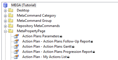
This AttributeControl enables display of a MetaTree in a properties page.
The identifier associated with the element corresponds to the identifier of the MetaTree. The root of this MetaTree is the object pointed by the element.
A MetaTree can be used to control a Map.
MetaTree options are described in a JSON format character string (character case should be scrupulously respected). Note that an option string containing a bracket must be specified using a Parameter.
Example:
treeParam = Parameter({"metalist":"OEb0XL0zF93Q","checkbox":true})
testTree = Item(~ulSYFlOK1XB0[Objects]),Control(MetaTree),Param(@treeParam)
The JSON can contain the following parameters:
"checkbox":boolean enables to have check boxes opposite each element. The default value is false.
"selPropagate":{"mode":string,"direction":string,"autoExpand":string} This option is only effective in the framework of a checkbox tree, and enables definition of the propagation mode of a selection of elements in the tree.
mode can be on, off, defaultOn, defaultOff. In the two default modes, a button allows the user to enable or disable this behavior as required.
direction can be:
down (default value): when a node is selected or deselected, all children are immediately selected or deselected. Behavior is recursive and should therefore only be activated on trees that are truly hierarchical (not of cycle).
up when a node is selected, all parents are selected, up to the tree root. When a node is deselected, its parents are deselected, except those that have another descendant selected.
both combines both behaviors.
autoExpand can be on, off (default), defaultOn, defaultOff but is only valid for descending propagation. This enables automatic expand of nodes to show selected child elements, with or without a button available to the user. This option should be used with care, since expanding the tree can be costly in terms of time.
Propagation of the selection is not supported in Windows Front-End.
"metalist":string: enables definition of additional columns on the MetaTree. The parameter supplied is a MetaList identifier, of which MetaFields will be interpreted as tree columns. MetaField now inherits from Abstract Property. This enables connection by the Implementation MetaAssociationEnd of a macro implementing the calculated attributes interface.
When value of a MetaField with macro is requested in the framework of a tree, the MegaObject is enhanced by addition of a "virtual" attribute "~MJoWUFOzF92Q[Tree Node Full Path]", which enables access to the full path of the object in the tree, formatted in the same way as the selection.
When value of a MetaField with macro is requested in the framework of a tree, the MegaObject is enhanced by addition of a "virtual" attribute "~MJoWUFOzF92Q[Tree Node Full Path]", which enables access to the full path of the object in the tree, formatted in the same way as the selection.
In Web Front-End, in-place edit is possible in columns by double-clicking the value you want to modify.
Limitations:
Presentation in columns is available in Web Front-End only.
In Windows Front-End, these fields are concatenated with the name of the element.
MetaFields of columns operate only for MetaFields based on a macro or on a MetaAttribute (not MetaAssociationEnd or query)
Properties:
Value: lists selected objects. This value is a JSON format character string that gives the full path of objects in the tree. In assigning the value we modify the selection.
Notifications:
sent when the selection changes.
3.5.2.12 Matrix
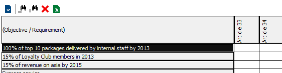
This AttributeControl enables display of a Matrix in the properties page. This matrix can be either display of the content of a Matrix or System Matrix occurrence, or display of the matrix resulting from application of a matrix template to the object pointed by the element (default mode).
To display content of a Matrix (or System Matrix), the Object option should be present – in this case the object pointed by the element is the matrix, and its content will be displayed – or the Data option – in this case the identifier associated with the element corresponds to the occurrence of the matrix to be displayed.
• In the case of the Object option, the identifier associated with the element is not taken into account; in the case of the Data option, content of the matrix does not depend on the object pointed by the element.
• The Matrix (or System Matrix) occurrence contains the list of selected rows and columns as well as those that may have been added using addition buttons. These collections are serialized in a technical attribute of the matrix at validation of the element. The matrix occurrence also memorizes display modifications (for example column width).
In the case of matrix template display, the identifier associated with the element corresponds to the identifier of the Matrix Template to be used. A matrix template enables definition of:
• an object collection defining rows of the matrix. This collection is obtained from the object pointed by element.
• an object collection defining columns of the matrix. This collection is obtained from the object pointed by element.
• a MetaAssociationEnd defining cell content: cell content corresponds to the association between column object and row object according to this MetaAssocationEnd.
• a MetaAttribute of the MetaAssociation defining the value displayed in the cell: if this attribute is not defined, the cell will display a checkbox indicating link presence or absence.
• It is possible to specify a query instead of a MetaAssociationEnd: in this case we display in the cell a checkbox indicating presence of the row object in the collection obtained from this query from the column object.
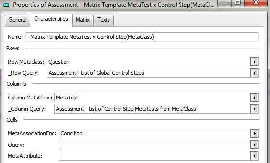
Unlike the case of matrix display, the list of rows and columns corresponds exactly to the content of row and column collections. You must be able to modify content of these collections to be able to modify the list of displayed rows and columns.
Options:
NoBar: the matrix toolbar is not displayed.
Object, Data: indicates that the matrix displays content of a Matrix or System Matrix occurrence.
AutoLink: simple click on a cell enables creation or deletion of the corresponding association.
Component methods:
Specific methods of the AttributeControl can be called from the component object (AttributeControl.Component)
.Fetch(Input As String) As String: this function obtains complete content of the matrix in the form of a JSON format string. The input parameter is ignored.
The JSON restored by this function contains two elements:
- an hdr element containing description of the matrix, and
- a content element containing the rows.
In hdr, columns are presented as a columns table of form
{ "id": "<idcol>", "format": "<format>" , "image":bool , "name":name };
<idCol> contains absolute identifier of the column element.
Also included are elements columnTotal (number of columns), total (number of rows), cornerName (title, displayed in cell top left corner) and checkBoxCell :true if cells include checkboxes, indicating presence of the association.
content is a table, each element including a row, of form
{ "id" : "<idLine>", "image": "<image>", "<columnid>": "<value>" … }
idLine corresponds to the identifier of the row object; only columns effectively specified are present,
<columnid> being the column object identifier and value to be displayed.
3.5.2.13 DropDownSelection

This element enables display of content of a selection in the form of a drop-down list. The menu button enables addition of elements to the collection, and access to the menu of the object selected in the list.
The identifier associated with the element is the identifier of a collection (MetAassociationEnd, query or other abstract collection).
Although of appearance identical to a DropDownListMenu (Error! Reference source not found.) the two elements are fundamentally different.
• The DropDownListMenu manages an Object type property. The drop-down list enables display of update proposals. Edit area content corresponds to the value (current or after validation) of this property. This element resembles an edit area containing update help features.
• The DropDownSelection manages an object collection directly associated with the object of the element. Edit area content is an object selected in this collection. This element is similar to a single-selection list view presented in compact form.
Like a ListView, a DropDownSelection enables updates on the collection (occurrences addition and deletion). It also enables (it is even its main use) control of a Map pointing to the object selected in the collection.
This element is not designed to be overloaded; in particular it does not generate public notifications. You can however use private notification of number 1, corresponding to change of selection. You cannot directly change the selected element in the list.
Options:
• NoMenu: in this case, the menu button is not displayed and the element has the appearance of a simple drop-down list.
• SelectOnRefresh: indicates that the collection should be recalculated when the element is refreshed; to be used when we want to take into account collection updates when corresponding to a query – in particular an ERQL query.
Properties:
• Value: edit area content (corresponds to short name of selected object) This value cannot be modified.
• TargetID: Identifier of selected object This value cannot be modified, (except by command SELECT-<id> from the properties page).
3.5.3 Composite AttributeControls
Composite AttributeControls enable presentation of complex data. To define this data, you may decide to associate it with sub-AttributeControls using a composition Map.
Example: sub-AttributeControls, amongst other things, enable definition of columns of a ListView.
3.5.3.1 ListView
A ListView enables display of an object collection. This collection is obtained from the object associated with the ListView element. The columns – properties of displayed objects – can be configured. A ToolBar is defined by default for the ListView, enabling triggering of actions relating to the collection (creating a new element for example) or to an element selected in the list. The ListViews can be single-selection or multiple-selection. Finally, it is possible to define a ListView displaying several selections, known as alternative selections.
A ListView can control a map: in this case the object selected in the list is assigned to the controlled map, and therefore becomes the object associated with items contained in this map.
On this subject, the ListView content map (enabling ListView specification) should not be confused with the map controlled by the ListView (enabling object path definition).
In the basic case, the identifier associated with the ListView is that of the collection to be displayed: the list displayed corresponds to the path by api of the collection obj.GetCollection(<ItemID>)
3.5.3.1.1 ListView "content" map
The listview content map enables definition of buttons, columns and alternative collections. Options defined for these elements indicate for which use it is reserved:
• An element corresponding to a toolbar button contains the "PushButton" option.
• An element corresponding to an alternative collection contains the "AlternateSelection" option.
• An element corresponding to an additional column contains the "Extra" option.
• The other elements are considered as column overloads.
3.5.3.1.2 Configuration elements
3.5.3.1.2.1 Specification of displayed columns
Displayed columns of a ListView are obtained from description of the displayed collection; it is possible to define filtering so as not to display all properties defined for this description. For information, it is possible to obtain by api the elements of this description by obj.GetCollection(« ItemID »).GetTypeObject.Properties
With each column is associated the identifier of the property represented. This identifier is unique, so two columns displaying the same property cannot be inserted.
If no column filtering option is present, all columns of the description are displayed, except:
• columns corresponding to Properties not visible according to metamodel access of the current user
• columns corresponding to MetaAttributes hidden at MetaClass level for the profile of the current user
• columns corresponding to translations of MetaAttributes (only the root MetaAttribute is displayed, corresponding to display of the value in the user language)
• columns corresponding to an administration property, a local property, or a property hidden in edit – corresponding to flags "in administration tab" (0x4), "never appears in list column" (0x1) and "hide on edit" (0x20000000) of the "extended properties" attribute.
• The "ShortName" attribute - we directly display the attribute that substitutes the name, beside which ShortName would be redundant.
If this list is not suitable, you can define generic filtering using the following options:
NoDefaultColumn: in this case, only the naming attribute is displayed; this is the one serving as name for description of the collection. It can then serve:
• as name if the name attribute is not substituted, or if the collection displays the long name by default. This is determined by the "Name Appearance" MetaAttribute which is read either on the browsed MetaAssociationEnd or on the MetaClass.
• as the attribute that substitutes the name if the collection is configured to display the short name. The name of this attribute generally being esoteric, we give it the conventional name ("Local Name").
• of the ShortName conventional attribute for collections derived from an abstract class or calculated
• of another attribute in the case of informal collections for which a naming attribute has been explicitly defined.
StandardColumn: filtering is identical to default filtering, but only the default columns (properties having enabled the "Default Column" (0x2) flag in their "extended properties") are visible by default.
AssocColumn: besides the naming attribute, the listview displays the properties defined on the browsed MetaAssociation.
More precise filtering can be defined by overloading columns in the ListView content map. When the identifier of a content map element of overload type (that is, not having as option "Extra", or "AlternateSelection", or "PushButton", or "Cookie") corresponds to a property identifier of the collection description, a new configuration is applied on this column according to the following rule:
• If the element is hidden (keyword HiddenOn() ), it is filtered. Note that if the hide condition is likely to change at object update, the columns list should be recalculated at ListView refresh; this is not done automatically, and to do this you must supply the ListView (and not the element) with the RefreshColumns option.
• otherwise, and if the column was filtered by default, it is made visible; this is not however done if filtering followed metamodel filtering or was defined by user rights.
• If the element is disabled (keyword DisabledOn) the column is not forced in read-only mode
• If the element is defined with keyword Title(Up), the column title is replaced by the Name() of the element.
• If the element is defined with a particular size (Size(x)) this size is used as initial size of the column. If the size is empty (Size(0)) the column is initially hidden.
• If the element is defined with a Control(CheckBox) it is displayed in the form of a check box; with a Control(ComboBitmaps) it is displayed preceded by its image.
Columns not included in the description can be added, known as "ExtraColumns". These columns are defined by content map elements provided with the Extra option. See 3.5.3.1.2.4. Finally, you can define columns specifically calculated for the ListView which are also content map elements, but provided with the Cookie option.
Default columns appear in the order defined for the description; it is however possible to reorder all or certain of the listview columns using the ReOrder option. When this option is specified, it is content map element declaration order that is used to sort columns, elements not obtained from this map being listed afterwards. Note that the name is always placed first.
3.5.3.1.2.2 Images associated with listed objects
By default, the first element of each line in the list is the image of the listed object. If you do not want this image to appear, specify option NoLineBitmap.
The image to be displayed can be redefined, either by stamping or by replacement. To do this, you must have available on the list element one or several properties for which an image is defined; these can be:
• enumerated properties of which values are associated with a MetaPicture
• calculated properties of megaidentifier type, of which values correspond to a MetaPicture.
To replace the image of the line:
specify the BitmapSelector=Field option where <Field> is a reference to the property to be used.
To stamp the image of the line:
specify the BitmapStamper=Field {,Field} line. Several stamps can be used. Stamped images do not replace the list image, but are placed above transparently.
3.5.3.1.2.3 Element sorting
At initial display, elements in a ListView are sorted:
• according to their order number
• at equal order number, according to name.
The order number and name are properties defined as those of the collection description. Name calculation has already been mentioned in section 3.5.3.1.2.1 and mainly depends on the target MetaClass and the collection browsed. The order number is the ‘Order' MetaAttribute when the collection displayed is a MetaAssociationEnd. When it is an ERQL Query – which does not allow order number retrieval – the object creation date is used.
To sort initially in lexicographical order, that is not use the order number and sort directly on the name:
specify the NameSort option.
To redefine the attribute used to determine order number:
specify the OrderOverloadProp=PropID option.
3.5.3.1.2.4 Definition of Columns outside description
You can insert in a ListView columns not included in description of the browsed collection. These columns are represented by listview content map elements, with options Extra or Cookie.
An Extra column has a corresponding property identifier which should be accessible for all listed elements, independent of the ListView. Similarly, if you define the following element in the content map:
Extracol = Item(PropID),From(contentMap),Param(Extra)
Then for all elements listed in the collection, it should be possible to execute (in script)
oListItem.GetProp(«<PropID>»)
It is for this reason that these columns are not in principle MetaAttributes, since these are normally included in descriptions derived from the metamodel. However, it is possible to include _AbstractProperties (generally TaggedValues).
• If listed elements are ‘Elements with TaggedValue' or ‘System Elements with TaggedValue', all non-calculated _AbstractProperties can be applied to them.
• If an _AbstractProperty is calculated, the possibility of inclusion as a column depends on its implementation, and more specifically on its compatibility with the browsed elements.
You can include a column whose calculation is specifically executed in the ListView: in this case, the content map element has the Cookie option, and other elements enabling definition of the calculation mode of this column as defined below.
Param(Cookie{,BasedOn=BaseId}{,IsTrigger=n},DataSource=DSId{,DSOptions})
DSOptions that can be: From:CollectionId
Path:ObjectPath
Macro:MacroId InitString
The principle of this calculation is to search for the column value not on the line object, but in another collection, called here DataSource.
In the standard case, this collection is constituted from the source object of the ListView.
To obtain the value of the column, we first search this DataSource for an object whose identifier corresponds to that of the line object.
If the column is defined as trigger (keyword IsTrigger=1 or IsTrigger=2), the collection derived from DataSource is managed as a link controlled by the column. If IsTrigger=2, the column does not reference a property, but is considered as a boolean value, displayed by a check box, whose value indicates presence of the object in the DataSource.
In other cases:
• if the object is not present in the DataSource, the column is unspecified.
• otherwise, value of the column corresponds to the value of a property of the DataSource object, corresponding either to the absolute identifier defined in <BaseId>, or by default to the absolute identifier of the column.
The following is the equivalent of the column value calculation in script.
' oRootObject : object associated with ListView (ListView.GetObject)
' oLineObject : object corresponding with line
' sColumn : column value
Dim cDataSource as MegaCollection
Set cDataSource = oRootObject.GetCollection("<DSId>")
'this example relates to a simple DataSource, that is without <DSOptions>
Dim oDataSourceObject
Set oDataSourceObject = cDataSource.Item(oLineObject.GetID)
If oDataSourceObject.Exists Then
if "<BaseId>" = "" Then
sColumn = oDataSourceObject.GetProp("<ColumnId>")
Else
sColumn = oDataSourceObject.GetProp("<BaseId>")
End If
Else
sColumn = "" ' No reference to object in DataSource, column not specified
End If
Definition Options of a DataSource enable management of a DataSource not corresponding to a collection directly accessible from the source object of the ListView
From :CollectionId enables access to the DataSource collection indirectly from a link considered unique. It could be that the DataSource collection is not defined.
Dim cDataSource as MegaCollection
Set oInter = oRootObject.GetCollection("<CollectionID>").Item(1)
If oInter.Exists then
Set cDataSource = oInter.GetCollection("<DSId>")
Else
Set cDataSource = Nothing ' in this case DataSource is not defined
End If
Path:ObjectPath In this case the DataSource collection is not obtained from the source object of the ListView, but from the object of which we specify the MegaPath. It could therefore be that the DataSource collection is not defined if the MegaPath does not correspond to an object.
Set oInter = oRoot.GetObjectFromPath ("<ObjectPath>")
If oInter.Exists then
Set cDataSource = oInter.GetCollection("<DSId>")
Else
Set cDataSource = Nothing ' in this case DataSource is not defined
End If
Macro:MacroId InitString enables access to the DataSource collection from a Macro implementing a standard collection as follows:
Function GetStandardCollection( MegaObject as MegaObject,
RetType as Variant,
InitString as String) as MegaCollection
MegaObject is the source object of the ListView
InitString is the character string specified in the option
RetType is an optional parameter enabling overloading of the returned collection type, when it is specified with an identifier corresponding to a collection type.
When a column derived from a DataSource can be modified, update affects the DataSource collection. If the column is not defined as being a trigger:
• When an object corresponding to the line element exists in the DataSource, the value of the property of this object corresponding to the column is updated with this value.
• When this object does not exist, we try to insert it in the DataSource collection by providing the identifier of the line object (except of course if the update value is empty: in this case we do nothing). If creation is successful, we update the property corresponding to the column of this new object with the update value.
If the update column corresponds to a trigger:
• In the case of an indicator (IsTrigger=2), we insert or remove the collection object according to the boolean value of the update (nothing is done if the value supplied corresponds to the calculated value).
• In the case of a simple trigger, update with an empty value removes the object from the collection if it was included; in other cases, update corresponds to the standard case (insertion if required and property update).
In the case where the DataSource collection is not defined, update fails.
3.5.3.1.2.5 ToolBar content specification
A ListView toolbar includes:
• standard buttons, which can be filtered
• specific buttons, which should be defined in the content Map.
The ListView toolbar can be hidden using the NoBar option.
Standard buttons of a ListView are:
Create (C): Starts the tool for creation of a new element in the list.
Link (L): Starts the tool for creation of a new element in the list (connect).
Reorder (R): Starts the tool enabling reordering of elements of the list according to standard order (see 3.5.3.1.2.3).
The following buttons concern the occurrence selected in the list:
Destroy (D): Starts the tool to delete the selected object.
Unlink (U): Starts the tool to remove an element from the list (disconnect).
Properties (P): Display of the properties dialog box of the object selected in the list.
Explore (E): Starts the explorer on the selected object (available only on Windows Front-End).
Open (O): Executes the default command of the menu of the selected object. This command is not present by default in the toolbar.
Standard buttons are automatically disabled when the action concerned is not possible or prohibited.
To filter standard buttons use the ToolBar[] option. Between the toolbar brackets are the names (or abbreviations) of buttons concerned, preceded by symbol "+" if you want to show these, and "-" if you want to hide them.
Example: the ToolBar[-RDU] option specifies hiding of buttons Reorder, Destroy and Unlink.
When a standard button is hidden, the corresponding command in the pop-up menu of the selected element is automatically removed (if it exists). If the toolbar is integrally hidden by the NoBar option, but you do not want commands corresponding to the buttons to be removed from the pop-up menu of the selected object, you must include the ToolBar[] option which will in this case enable forcing of display of corresponding menu commands.
When alternative lists have been defined in the ListView, selection of the list to be displayed can be by means of dedicated buttons (see 3.5.3.1.2.6)
Export buttons enable production of a document using content of the ListView. Export in Excel (X) and PDF (P) are available as standard. The ExportCommands=P|X|0 option enables control of display of these buttons.
You can redefine the list of these buttons in a given ViewPort PropertyPage (see 2.3.4). In this context, the default list of buttons will follow configuration of this viewPort, defined in its _Parameterization. text.
In this configuration, we define export buttons in the [ListViewExport] section:
[ListViewExport]
<ExportName>=Item(<ButtonID>),Param(<extraParameter>),Name(<Name>),Picture=<PictureID>,Method=<MethodID>
Each export button is identified by its ExportName. The first letter of each of these ExportNames should be distinct, since it identifies the button in the toolBar and can be used in ExportCommands to specifically filter export buttons in the ListView.
Example: if you define an export named "Html", ExportCommands=H will indicate that only this export button will be present in the listView.
Identifier of the button will be <ButtonID>; the name displayed will be <Name>, which can be a character string or a field – in this case the name will be that of the referenced object -. The image associated with the button corresponds to <PictureID>, and the macro to be invoked <MethodID>. <extraParameter> can be used to specify an initialization string for this macro.
You can define additional buttons or modify behavior of standard buttons, using the content map. To do this, elements with the PushButton option should be added to the content map. Clicking one of these additional buttons generates a notification TBN_DROPDOWN (64826) relating to the ListView, which can be intercepted by the trigger macro of the property page (see 3.4.3). The PushedButton ListView specific function enables determination of which button has been clicked: It returns the identifier of the content map element associated with the button.
The name associated with the button corresponds to the title defined for the element.
Configuration of a button element uses the following options:
Param(PushButton{,OnSelection}{,CheckFlags}
{,Picture=PicId}{,Method=MacroId}
{,ReplaceStandard[<ButtonName>]}{,OverloadStandard[<ButtonName>]})
OnSelection: indicates that the button only ungrays if an occurrence is selected in the list.
CheckFlags: indicates that the button should gray if the element is disabled (for example by DisabledOn).
Picture=PicId: defines the image associated with the button.
Method=MacroId: indicates that the button should not generate a notification on the trigger macro of the property page, but on an instance of the MacroId macro created specifically for this button.
ReplaceStandard[] and OverloadStandard[] enable overload of a standard button. With OverloadStandard, only the image of the standard button is affected. With ReplaceStandard, standard processing of the button is replaced by the specific processing associated with the element. The name of the standard button to be overloaded corresponds to the name defined in ToolBar[]
3.5.3.1.2.6 Alternative list specification
Specification of alternative lists enables a unique ListView to display several distinct collections. Advantages here are more compact page size and faster loading, since only the selected collection will be queried.
When a ListView has alternative collections, we add to it a user interface enabling selection of the current collection:
• This selection can be made using additional buttons added to the ToolBar of the ListView. These buttons are RadioButtons – only a single selection can be made. This is default behavior.
• It can be achieved by means of a DropDownList inserted in this same ToolBar; to do this, we should include the ShowAlternate=DropDown option.
• It can be done – in Web Front-End only, by means of a list of buttons including tabs located above the ListView (and therefore outside the ToolBar). To do this, include the ShowAlternate=Folder option. This function not being available in Windows Front-End, the option is ignored in this case and buttons are displayed. If you want to display tabs in Web Front-End and a DropDownList in Windows Front-End, you can include the ShowAlternate=FolderOrDropDown application.
To define alternative collections:
Define in the ListView content map an element that has the AlternateSelection option. The identifier of this element will be that of the browsed collection. Options of such an element are:
Param(AlternateSelection{,Picture=<PicId>}{combinateOptions}{plugin})
<PicID> picture associated with the button. If this option is not specified, the picture defined for the collection will be displayed.
combinateOptions concerns combine alternative lists, see 3.5.3.1.2.7.
Plugin enables definition of a specific macro enabling population of the collection to be displayed, see 3.5.3.1.2.8
Column Filter enables definition of generic column filtering specific to the alternative Selection. This option is of form:
ColFilter=NoDefColumn|StandardColumn|AssocColumn|None
When this option is present, it replaces the column filtering defined on the ListView (NoDefaultColumn, StandardColumn, AssocColumn). The value None deactivates filtering defined on the ListView.
When alternative collections are defined for a ListView, the ListView identifier itself is no longer used to define a collection, except if for questions of visibility none of the alternative selections is available. In this case the ListView becomes a standard list. However, visibility of the ListView itself will be subject to availability of this identifier.
Although this ListView can display several distinct collections, it has only one content map. Elements contained in this map (additional columns, buttons) may apply to only one of the alternative collections, and filtering should be defined so that they are only taken into account in suitable collections. Filtering is carried out by means of the ForAlternate[collectionID{,CollectionID}] option, which should appear in the element to be filtered. If this option is specified, the element (column or button) will only be visible when a collectionID defined in the option corresponds to the identifier of the current alternative collection.
Note: in Windows Front-End, the platform does not allow dynamic hide of a button in a toolbar: inappropriate buttons will not be hidden but simply disabled.
3.5.3.1.2.7 Combined alternative lists
This system is a variant of alternative lists, affecting their selection mode. It proposes replacement of RadioButtons by CheckBoxes. In this case, the total number of alternative selections corresponds to the number of possible combinations. In this system, the total number of alternative collections therefore corresponds to the square of the number of CheckBoxes.
Example: two CheckBoxes enable selection of four collections (no selection, first button selected, second button selected, both buttons selected).
To specify a combined alternative list:
define as many AlternateSelection elements in the content map as there are possible selections, minus one: the identifier associated with the ListView is that of the collection used when none of the CheckBoxes is selected.
We then distinguish between elements corresponding to unitary collections (corresponding to click of a single button) and elements corresponding to combined collections (corresponding to a combination of buttons).
Elements corresponding to unitary collections have the PushMask=n option, where n is the bit value (1,2,4,8).
Elements corresponding to combined collections have the MaskValue=c option, where c corresponds to the combination of buttons.
Example: when there are two buttons:
• PushMask=1 indicates the collection activated by selection of the first button
• PushMask=2 indicates the collection activated by selection of the second button
• MaskValue=3 indicates the collection activated by selection of both buttons
(If no button is selected, the collection activated corresponds to the identifier associated with the ListView).
These ListViews necessarily using CheckBoxes, the ShowAlternate option is not taken into account.
Note: the generic system of display of inherited and substituted objects, which applies as standard to all ListViews configured by a MetaAssociationEnd for which inheritance of variations is enabled, automatically uses the system of combined alternative lists. This system is exclusive, and will be disabled if alternative collections are explicitly defined for the ListView.
3.5.3.1.2.8 Specific collections: plug-ins and ERQL queries
You can define a ListView that does not browse a collection defined in the metamodel. Two cases may require such a system:
• You may want to display the result of a dynamically defined ERQL query.
• You may want to define a collection defined by a Macro.
To display the result of an ERQL query:
Supply the ListView with the RequestMode option.
In this case, the identifier of the ListView must correspond to a property of type VarChar. The text contained in this property should correspond to an ERQL query, which will be evaluated when completing the ListView: the query result is then displayed in the list. In HOPEX 1.0 version, queries with parameter cannot be executed.
To display a collection calculated by a macro:
Supply the ListView with the option:
PlugIn<macroID{:InitString}>
macroID corresponds to a Macro identifier. This macro should implement a standard collection as follows:
Function GetStandardCollection( MegaObject as MegaObject,
RetType as Variant,
InitString as String) as MegaCollection
MegaObject is the source object of the ListView
InitString is the character string specified in the option
As InitString can be anything, it is possible to generate pages with macros having dynamically defined behaviors.
Another difference between such a Macro and one used in a Query or AbstractCollection, is that this macro can use the association browsed by a source object of the ListView. This is in fact the case for the BridgeCollection macro supplied as standard by MEGA, which can be used in all ListViews. This macro enables display of objects according to two links, one of which is from the source object of the ListView object.
PlugIn<BridgeCollection:MainMAEID,SecondaryMAEID>
In this case, the collection browsed is oObject.getCollection(«MainMAEIe»)
If the ListView object is derived from browsing of a link (oObjet.getSource.Exists): we therefore have the collection oObject.getSource.getCollection(«SecondaryMAEId»).
In this case the attributes of the MetaAssociation SecondaryMA are added as columns in the ListView, and we search for the corresponding values of these attributes in the second collection.
If the object is not a source object, only the first collection is displayed.
3.5.3.1.2.9 Web Front-End specificities
ListViews displayed in Web Front-End benefit from functionalities not accessible in Windows Front-End. The main innovation is that lists are by default presented in paginated mode, enabling faster loading. It is also possible to implement filtering via columns. Finally, presentation mode benefits from more comprehensive configuration.
• Display of alternative collections (ShowAlternate) is more complete, since it uses Folder mode.
• The hidePagingToolbar option deactivates pagination. It can be used on lists which we know will contain only a few objects.
• hideLabelButton=1: in Web Front-End, toolbar buttons have a label. This option enables their removal
• GridMode: indicates that use of ListView is data entry oriented. In particular, cell modification access is simplified.
3.5.3.1.2.10 MultiSelection list
The MultiSelection option enables definition that a ListView is multiselection. This new operating mode has been introduced in HOPEX.
In this mode, the ‘'Property' command displays a box containing all columns in update not corresponding to Unique Index Attributes: this box enables simultaneous modification of all selected objects.
In Web Front-End, entry of a cell in this mode modifies the column value for all selected objects.
When the column is managed by a specific updateTool, the latter may not adapt to the fact that it is not instanced on a specific object, but on an object collection.
MultiSelection mode is not the default mode, but it is possible to configure the active PropertyPageViewPort to make it the default mode for all ListViews.
For this:
Configure the PropertyPageViewPort concerned by inserting the following keyword in its _Parameterization text (as 2.3.4).
[ListViewDefault]
MultiSelection=1
Note: with this configuration, certain ListViews may exhibit inconsistent behavior, in particular when they control elements, or when you have defined specific buttons in their toolbar that do not operate correctly in this mode. You can alleviate these problems by providing such ListViews with the MonoSelection option, which deactivates multiselection.
3.5.3.1.2.11 Specific Configurations
Filtering: the ShowAbstract option applies to object collections of an abstract class, and enables deactivation of filtering relating to visibility of the concrete class of the element, filtering applied as standard. For lists displaying system repository objects, the NoMetaFilter option enables deactivation of filtering relating to visibility of these objects.
Entry mandatory: in a wizard, it can be useful to impose constraints on a ListView. The Mandatory parameter, applied to the list, indicates that a selection must be made in the list to validate the page. A less restrictive option, NotEmpty, indicates that the list should not be empty for the page to be validated.
A list can be used specifically to reorder its elements. Any other form of update is prohibited, and it is not possible to resort the list according to a column. The new sort order is saved in the repository when the page is validated. This mode is activated by the ReOrderDrop option.
The pop-up menu of elements displayed in the ListView can be redefined. For this, define a MetaCommand Manager and associate this with the ListView by means of the ExtraCommands=<CommandAccessorID> option. Commands defined in this manager will be inserted in the pop-up menu of objects in the list.
3.5.3.1.2.12 Cell Edit
When you edit a cell of a ListView, you initiate a system called in-place editing. This triggers specific start of an editing tool superimposed on the ListView without directly affecting it.
This editing tool operates according to the updateTool defined for the column of the cell to be edited. If necessary, the UpdateTool will adapt to in-place mode; it can adapt its behavior when in-place mode imposes data entry space limited to cell size.
A column declared in read-only does not allow activation of editing of these cells (excepting the particular case where the AttributeControl enables actions other than cell modification; in particular, this is the case for editMenus displaying the object menu).
The NoInPlaceEdit option enables deactivation of cell editing for the complete ListView
3.5.3.1.2.13 List view content refresh
ListViews can display collections of different types: certain are "live" and can react directly to repository updates that could modify their content; this is the case for example for collections derived from a non-calculated MetaAssociationEnd. Other collections however cannot react to these updates, as for example the result of an ERQL query. The query must be run again to reflect the consequences of these updates in the list.
The ListView cannot know behavior of the collection displayed at update, and using an option you should indicate to it the required refresh modes if necessary. Available options are:
RefreshOnChange,RefreshOnInsert,RefreshOnDelete: these options indicate that when the collection is modified, we must reselect before refreshing content.
RefreshOnCommand: indicates that the Refresh function applied to this ListView results in reselection of this list. Otherwise, the Refresh function only results in fetch of the existing collection, without reselection.
indicates that the Refresh function applied to this ListView results in reselection of this list. Otherwise, the Refresh function only results in fetch of the existing collection, without reselection.Reselection of a collection can be costly in terms of performance, and options should be specified carefully.
3.5.3.1.3 Options
Column Filter Definition
NoDefaultColumn: only the naming attribute is displayed.
StandardColumn: displays only standard columns, other presentable columns are initially hidden.
AssocColumn: displays the naming attribute and properties of the browsed association.
ReOrder: orders columns according to content map.
RefreshColumns: recalculates column list when page is refreshed.
Definition of image associated with each listed object:
NoLineBitmap: no image.
BitmapSelector=PropID: defines property serving to calculate image.
BitmapStamper=PropID {,PropID}: adds stamps on image
Definition of initial sort:
NameSort: sort by name, order number is not used.
OrderOverloadProp=PropID: enables order number attribute redefinition.
Refresh collection: indicates when collection should be re-queried.
RefreshOnChange
RefreshOnInsert
RefreshOnDelete
RefreshOnCommand
Configuration of background loading of the ListView (Windows Front-End).
NoBackgroundLoading: loading is synchronous.
NoBackgroundEscape: background loading cannot be interrupted by Escape key.
Defining Toolbar:
NoBar enables toolbar hide.
ToolBar[] enables hide/show of ListView standard buttons.
hideLabelButton=1 (Web Front-End only): does not display button labels.
ExportCommands=P|X|0: export buttons display commend (0: no button, X: Excel, P: Pdf).
Specific Selections:
RequestMode: Selection obtained from ERQL query.
PlugIn<MacroId{:InitString}>: Selection obtained from macro.
Filtering objects displayed in list:
ShowAbstract: deactivates filtering related to visibility of concrete class of the element
NoMetaFilter: deactivates filtering related to visibility of system objects.
Alternative collection selection display mode:
ShowAlternate=DropDown | Folder | FolderOrDropDown
Other options:
hidePagingToolbar: (Web Front-End only): deactivates pagination
MultiSelection: activates multiselection mode
NotEmpty: validiity condition of the ListView imposing that this should not be empty
EnableDropOrder: ListView designed for sorting its elements
NoInPlaceEdit: deactivates cell editing
GridMode: (Web Front-End) indicates that the ListView is principally designed for editing.
AssociativeCollection: collection obtained from RelationShip object
ExtraCommands=<CommandAccessorID> redefines menu of listed objects
3.5.3.1.4 Properties
Value: this property contains absolute identifiers of the selected object in the ListView. In the case of a list with multiselection, the concatenation of selected absolute identifiers is returned, separated by a space. In assigning the value you modify the selection.
3.5.3.1.5 Notifications
Select: sent when the selection changes.
Open: sent at double-click (Windows Front-End only)
BarClick: sent at click on one of the specific buttons of the toolBar. The PushedButton method enables determination of which button has been clicked.
3.5.3.1.6 Component Methods
Specific methods of the AttributeControl can be called from the component object (AttributeControl.Component)
.PushedButton As Variant: this function should be called at processing of a BarClick notification and returns the identifier of the clicked button. This identifier corresponds to the Item of the button or to a conventional button identifier (for example for PDF Export)
.GetCollection As MegaCollection: returns the collection displayed in the ListView
.GetAlternate As Integer: returns a distinct number according to the alternative collection displayed.
.Fetch(JSONCommand As String) As String: Obtains content of the list as it is displayed in the ListView. This function returns a JSON format string. The Command is a JSON format string indicating what you want to obtain. If you want to obtain the complete list with all columns displayed, this parameter should be exactly {"currentView":true}. If not, it should contain information relating to what you want to obtain conforming to the hdr structure as described below. This can be useful if you want to partially retrieve the collection by specifying fields firstLine and lineCount.
The returned JSON contains two structures:
• An hdr structure containing restored data (list of columns columns, sort method sortCriteria), as well as the number of restored rows lineCount, the number of elements of the collection total, and the index of the first restored row firstLine.
• A content structure, table containing the list of rows. Each row is a structure for which conventional fields are specified id (object absolute identifier, classId (object class), image (object image moniker) and as many fields as columns specified for the object (the name of the field corresponding to the column identifier) of which the value corresponds to the value to be displayed (when the column displays an image, its value is an object containing the image moniker and the string to be displayed). If the ListView is multiselection, we also indicate if the object is selected with the boolean field isSelected
Example of a restored JSON:
{
"content":[
{"id":"f10000000b20","classId":"O20000000Y10","image":"~gYNHjd5mzKQ1","210000000900":"Commentaire"},
{"id":"f20000000b60","classId":"O20000000Y10","image":"~gYNHjd5mzKQ1","210000000900":"Journal"}],
"hdr": {
"firstLine":0,"lineCount":2,"total":2,"noEmpty":true,
"columns":[{"id":"210000000900"},{"id":"Q10000000f10"},{"id":"S20000000n50"}}],
"sortCriteria":[{"id":"210000000900"}]
}
}
3.5.3.2 TreeView
The TreeView element enables tree display. Unlike MetaTree, it is not necessary to define a MetaTree to use it. In addition, it also operates with informal objects.
This object enables display of Collections from the object associated with the element. These collections are presented in the form of folders. In expanding these, you can list elements of a collection.
3.5.3.2.1 Specifying collections to be displayed
The identifier associated with the TreeView can be:
• the identifier of an _Operator.
In this case Collections are filtered according to behavior of this operator related to the collection.
By default, only collections with “Abort” behavior are filtered. If you specify the ScanStandardOp option, “Abort” and “Link” behaviors are filtered. With the ScanDeepOp option, only “Deep ” behaviors are displayed.
• the identifier of a MetaAssociation type.
In this case collections of this type are displayed.
• the identifier null (~000000000000[Null]).
In this case no collection is filtered.
To explicitly define collections:
Use the content map associated with the TreeView.
Identifiers associated with elements of this map can be MetaAssociationEnd or _Abstract Collection identifiers (therefore in particular of queries).
When an object is expanded in the tree, we collect in the content map the elements of which the source is compatible with this object, in order to create the list of collections to be displayed.
Whatever the collection display definition mode, only those collections visible from the user technical level viewpoint, and from the viewpoint of his/her associated rights are displayed.
3.5.3.2.2 Tree configuration
3.5.3.2.2.1 Multi-level trees
By default, the tree only expands at a Collection level. The IsDeep option enables specification of a multi-level tree. In this case, the filtering mode on child levels is identical to that of the root; in particular the content map is also used for child elements.
To increase or decrease the number of expanded element levels at element display:
Use the UnfoldedAtStart=n option, where n is the number of levels to expand (by default, n = 2).
This option should be used with caution, since the number of levels open to initialization significantly affects tree loading time…
When the tree is configured with a content map, it is possible for only certain types of element to be multi-level by specifying the IsDeep option on the element of the map itself. On the other hand, IsLeaf on an element enables deactivation of the IsDeep option global to the tree.
3.5.3.2.2.2 Direct display
When there are no ambiguities on displayed objects, it is possible not to display folders corresponding to collections, but to directly display objects listed in collections. For this use the HideFolder option.
ShowFolder HideFolder
When you expand the element, all visible collections are therefore expanded; nodes however remain grouped by collection.
This option results in disappearance of folder level, commands appearing on folders (in particular create and connect menus) are no longer accessible; in addition it is no longer possible to explicitly drag-and-drop objects in the folder representing the collection. HideFolder mode must therefore take account of this.
When the tree is configured with a content map, it is possible for folders to be hidden only for certain types of element, by specifying the HideFolder option on the map elements themselves. On the other hand, the ShowFolder option on an element enables deactivation of the HideFolder option global to the tree.
3.5.3.2.2.3 Displaying generic collections
When target of a browsed collection is an abstract MetaClass, objects presented under a folder can be of different types. By default, the tree displays objects on a single level, without grouping by MetaClass.
To group them by MetaClass:
Use the ShowConcrete option.
In this case, another level is added, grouping child nodes by MetaClass.
ShowConcrete
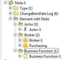
When the tree is configured by a content map, you can define this display specifically for each collection using the ShowSpecialized and HideSpecialized options specified on the map element.
3.5.3.2.2.4 Object sort and display
As standard, elements expanded in the tree are sorted according to the order number defined for the collection (generally the Order attribute). When two elements have the same order number, the second sort criterion is the label associated with the node. This label is itself the collection naming property.
For folder level, we use sort order defined for MetaAssociations in the Metamodel.
To display a label other than the object name:
Use the option NameComputer=<PropID>.
In this case, the PropID property will be used as label. When the tree is configured by a content map, you can deactivate this behavior for a given element by specifying the NoComputedName option.
In this case you can also deactivate sorting by order number using the option NoOrder (objects will then be ordered lexicographically).
Folders are represented by homogeneous folders.
To differentiate their display:
USe the DefaultFolderBitmap option.
In this case the color of the folder depends on collection type (major, minor, calculated).
3.5.3.2.2.5 Defining the toolbar
The toolbar of a treeview cannot be extended and displays only standard commands. These commands differ depending on whether the selected element is a folder or an object. In particular, commands "New", "Connect" and "Paste" are only available at Folder level, and are grayed when the selected node is a MEGA object.
Standard buttons of a treeview are:
Create (C): Start the tool for creation of a new element in the collection corresponding to the selected folder
Link (L): Start the tool for insertion of a new element (connect) in the collection corresponding to the selected folder
Reorder (R): Starts the tool enabling reordering of elements of the selected folder according to standard order (see 3.5.3.1.2.3). This option is not present by default.
Destroy (D): Start the tool for deletion of the selected object. When a Folder is selected, proposes the mass deletion tool for all collection objects.
Unlink (U): Start the tool for disconnection of the selected object. When a Folder is selected, starts the mass disconnection tool for all collection objects.
Properties (P): Display of the properties dialog box of the object selected in the list.
Explore (E): Starts the explorer on the selected object or collection (available only on Windows Front-End).
HideEmpty (H): Enables show or hide of folders corresponding to empty collections. The HideEmptyAtStart option enables initial hide of empty collections.
The ToolBar[] option enables show or hide of elements of this toolbar. It is configured similarly to the ListView toolbar (see 3.5.3.1.2.5Error! Reference source not found.)
3.5.3.2.2.6 Notifications
Select: sent when a new node in the tree is selected.
Generally this notification is only sent when the selected node is an object. A folder does not correspond natively to an object, since it corresponds to a collection. It is however possible to make a folder selectable using the SelectFolder=<CollectionID> option. When this option is activated, an informal object is created corresponding to the folder description, to which is added the <CollectionID> collection corresponding to the object collection seen from the folder. This object is then considered as the selected object. Such a system enables specification of a user interface displaying a list corresponding to the list of objects of the Folder.
3.5.3.2.2.7 Options
ScanStandardOp, ScanDeepOp: enables modification of filtering of collections when the tree is configured by an operator.
IsDeep: multi-level tree
UnfoldedAtStart=n: number of levels initially expanded.
HideFolder: hides folders level
ShowConcrete: displays folder level for concrete MetaClasses
NameComputer=<PropID>: tree elements label calculation
DefaultFolderBitmap: color display of folders.
HideEmptyAtStart: enables initial hide of empty collections.
ToolBar[]: specifies toolbar content.
SelectFolder=<CollectionID>: makes folders selectable
3.5.3.3 Text
This element enables display and editing of text type properties. The text editor displayed depends on the type of text associated with the property.
The identifier associated with the element corresponds to the editor property.
You can group editing of several texts in the same screen area. In this case a dropdownlist located above the edit area enables selection of displayed text. This is default behavior, when several texts are associated with the displayed MetaAttributeGroup.
When you want to explicitly specify a text grouping, you can do this using the content map of the element; for each map element there is a corresponding property to be edited. This map also enables forcing read-only display mode.
Options:
NoBar: removes the text editor toolbar.
Notifications:
Change: sent when text content has been changed
3.5.3.4 SubPage
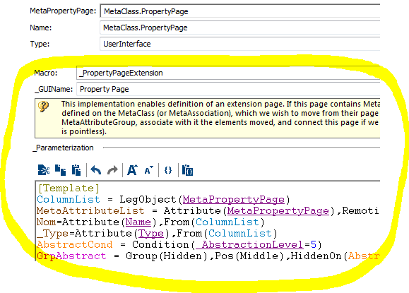
An AttributeControl of" SubPage" type enables inclusion of one page in another. This system is particularly useful in the case of an AttributeControl controlled by a Map, since it elegantly manages the fact that objects of different types can be displayed differently in the same page. Content of the SubPage is dynamically calculated according to the object associated with the element. This calculation can also be executed in deferred mode, and therefore this system can facilitate form display (particularly in Web Front-End).
Typically, the identifier associated with the element corresponds to a MetaPropertyPage which is instanced on the element of the page. This identifier can however be of another type, depending on the options defined on the element, particularly the Computed element, which indicates that the page to be displayed is derived from a calculation. This option should be systematically present if you are not in the typical case.
If the MetaPropertyPage indicated in the element is not a standard property page of the object, you should include the External option.
The first calculation mode can be defined when the MetaClass of the object associated with the element is not fixed; in this case it is possible to define a specific MetaPropertyPage for each of the MetaClasses possible for the element, using its content map. Elements of this map should be of form:
SubPageItem=Item(<MetaClassID>),From(SubPageMap),Param(<PageID>,Default)
If the MetaClass of the associated object corresponds to <MetaClassID>, the SubPage displays <PageID>.
The Default option should be used when <MetaClassID> is an abstract MetaClass; in this case, if no sub-element corresponds to the class of the element, a second pass will enable association of the element with a <PageID> if the MetaClass of the element is a sub-class of <MetaClassID>.
Another calculation uses the _Type associated with a standard page of the object associated with the element. For this include the Type option, and associate with the element an identifier of _Type. In this case the object page corresponding to this _Type will be displayed (if several pages correspond to this _Type, the first one found will be displayed).
To request display of a standard page of the object:
Specify the CLSID of the macro of this page (corresponding to MacroCLSID mentioned above), using the CLSID={clsid of the macro} option.
To request display of a virtual page including all object attributes:
Use the CompleteDescription option.
When no page can be determined, or when no object is associated with the element, the SubPage displays nothing.
If size of the element has not been specified, the Control is resized to contain at least the page at its minimum size.
Options:
Computed, External, Type, CompleteDescription, CLSID={clsid of the macro}: options enabling definition of page to be displayed
Owner=off, Name=off: these options can be used when you display the object characteristic page and enable hide of Name and Owner fields of this page.
SetMinMax=1: indicates that the size specified for the element should be used to define size of the SubPage.
Maximized=0: deactivates BOTTOMALL style of control (this style is present by default)
Abstract: when this option is present, the object of the page corresponds exactly to the object associated with the element, even if instanced on an abstract class (for example when this object is controlled by the browsing path of a generic MetaAssociation. In the opposite case and therefore by default, the page is initialized with the concrete object.
Associative: enables display of an associative page. The object associated with the page corresponds to the object derived from the association browsed by the object of the element.
Component methods:
Specific methods of the AttributeControl can be called from the component object (AttributeControl.Component)
.SubPage As MegaPropertyPageComponent: returns the object corresponding to the displayed sub-page. It can be Nothing if no page was instanced for this control.