Desktop component elements
A desktop comprises Containers and desktop components (Parameterized Tools).
Container types
In your desktop you can insert the following Container types:
• Container of Tool: this Container is a tool recipient.
• Container of Sub-Containers: this Container is a recipient designed to receive other Containers of Container of Sub-Containers or Container of Tool type.
Container of Sub-Containers
A Container of Sub-Containers can be of type:
• TabPanel
• Accordion
• Border Layout
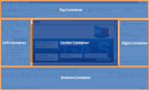
Border Layout
The Container of Sub-Containers of Border Layout type can comprise one to five Containers. It is represented as here:
The Center Container is mandatory.
The Top, Left, Right and Bottom Containers are optional.
Accordion
The Container of Sub-Containers of Accordion type comprises a stack of pages containing desktop components. It can be used for example in a Left Container. It is represented as here:
TabPanel
The Container of Sub-Containers of TabPanel type comprises tabs. It can be used for example in a Left Container. It is represented as here:
Container attributes
Each Container can be customized by means of its attributes. Attributes of a Container are defined in its Properties page, Characteristics tab. Certain attributes vary according to Container type:
• General attributes:
- name in user interface
_GUIName
- icon in user interface
MetaPicture
- display or not the title and image of the container in the user interface
Display Mode
Default value: "Name and image" for a container of tools and "none" for a container of containers.
- position of title (top, bottom, left, right)
Title Position: Top (default value), Bottom, Left, Right
- type of Container (frame, accordion, tab, none)
Container Layout: Border Layout, Accordion, TabPanel, (none)
- position relative to parent (desktop or Container in the case of a Container of Border Layout type) (top, bottom, left, right, center)
Position:Top, Bottom, Left, Right, Center
• Dimension (width, height, minimum height, minimum width)
Dimension attributes depend on Container type:
Left Container: Width, minimum Width
Right Container: Width, minimum Width
Top Container: Height, Minimum Height
Bottom Container: Height, Minimum Height
The center Container has no Dimension attribute, it adapts to desktop dimensions depending on other Containers.
• Behavior attributes:
These attributes simplify desktop readability.
- closable, collapsible, collapsed, hidden
Is Closable, is Collapsible, Is Collapsed, Is Hidden
- default container, container that receives tools that do not have candidate container to receive them
Is Default Container
- drop for objects authorized or not in its component(s)
Accepts Dropped Items
- resizable
Is Resizable (default value: True)
• Desktop components (MEGA Parameterized Tool):
MEGA Parameterized Tool attributes enable insertion of already-parameterized tools.
Examples:
- Administration tree
Administration MetaTree Component
- Collaboration tree
Collaboration MetaTree Component
- Controls and risks tree
Controls and Risks MetaTree Component
- Diagrams tree
Diagrams MetaTree Component
- Properties page
Docked PropertyPage Component
- Documentation tree
Documentation MetaTree Component
- Main toolbar undo/redo tool
Undo/redo
For example, desktop components of tree type are implemented by the MEGA Tool "MetaTree Tool":
Example: the MEGA Parameterized Tool "Documentation MetaTree Component" is implemented by the MEGA Tool "MetaTree Tool".
Tools
Tools (MEGA Tools) enable viewing and/or integration with repository data. A MEGA Tool cannot be used directly in a desktop, but only via a desktop component (MEGA Parameterized Tool).
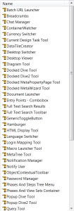
Examples of tools:
Characteristic attributes of tools:
- Asynchronous: the tool can be loaded in parallel on the desktop. There is no need to wait for the desktop to be loaded to load the tool (example: ToolbarTool)
Is Asynchronous
- Batch Tool: the tool executes without user interface, indicating whether display should be managed or not.
Is Batch Tool
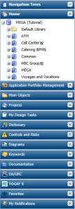
Examples of use of the MetaTree Tool tool:

 The name of the Container in the user interface is specified only in the case of a Container of Containers. If the Container contains a tool, it is the tool name that is displayed.