FORMS properties page design
Basic principles and initialization
A Forms MetaPropertyPage is implemented by one of the two following macros:
_PropertyPageStandard: this implementation is used in "Characteristics" pages.
_PropertyPageExtension: this implementation is used in other cases.
These implementations use the _parameterization text defined on the MetaPropertyPage, and more specifically the [Template] paragraph.
They also use the MetaAttributeGroup associated with the MetaPropertyPage: the page is automatically populated by the properties defined in this MetaAttributeGroup
In addition, the _MetaPropertyPageStandard will automatically add to the form:
• the object name
• its owner
• the MetaAttributes defined in the accessed MetaAssociation (if the object is seen from a MetaAssociation) and not associated with a specific MetaAttributeGroup of the MetaAssociation.
These implementations also use other sections of the _parameterization text, enabling definition of page behavior.
The name of the properties page is the GUIName of the _PropertyPage, except for the Characteristics page of which the name is predefined. If not specified , the GUIName of MetaAttributeGroup is used.
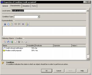
The following example indicates programming of the condition page shown below.
[Template]
AttGroup=Group(Bar),Pos(Top)
FObjGroup=Group(Bar),Pos(Bottom),Name(Following objects)
ExprGroup=Group(Bar),Pos(Middle),Name(ExpressionBody)
FObj=Map(Following objects)
TypeAtt=Item(Condition Type),In(AttGroup)
FObjList=Item(Following objects),Contains(FObj),In(FObjGroup),Control(ListView),Title(No) ExpressionAtt=Item(ExpressionBody),In(ExprGroup),Control(Text),Title(No)
Page minimum size can be defined in another section of the parameterization text:
[Page]
MinWidth = <width>
MinHeight = <height>
<width> and <height> are specified in DialogUnits.
This parameterization can be essential if you want to define specific deformations of elements at page resizing: in this case, the minimum page size is used as the basic size in the parameterization.
For information, DialogUnits is a unit independent of font size. In this unit, a medium character of the font used occupies a rectangle 4(width) x 8(height). To obtain the effective size of the page, you need to know the medium character size of the font used to display the form.
Properties page logic model
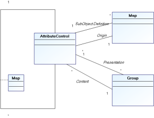
AttributeControl
A page is defined as being an AttributeControl hierarchy. In the model of the above object, the page is itself an AttributeControl.
An AttributeControl is therefore a page element. It relates to a MEGA object and is associated with a metamodel concept representing information on this object.
There are three main AttributeControl types:
• Implicit AttributeControls
These are automatically associated with MetaAttributes, TaggedValue (or more generally AbstractProperties) and MetaAssociationEnd _LegAttributes, depending on their type and format. They therefore reference properties directly defined on the object.
Implicit AttributeControls are suitable in the vast majority of cases to adequately display object properties, as well as most extensions (AbstractProperties or MetaAssociationEnd). These extensions are not directly associated with the object, but are defined in the System repository and must have a value for the object. The keyword XRef(True) enables indication of an element as extension, and directs the template analyzer to the correct AttributeControl type to be displayed.
• Explicit AttributeControls
These propose specific data entries on object properties, or display of calculated data obtained from the object and defined by a metamodel concept (for example a matrix, an HTML formatter or a MetaTree), or display of presentation elements (titles, comments) referencing system repository elements without direct reference to the displayed occurrence (for example codeTemplates or resources).
• Composite AttributeControls
These are explicit AttributeControls of which definition is complex and included in the template. This definition can reference system repository objects, which will be associated with the composite element by a composition map. For example, to define a ListView, you may explicitly define its columns, which are mainly MetaAttributes: The latter will be cited as the composition map element associated with the ListView.
Maps
Maps are used to logically group AttributeControls. They are associated with Page type AttributeControls. There are two types of map:
• object maps
• composition maps
Object maps
These enable redefinition of the object associated with an AttributeControl. In this way it is possible to display in the same form properties from several distinct objects. These maps are explicit elements of page type AttributeControls, indicating the list of objects to which the page relates.
A map of this type points to a specific object, and does this in several ways:
Pilot maps: these are commanded by a composite AttributeControl (for example a ListView or a TreevVew). In this case the Pilot(AttCtlName) keyword associated with the map indicates the AttributeControl that will pilot it. The object of the map therefore corresponds with the object selected in the piloting control. When the selection changes, all AttributeControls of the page are reinitialized with the new object of the selection. If no object is selected, map elements are deactivated. In a map of this type, the identifier used in the Map(ident) keyword is not used.
Unique collection maps: these maps have a collection as identifier. In this case the first element of the collection is considered as the object of the map. If the collection is empty, map elements are deactivated.
Maps on object: these maps are for calculated pages, since they reference an explicit object of the repository, by keyword Child(childID). The object pointed by the map must be connected to the object of the page by the collection identified in the Map, and correspond to the absolute identifier supplied.
Maps on root: identified by the keyword Root(Yes) , these maps point to the repository root, and are therefore independent of the displayed object.
Context maps: these maps enable use of connections to tools displaying pages. For wizards, the "Context" name implicit map points to the collaborative object of the wizard.
Composition maps
Composition maps enable definition of content of a composite AttributeControl: for example, columns of a ListView or branches of a TreeView are defined asAttributeControls, defined in a composition map. This map will then be associated with the MetaAttributeComposite. These maps do not have a real existence in the object model of the form, since they merely participate in definition of the hierarchy of the AttributeControls.
Groups
Groups are used to define appearance of a form. They are associated with Page type AttributeControls.
Groups defined for the page are assembled vertically in a defined order. A certain number of groups are implicit and are created automatically when Attributes are included.
The page analyzer first lists the composition of the MetaAttributeGroup (if this exists). We then search in the configuration for any possible elements that could overload it. If there is no overload, or if the overload does not specify a group, these attributes are arranged in standard groups as follows:
Naming groups (short name, long name) are associated by default with the NameGroup implicit group as follows:
• Extensions are associated with the ExtensionGroup implicit group
• Texts are arranged in a control associated with the text group
• Attributes derived from the association are associated with the LinkGroup implicit group
• Other attributes are associated with the standard group.
NameGroup, ExtensionsGroup and LinkGroup groups can be used in the parameterization: you can then associate specific elements.
Groups are positioned in the page in the following way, Pos(xxx) being a syntactic element enabling definition of the general position of a group. It should be noted that Groups of the same position are ordered alphabetically according to name.
Properties page group positioning
NameGroup
PosGroups (Top)
StandardGroup
PosGroups (Middle)
ExtensionsGroup
PosGroups(Extension)
LinkGroup
PosGroups (Bottom)
TextGroups
The text group is always positioned at the end; only the last zone displayed can be resized vertically, and texts are the most likely elements for resizing. However, if you want to display a ListView that can be resized, it can be positioned alone in a Group in 'Bottom' position. For example, this is what is proposed by the condition page above. It explicitly positions the ExpressionBody text in another group so the ListView will effectively be the last zone displayed.
Specifying templates
Syntax
Page programming is carried out in the _Parameterization text, which is a configuration text: it must therefore conform to configuration text compatible syntax. The [Template] paragraph of this text is used.
All elements included in this paragraph should be defined in a single line.

Each element is named to conform to configuration text syntax (name = definition). The name is never included in the properties page, but is used to order groups.
It is essential that the order of parameters of each element be respected.
Syntax of elements is detailed below. Elements in bold (red) are keywords; optional parameters are between curly brackets. Alternative elements are between curly brackets separated by vertical bars
For certain elements it is possible to specify positions and sizes. Characteristics should always be expressed in Dialog Units.
Elements recognized by this syntax are:
Conditions
Conditions enable conditioning of the appearance of groups or of elements. The condition relates to the properties dialog box object occurrence.
Condition relating to the form object:
<Name> = Condition(<Bool-Expression>)
Condition related to the object pointed by a map:
<Name> = ConditionFrom(<MapName>[:{True|False}],<Bool-Expression>)
If the map does not point to any object, the Condition is evaluated as False, unless otherwise specified after the colon.
Syntax of conditions is described in section
2.5.3.
Groups
These enable positioning of elements with respect to each other. In addition, it is possible to condition appearance or deactivation of the elements included.
Elements appearing in the same group are canonically presented in their order of declaration. It is however possible to include them in the order defined by the metamodel using the MetaClass/MetaAttribute, MetaClass/TaggedValues and MetaClass/MetaOppositeAssociationEnd links using the following option:
[Page]
NoGroupOrder = 1
The groups are declared in the template using the following syntax:
<Name> = Group(<Aspect>)[,Pos(<Position>)][,Name(<Field>)][,At(<column>[,<line>])]
[,Size(<width>,<height>)][{,HiddenOn(<ConditionName>)|,DisabledOn(<ConditionName>)}]
[,Initially(<ConditionName>)]
<Aspect> :: {Bar|Frame|VisibleBar|Hidden }: Characterizes physical representation of the group - single bar at top, frame around attributes or nothing. VisibleBar indicates that the bar is visible, even if the group is the first on the page. Groups of Frame can be collapsed in Web Front-End.
<Position> :: {Top|Bottom|Extensions|Middle}: Characterizes overall positioning of group in page. Default is Middle.
<Field>: Field relating to any MEGA occurrence of which the name, preferably translatable, will be displayed in the page as the group name. You can also include a simple character chain, which will be non-translatable.
<column>: Numerical value in Dialog Units indicating horizontal shift of elements included in the group. This data can be included alone.
<line>: Numerical value in Dialog Units indicating vertical position of the top of the group.
<width> <height>: Group height and width. As for <line>, these parameters are optional and need only be used when the specifier wishes to precisely control the position of a group. If not specified, group size is calculated as a function of the cumulative size of groups included, and group position as a function of other groups present in the page.
<ConditionName>: Name of a previously defined condition. If the condition is not fulfilled, the group and its entire content are either masked (HiddenOn), or deactivated (DisabledOn). The keyword Always can be used instead of a condition. Applied to the keyword Initially, the condition indicates the initial appearance of a collapsible group (this is only effective in Web Front-End).
Maps
<Name> = Map(<Field>){,Root(Yes)|,Cookie(<Field>)|,Child(<Field>)}
[,Visibility(<Visibility>)][,Advisor(Yes)][,Pilot(<ItemName>)]
<Field> : field referencing a MEGA object
<Visibility> : {Always|IfExist|IfFrom}: Enables conditioning of display of Map elements. Default is Always, and Map elements are then systematically displayed (they are disabled if the connected object is not found). If not specified, the elements obtained defined from this Map are masked if the connected object does not exist (IfExist case) or if the object cannot be seen from the MetaAssociationEnd opposite the specified MetaAssociationEnd (IfFrom case). In this case the Map points to the parent object.
For composition maps, no parameterization (including <Field> of the map) is taken into account. These maps serve only to group AttributeControls defined for a composite AttributeControl, and it is the latter that uses the elements associated with it as required.
For the other maps, <Field> specified after the map keyword represents the Collection enabling access to the object pointed by the map from the form object. This collection is therefore generally a MetaAssociationEnd, a Query or any form of Abstract Collection accessible from this object. The object pointed is determined as for the following API function:
obj.GetCollection("<Field>").Item(1)
When the Collection contains several elements, the result is therefore unspecified, except if the keyword Child indicates the occurrence to which the Map should point.
In this case, the object pointed is determined as for the following API function:
obj.GetCollection("<MapField>").Item("<ChildField>")
This use is however generally reserved for pages generated dynamically, since such an identifier is rarely available at specification.
The keyword Advisor(Yes) enables definition of a Map that is not directly use to display elements but that causes the page refresh when a modification is detected in the collection with which it is associated.
The keyword Refresh(Yes) indicates that the collection must be reselected at page refresh. It must be used when the collection associated with the Map is a request or a calculated association, and when its content might change while the form is displayed.
The keyword Pilot(<ItemName>) enables to indicate the form element, which will define the object pointed by the map.
When an object is selected in the element, this notification is processed by the map that modifies, as appropriate, its pointed object. Only elements that enable selection of an element can be pilots, either listViews, treeViews, or Metatrees.
Maps also enable access to objects not directly associated with the form object:
The keyword Root(Yes) indicates that the map points to the repository root:
obj.GetCollection("<Field>").getRoot
The keyword Cookie enables referencing of a context object. By compatibility, this keyword enables access to the collaborative object of a wizard (Context.cookieObject. In this case the Cookie corresponds to the identifier of the MetaClass MetaWizard (~DutIllKV5X40[MetaWizard]), and the identifier of the Map corresponds to that of the collaboration of the cookie.
This access mode has however been replaced by the Context implicit map, which enables access to this object without needing to know the identifier of the collaboration.
The keyword Visibility(<Field>) enables definition of a Map pointing to the parent object of the form object, when the latter is obtained from a collection. In this case <Field> must correspond to the identifier of the accessed MetaAssociationEnd.
The FromLeg implicit map indicates the associative object of the form object; when the latter is obtained from a Collection (obj.getRelationship). By using it you can include MetaAssociation generic attributes in the page.
By compatibility, the keyword LegObject is synonymous with Map.
AttributeControls
AttributeControls enable definition of page content, or composite elements of this page. Within the same Map (keyword From), all AttributeControls must have distinct <Field> identifiers, since it is not desirable to display the same element in the same form several times (at update in the two elements, we cannot determine which value will finally be used). If necessary, the keyword Duplicate(Yes) enables explicit specification of a duplicate.
When the AttributeControl is not defined in a map, either a composite or calculated element will appear, but more generally a property of the form object. Elements defined in the MetaAttributeGroup associated with the page are implicitly added; if an element is redefined here (its <Field> then corresponds to the identifier of a property listed in the MetaAttributeGroup), it replaces the implicit element: In this way you can therefore modify implicit display of an intrinsic property of the form object. If an implicit element appears in the page and is not connected to a MetaAttributeGroup, this may mean that it appears in a page other than that actually defined: You should therefore check that these two pages are not present simultaneously in the form, or that redundancy of the elements is not problematic (which is the case for example when one of the two elements is read-only).
When the element concerns a property of the object concerned, it is not generally necessary to include the control type to be displayed, this latter being deduced from the metamodel.
The keyword XRef(True) offers this implicit processing of properties not directly associated with the object (for example TaggedValues). This keyword indicates that the interpreter of the page can consider that the definition of the <Item> is accessible in the repository (for example via the GetPropertyDescription API function) and that it can be used to determine the implicit control type to be used.
<Name> = Item(<Field>)[,From(<MapName>)][,Duplicate(Yes)]
[,{Contains|Remoting}(<MapName>)]
[,In(<GroupName>)]
[,Control(<ControlName>)]
[,At(<left>[,<top>])][,Size(<width>,<height>)][,MaxSize(<width>,<height>)]
[,VClip(<VClipMode>)][,HClip(<HClipMode>)]
[,Visibility(<Visibility>)][,Name(<NameField>)]
[,Title(<TitlePos>)][,At(<left>,<top>)][,Size(<width>,<height>)]
[,Param(<Param>)]
[,{HiddenOn|DisabledOn}(<ConditionName>)]
[,Mandatory(<ConditionName>)]
[,XRef(True)]
<Field>: References the MEGA element mapping the object. This can generically be a MetaAttribute, a TaggedValue, a MetaAssociationEnd. For implicit AttributeControls, the corresponding value must be accessible by the API function obj.getProp("<Field>"). For explicit or composite AttributeControls, other object types are possible, and use of <Field> depends on the control type.
<MapName>: Name of a Map relating to the element. It must be explicitly defined, but can be implicit (map Context map or FromLeg map)
The From Map indicates that the AttributeControl does not relate to the object, but to the object pointed in the map
The Contains Map is used on composite AttributeControls and enables definition of the list of its component AttributeControls. Implicit maps cannot be used in this case.
(compatibility): The Remoting Map indicates that the AttributeControl pilots a map; in this case the Control should not be specified, since the keyword only operates for Control(DropDownSelection). This specification has been replaces by keyword Pilot defined on the Map.
<GroupName>: Name of the Group in which the element will be physically located. The group must be defined before the element if it is explicit.
<ControlName>: Identifies the name of the type of graphic element to be used. The list of controls and their specificities are define in chapter
3.5. This parameter is not necessary in the case of an implicit control (property defined on the object, or external reference indicated by keyword
XRef(True).
<left>, <top>: Horizontal and vertical coordinates, relative to the group, expressed in DialogUnits (except exceptions). The vertical coordinate can be omitted; in this case the horizontal coordinate expresses shift relative to the group. These coordinates are optional, the element being positioned below the previous element by default.
<width>, <height>: Element height and width, expressed in DialogUnits. If not specified, a default size appropriate to control type and property characteristics is used.
<VClipMode>, <HClipMode>: These parameters enable management of deformation of a control at page resizing.
VClipMode enables definition of vertical deformation. It can have the following values:
No: No vertical deformation – distance from top of element to top of page is fixed.
Yes: Deformation proportional to that of page: distance from top of element to top of page is fixed, as is distance from bottom of page to bottom of element.
TopToBottom: Equivalent to Yes.
Bottom: No vertical deformation of element, distance from bottom of element to bottom of page is fixed.
Center: No vertical deformation of element, distance from bottom of element to middle of page is fixed.
TopToCenter: Distance from top of element to top of page is fixed, as is distance from bottom of element to middle of page. Vertical deformation of element in proportion half of page deformation.
CenterToBottom: Distance from top of element to middle of page is fixed, as is distance from bottom of element to bottom of page. Vertical deformation of element in proportion half of page deformation.
HClipMode enables definition of horizontal deformation. It can have the following values:
No: No horizontal deformation. Distance from left limit of element to left of page is fixed.
Yes: Distance from left limit of element to left of page is fixed, as is distance from right limit of element to right of page. Stretch of element is therefore proportional to that of page.
LeftToRight: Equivalent to Yes.
Right: No horizontal deformation. Distance from right limit of element to right of page is fixed (element remains aligned on right).
Center: No horizontal deformation. Distance from left limit of element to middle of page is fixed (element remains centered horizontally).
LeftToCenter: Distance from left limit of element to left of page is fixed, as is distance from left limit of element to center of page. Stretch of element is therefore in proportion half of page deformation.
CenterToRight: Distance from left limit of element to center of page is fixed, as is distance from right limit of element to right of page. Stretch of element is therefore in proportion half of page deformation.
Clipmodes must be defined with great care. An incorrect specification can cause overlap or covering of elements.
If you use clipmodes on several group elements, you must explicitly define minimum page size: this is the size on which elements are based to be correctly positioned. In Web Front-End, the size of the group in which the element appears is taken into account for element docking, if it is specified.
If clipmodes are not specified, standard behavior depends on control type. Most controls are of fixed maximum size and are resized horizontally when this maximum size is greater than effective page size. Composite controls and texts are resized by default to the maximum allowed by page size when they are located at the end of the page.
<Visibility>: Determines presence or absence of the element as a function of the user view of the metamodel. It can have the following values:
Standard: Applies the mapping visibility level (default value)
Always: Overrides systematic display
Admin: Displays only in extended view
Hidden: Systematically hides the zone and should therefore be used as overload of an unwanted attribute.
<NameField>: Enables replacement of the title of the element. Can be a field, and in this case the name of the referenced MEGA object will be displayed as zone title. A 'hard' non-translatable character chain can also be included. By default, the title of the zone is the name of the concept used as <Field>.
<TitlePos>: Indicates position of the zone title related to the zone. It can have the following values:
Up: The title is positioned above the element
Left: The title is positioned to the left of the element
No: The title is not displayed.
Positioning is ignored if title coordinates are explicitly given by the At and Size parameters defined immediately after. If these parameters are not defined, titles are aligned and sized to the maximum title size of the group concerned so that group elements can themselves be aligned.
<Param>: Optional configuration specific to control type. Can be a character string or a reference to a Parameter (in this case the parameter name is preceded by ‘@’).
<ConditionName>: Name of a previously defined condition. If the condition is not fulfilled, the zone is either masked (use with HiddenOn), or deactivated (use with DisabledOn). However, unlike masking of groups, zone location remains reserved in the case of HiddenOn. If the page is not Synchronized (in this case, application of the condition does not cause page redesign). Keywords Always or Never can be included instead of a condition.
Applied to keyword Mandatory and to a modifiable element, the condition enables definition of whether the obligation constraint should be applied to the element.
Conditions are reassessed when displayed objects are modified in the repository, or when you modify their value (in the case of synchronized pages). If the value of a condition changes at these updates, the page can be redesigned.
By compatibility, the keyword Attribute is synonymous with Item.
Parameters
Can be used in the Param() field of an element when this field is long, complex, or includes brackets.
The chain supplied begins at the first bracket (after Param) and ends at the final bracket of the line.
In this case, the Parameter name should be included, preceded by @.
Example:
MyParam = Parameter(Long Parameter, with (Parenthesis) and « specials chars[>)
MyAtt = Attribute(…) …,Param(@myParam)
Inclusions
In page parameterization, reference can be made to another parameterization. This enables:
• factorization of elements common to several parameterizations.
• making page content dependent on elements specific to the form object.
• calculation of part of page content using a Macro.
Origin of inclusion is defined in parameterization by the keyword Origin.
Static inclusions use a parameterization included in a system repository object explicitly cited in the inclusion. In this elementary case there is no origin.
In dynamic inclusions, the system repository object in which we read the parameterization is deduced from the displayed object.
Inclusions can call a macro that will generate the parameterization to be included.
The lines of definition obtained by inclusion are inserted in the template of the page in the position where the keyword is located.
This device is recursive.
<Inclusion> = IncludeProfile(<ObjField>)[,DefaultOf(<InclusionName>)]
[,From(<MapName>)][,In(<GroupName>)]
[,Origin({FromLeg|Service|Object|ServiceList|Value|Macro})]
[,Text(<TxtField>)][,Paragraph(<PrgName>)]
<ObjField>:
If the inclusion does not depend on an Origin, identify the system on which the parameterization will be queried. This object is not necessarily a _PropertyPage. If not, use of this identifier depends on the origin.
<InclusionName>: Indicates that this inclusion is only effective if the <InclusionName> dynamic inclusion has found no system object on which to read a parameter. It therefore enables definition of a default content.
<From>:
When the inclusion depends on an origin, enables calculation of the origin from the object pointed by the map rather than the form object.
<GroupName>:
Includes elements of the inclusion for which no group was defined in the specific group.
<TxtField>:
Identifies the text in which configuration is included as appropriate. By default, this is the _Parameterization.
<PrgName>: Name of the paragraph in which configuration will be read. By default, this is the Template paragraph.
The keyword Origin enables determination of the calculation mode allowing us to obtain the parameterization. It can have the following values:
• FromLeg: in this case we read the parameterization text on the MEGA object corresponding to the description of the form object. (in API: obj.gettypeobject.getID ). In particular, this allows us to include elements relating to the MetaAssociationEnd from which we observe the form object.
• Service: in this case, <ObjField> is a MetaAssociationEnd or a property of object type, and we read the parameterization from the object corresponding to this property, (in API: obj.getProp("<ObjField>") if it is specified and belongs to the system repository.
• Object: in this case parameterization is read directly on the form object (in API: obj.getID). This is only possible of the observed object is in the system repository.
• ServiceList: parameterization is similar to Service, except <objField> here is a Collection identifier allowing us to obtain system repository objects from the form object. Parameterizations of accessed objects are concatenated when there are several of these (in API: for each srv in obj.getCollection("<ObjField>") …)
• Value: in this case <ObjField> is a listed property; when the value of this property for the form object corresponds to an listed value (MetaAttributeValue or more generally Abstract PropertyLiteralValue), we read parameterization on this occurrence of the literal value.
• Macro: in this case <objField> is a macro. The macro should implement the following function:
Function InvokeOnObject(
obj As MegaObject,
idText,
Page as MegaPropertyPageStandard) As String
obj being the form object, idText the identifier of the requested text (_Parameterization by default, or <TxtField> if specified, and Page the page in preparation.
This macro should send a character string which will be analyzed as a parameterization text. The paragraph [Template] (or [<PrgName>] if specified) of this text will be included in the parameterization.
Other options of standard pages
On a standard page you can define options that enable definition of its general behavior. These parameterizations can be declarative in the _
parameterization text of the Page, or programmatic (see
3.4.1 and
3.4.2.4)
[Dialog]
CommandHandler=<MacroID>: Enables definition of a Macro that will be connected to the page and can listen to notifications from AttributeControls or the form (see
3.4.3)
[Page]
CheckVisibility = 1 (default) or 0: This option enables conditioning of page display due to the fact that its content is not empty at creation of the form. It should be deactivated if content of the page is calculated dynamically, but also for performance reasons; calculation of page content can be costly, and if this option is activated, should be carried out at creation of content (therefore at initialization) and not at display of the page. This option should also be deactivated if presence of the page is determined by the product or the ViewPort, and not by its content.
ReloadOnActivate = 0 (default) or 1: If activated, indicates that the page should be recalculated each time it is redisplayed. This can be useful when page content is determined dynamically and can vary depending on updates made from other pages.
ImmediateUpdate = 0 (default) or 1: When this option is inactive, the page is validated transactionally, that is the object is not updated with values modified in AttributeControls by clicking a button of the form (OK or Apply) or the wizard (Previous, Next or Finish. Otherwise the object is updated as soon as the AttributeControl is modified; in certain cases however this modification is effective only after a certain delay (Web Front-End) or when the modified AttributeControl loses focus.
IsSynchronized = 0 (default) or 1: If activated, indicates that the page is synchronized; in this case the conditions in its parameterization are evaluated with values in the form rather than with the effective values of the object attributes. This option is pointless if ImmediateUpdate = 1, since in this case these values coincide.
ActiveControl = 0 (default) or 1: When this option is activated, the validity control of an AttributeControl is executed at its modification; otherwise it is not executed until validation. This option is pointless if ImmediateUpdate = 1.
ContinueApply = 0 (default) or 1: If this option is activated, the page can be validated even if certain of its AttributeControls have detected errors. This mode can be indispensable in the case of a docked form without buttons, since in this case it can be impossible to close the form.
LabelTemplate = string: Enables redefinition of a page name. This string can contain a reference to an object of the system repository (in the form of a field), and in this case the name of this object will be used as the page name.
Synchronized pages - Immediate pages
Programmatic access to forms
This section describes possibilities of accessing page content by API code, so as to be able to specify a specific style on the form.
Executing a form by API
A form can be directly executed from APIs by the PropertiesDialog method. This method applies to the object that is the form object:
myObject.PropertiesDialog [option]{[,option]}
The following options are exclusive and enable determination of form content:
"PropPage=<Field>" displays the <Field> page in the form. By default, the ShowContextMenu option is deactivated.
"ViewPort=<Field>" displays the form of the object, conforming to PropertyPageViewPort <Field>. By default, the ShowContextMenu option is activated.
"Loader=<Field>initString" displays the form defined in the <Field> macro (see
2.3.2). By default, the ShowContextMenu option is deactivated.
The following options enable modification of form appearance or behavior:
"ApplyMode=Continue": enables continuous mode activation. In this mode, page modifications can be applied and the form closed, even if there are errors. This can be indispensable in docked mode.
"Immediate={0|1}": activates immediate mode; in this mode, application of the modification is instantaneous.
"Title=caption": enables modification of the form title.
"CheckAction={0|1}": enables display (1) or not (0) of the button for actions related to workflow of the form object (as appropriate) in the button/status bar.
"TabStyle={styles}": enables modification of tab display style (Windows Front-End) (see
2.3.2 ).
"ShowContextMenu{0|1}": enables activation (1) or deactivation (0) of display of object menu from the form title bar.
"HideStatus={0|1}": hides (0) or shows (1) the form button/status bar. If hidden, the form automatically passes to mode Immediate=1 – in absence of button it is not possible to apply modifications consistently outside this mode.
"ActivePage=pageid": enables definition of the initial page of the form.
"DefaultSize=width,height": enables definition of default size of the form (in pop-up mode).
"Position=left,top": enables definition of the position of the form in pop-up mode (Windows Front-End only).
As many arguments can be transmitted to the method as there are options. It is nevertheless possible to include several options in the same argument, separating these by a semicolon. The following two commands are therefore equivalent;
myObject.PropertiesDialog "ApplyMode=Continue;Title=my caption"
myObject.PropertiesDialog "ApplyMode=Continue" , "Title=my caption"
This is not however possible for the Loader= option, the initString string being totally free and can therefore contain semicolons.
The above options concerning form pages can be specifically redefined on each of the pages (see
3.3.2).
Access interface
Access to form content
You usually access interfaces relating to properties pages via a handler, that is via functions called at processing during execution of a form or wizard. It is however possible to directly access the component of a form using the PropertiesDialog function.
Set oList = oObject.PropertiesDialog([option]{[,option]}[,] "Description")
The string "Description" must be the last parameter.
The oList object returned is an enumerator enabling listing of form pages. The enumerated objects are MegaPropertyPage components.
MegaPropertyPage
The MegaPropertyPage enumerated above have the following properties:
.getId: GUID of the page (corresponds to the GUID MetaPropertyPage property of the page when it corresponds to a MetaPropertyPage).
.GUIName: page name that can be displayed in the user interface language.
.name: page name in the user language.
.Default: True if the page is the default page (active tab of form).
.IsTab: if True, the page in question is not a page with content, but a tab containing sub-pages.
.level: level of the page in hierarchy of tabs. If higher than 1, the page appears in a tab.
.ParentId: when the page is in a tab (level > 1), contains the identifier of the page containing the tab.
.sourceID: identifier of the MetaPropertyPage corresponding to the page. When the page is calculated, it does not correspond to a MetaPropertyPage, and in this case the identifier (if it exists) is the identifier of the system repository object that motivated appearance of the page; this is generally a MetaAttributeGroup.
.TypeID: identifier of _Type associated with the page.
.Component: when the page is a described page, returns the corresponding MegaPropertyPageComponent component. Otherwise returns Nothing.
MegaPropertyPageComponent
The MegaPropertyPageComponent object enables access to page content via an informal MegaObject (ie. it does not correspond to an occurrence of the MEGA repository) describing the page as an AttributeControl.
.Content enables access to this MegaObject.
.QueryVerb indicates if this MegaPropertyPageComponent implements the requested method. By this means, you can determine if it is a MegaPropertyPageStandard: in this case the connect function (for example) is implemented, and therefore QueryVerb("Connect") returns True.
MegaPropertyPageStandard
When the page is a standard page, the MegaPropertyPageComponent is therefore also a MegaPropertyPageStandard. It is using this component that wizard triggers access content of pages. It implements the following functions and properties:
Functions:
.Refresh(Optional reset as Boolean) requests the page to refresh. By default, this consists of requesting refresh of the AttributeControls it contains. If reset is present and is True, the page is totally recalculated. It is preferable to avoid using this option unless absolutely necessary, since the calculation can be costly and cause loss of contextual data.
At refresh of an AttributeControl:
• either the AttributeControl value was modified from the last application of updates: in this case the value is not modified, so as not to lose the entry made by the user.
• or the AttributeControl was not modified, in which case the displayed value is recalculated.
.Connect(connection As Object) enables association with the page of a component which can listen to notifications sent by AttributeControls.
.Disconnect(connection As Object) enables dissociation of a component associated by Connect.
.SetModify(val As Boolean) enables forcing of status of the page to be “modified” or “not modified” depending on the value val. In Windows Front-End in particular, the effect of this can be to "gray" or "ungray the "Apply" button: if after a SetModify(False) no form page is in "modified" state, the button will be grayed. It will be ungrayed at a SetModify(True).
.SetButton(button As String,Action As String) enables modification of appearance of the button of a form or wizard displaying the page. This function should be used with care, since buttons of wizards and forms are not identical:
For a wizard, buttons are named CANCEL, PROCEED, NEXT, PREV.
For a form, buttons are named CANCEL, OK, APPLY, HELP.
Possible actions are:
SHOW: shows button
HIDE: hides button
ENABLE: activates button
DISABLE: deactivates button
FOCUS: gives focus to button (if possible, and Windows Front-End only)
DEFAULT: defines the button as default button (Windows Front-End only)
TOCLOSE: applied to CANCEL button in a form, and in Windows Front-End only, renames the "Cancel" button to "Close" and deletes the "OK" and "Apply" buttons. To be used when an irreversible action has occurred (in this case it is no longer possible to cancel).
.OnCommand(Cmd as String) as String: enables simulation of sending a notification to the page. This function should only be used in specific contexts – for example to interact an updateTool with a dialog Handler (see
3.4.3 and
3.4.4). The command can contain a string in JSON format, and in this case the notification is considered as a DesktopCommand. It can also simulate a specific notification sent by an element of the page, in which case it is of form "ntfname:itemname". The value returned depends on the notification.
The following properties are accessible in read-only:
.getId As String: returns CLSID of the page. Equivalent to MegaPropertyPage.getId.
.getPageId: returns identifier of the MEGA object modeling the page. This is generally a MetaPropertyPage identifier, but not necessarily so.
.getRoot As MegaObject: returns repository root.
.template As MegaObject: returns the object on which the page was activated.
.isConnected As Boolean: indicates that the page has connections that can listen to notifications.
.labelTemplate As String: page title.
The following properties can be modified at form initialization (for example in a wizard), with the exception of statusMessage and isContinue properties, which can be modified at any time. If not, they can be consulted at any time. In most cases you can define these properties statically in page parameterization (see
3.3.2), but they can be overloaded in this way.
.transactional As Boolean: if True, the page is transactional and updates only at an explicit command (for example a click on "Apply" or "OK" buttons, or in a wizard “Previous”, “Next” or “Finish” buttons. Otherwise, update is carried out at each modification of an AttributeControl.
.activeValidation As Boolean: if True, the validity control of the page is carried out at each modification of an AttributeControl. Otherwise, it is only carried out at validation. Pointless in the case of a non-transactional page.
.statusMessage As String: indicates to the page container an error message or status to be displayed, as appropriate.
.isSynchronized As Boolean: Indicates that the page must be synchronized, that is that conditions defined in its template apply to data assigned in AttributeControls, and not to effective value of the object associated with the form. Pointless in the case of a non-transactional page.
.isContinue As Boolean: indicates that the page accepts validation, even if certain of its AttributeControls detect an error.
The following properties are not accessible at processing of a notification (see
3.4.3)
.currentControl as MegaObject: returns the AttributeControl sender of the notification.
.currentSelectedItem as MegaObject: when the sender AttributeControl is a list, a tree, or more generally an element handling a list of objects, and when the notification in progress references an element selected in this list, then this element is accessible using this property.
.currentNotification as String: returns the name of the current notification.
AttributeControl MegaObject and associated model object
The object model of a page (and more generally of a form) can be accessed via a hierarchy of MegaObjects. These objects do not correspond to occurrences of the database. The list of properties, methods and collections defined for these MegaObjects is not defined in the repository, so they can be accessed by their name without risk of incompatibility.
Properties defined for this MegaObject
Nature (String): name of AttributeControl type corresponding to the element (see
3.5).
Kind (Integer): completes nature of AttributeControl. This is a bit field containing in particular the following values:
ReadOnly: 0x2000 (8192): indicates that the element is read-only.
Numerical: 0x0100 (256): indicates that the element corresponds to a numerical value.
WidthDefault: 0x0100 (2048): Indicates that the element manages display of default value.
Mandatory: 0x4000 (16384): indicates that the element is mandatory.
NoEdit: 0x0400: indicates for a composite element with a data entry zone (ComboBox, EditButton…), that this zone is read-only.
ResetOnRefresh: 0x0200 (512): This flag is for drop-down lists and elements displaying a menu, and indicates that the menu or content of the list can change if the element has undergone modifications, and therefore needs to be recalculated.
ValidateInput: 0x8000 (32768): indicates that the updated value in the element must be specifically checked when the page is in active validation mode.
ItemName (String): element internal name. This name is stable and unique and corresponds to the name of the element declared in the template. In the case of an implicit element, this name is based on the absolute identifier of the implicitly listed property. The name can be used when you are querying an element in a collection using the Search function. It is also used to build the name of notification functions relating to this element.
Style (Integer): bit field defining element style.
Styles relating to element docking:
CLIPLEFT 0x00000002 dock at left (default)
CLIPRIGHT 0x00000004 dock at right
CLIPTOP 0x00000008 dock at top (default)
CLIPBOTTOM 0x00000010 dock at bottom
CLIPMLEFT 0x00000020 dock at left and at middle
CLIPMRIGHT 0x00000040 dock at right and middle
CLIPMBOTTOM 0x00000080 dock at bottom and middle
CLIPMTOP 0x00000100 dock at top and middle
NOVCLIP 0x00001000 ignore vertical docking
NOHCLIP 0x00002000 ignore horizontal docking
BOTTOMALL 0x00080000 dock at bottom if element is last on page
Styles relating to element title:
NOTITLE 0x00010000 element without title
TITLEUP 0x00020000 element with title above
SETTITLE 0x08000000 reserved for RadioButtons, to calculate their size
Styles relating to positioning and size:
AUTOPOS 0x00000800 element position has been calculated
AUTOSIZE 0x00004000 element size can change dynamically and is calculated by the element itself
SCREENUNITS 0x00008000 element size expressed in pixels and not in DialogUnits
BORDERED 0x00100000 element has border
Styles relating to element availability
DISABLED 0x00400000 element is deactivated
HIDDEN 0x00800000 element is hidden
MANDATORY 0x04000000 element entry is mandatory
Other styles
DEFAULTED 0x00040000 indicates that element manages default value
COMPUTEDHELP 0x20000000 indicates that element help must be calculated
ALWAYSUPD 0x10000000 indicates that element must be systematically validated, even if it has not been explicitly modified
DYNAMIC 0x01000000 indicates that element visibility can change during data entry
REMOTING 0x02000000 indicates that element can pilot other elements
ClipMode (String): property calculated from Style and describing docking mode. This string is empty if no docking is defined for the object, otherwise it takes the form:
"vertical":"<Vclip>","horizontal":"<Hclip>"
If vertical or horizontal docking is not defined, the corresponding element is not present in the string.
Vclip can be "TopToBottom", "Bottom", "Center", "TopToCenter", "CenterToBottom"
Hclip can be "LeftToRight","Right","Center","LeftToCenter","CenterToRight"
ID: element identifier. This identifier is based on the dynamic identifier and cannot be used to make information relating to this element persistent.
MapID: identifier of the Map in which the element is defined. This identifier allows you to find the Map in the collection associated with the parent AttributeControl of the element.
GrpID: identifier of the Group in which the element is positioned. This identifier allows you to find the Group in the collection associated with the parent AttributeControl of the element.
Name (String): element title in user language.
GUIName (String): element title in interface language.
HTMLTitle (String): element title in HTML format in interface language. This title can be "rich".
Order (Integer): element order umber, corresponding to the element dynamic identifier. It determines order of access to elements at browsing by tab key.
Width, Height, Left, Top (Integer): indicate position of the element relative to its group, as well as its size. This data cannot be specified if positioning is automatic (ie. not defined explicitly) or if its size corresponds to default size. This data is supplied in DialogUnits (see
3.1) except in special cases.
TitleRect (String): when title position has been explicitly defined, this property contains a JSON indicating this position. The JSON takes the form:
{ "x" : x, "y" : y, "width" : w, "height" : h }
If one of these properties is not defined, it does not appear in the JSON.
If this property is not defined, the space occupied by the title is included in the size of the element.
SourceID: contains the absolute identifier defined for the element. Generally corresponds to the absolute identifier of the displayed property, and more specifically to the identifier associated with the element in the template by Item(<SourceID>).
ObjectID: identifier of the object with which the element is associated. This is the form object if the element is not in a Map; otherwise it is the object pointed by the Map.
Options (String): contains options defined for the element. This value generally corresponds to parameterization contained in the Param() field in the element definition.
This property can be modified: certain control types can adapt their behavior at modification of this parameterization.
Value (String): value displayed by the element. If the element does not explicitly a value - this is for example the case for a CheckBox or RadioButtons – it contains the value of the property associated with the element for the source object. For composite elements not proposing a consistent value, this property cannot be used for specific purposes.
This property can be modified.
TargetID: contains an absolute identifier relating to the value displayed in the element, when this has a sense, and in particular:
When the element is designed to display a MEGA object, or more generally an attribute of object type, TargetID contains the identifier of this object.
When the element displayed has an enumerated value attribute, TargetID contains the identifier of the enumerated value.
When an element is updated by value, TargetID corresponds to identifier null if this value has not been identified as an enumerated object or value. This comparison is only made at validation of the element.
This property can be modified.
Data (String): character string containing information relating to the current value of the element. Its content depends on the control type and is generally presented in JSON format.
This property can be modified.
Format (Integer): bit field specifying nature of the element value, and information enabling use or specification of this value.
FORMAT_IDABS 0x0001 value corresponds to an object identifier and must be synchronized with TargetID
FORMAT_TRANSLATION 0x0010 value is not in current language
FORMAT_NEUTRAL 0x0020 value is in "Neutral" language
FORMAT_USERLANGUAGE 0x0040 value (enumerated) is in user language
FORMAT_HASDEFAULT 0x0080 for an enumerated attribute, the value (empty) indicating an unvaluated property is replaced by the value (default)
FORMAT_NUM_FLOAT 0x0100 value is a floating comma number
FORMAT_NUM_SIGNED 0x1000 value is a signed number
FORMAT_NUM_DURATION 0x2000 value is a number representing a duration
FORMAT_NUM_PERCENT 0x2000 value is a number representing a percentage
FORMAT_NUM_EFFECTIVE 0x8000 value is an unformatted floating comma number
Read Only (Boolean) or short form RO: indicates that the element is read-only or deactivated.
Length (Integer): when the element displays a character string, indicates maximum string size. This property can be used to limit data entry or determine element size if this is not provided.
HelpKey (String): character string enabling determination of content of help associated with the element.
ErrorMessage (String): when the value of the element is invalid, or more generally an error has been detected related to this element, this string contains the corresponding error message.
IsDirty (Boolean): indicates that the element has been modifies and requires validation.
IsDefaultValue (Boolean): when the element manages default value, indicates that the current value corresponds to the default value.
IsInitialized (Boolean): indicates that the element has been initialized. Otherwise, the page has not yet been displayed and the values of properties that depend on the form object (for example Value, TargetID, Data) cannot be used.
Tick (Integer): numerical value incremented each time the element is modified.
Group, GroupGUIName (String): name of the group in which the element is located.
GroupOrder (Integer): order number of the group in which the element is located. Enables ordering of page elements.
ControlID (String): contains CLSID of the update Tool attached to the element.
Methods defined for this MegaObject
GetObject as MegaObject: object with which the element is associated. This is the form object if the element is not in a Map; otherwise it is the object pointed by the Map.
myCtl.GetObject.GetID corresponds to myCtl.ObjectID. We pass via this function when the element object is informal, since in this case we cannot use GetObjectFromID to access this object with its identifier only.
Search(itemIdent{,optional mapoption1, mapoption2 }) as MegaObject: When the element is a page or composite element, this function finds a sub-element according to its name (itemName).
It is also possible to find an element using its SourceID with an identifier (internal format) or a field as itemIdent argument. In this case several page elements can have the same SourceID, in particular if they are in different Maps. In this case you can specify the Map in which to search.
Search(sourceID, "MapID", mapID)
Otherwise, or more explicitly if you write:
Search(sourceID, "AnyMap")
the function returns the first element of the page with this sourceID.
You can recursively search for a sub-element from a composite sub-element by using an itemName path made up follows:
ItemNameMain>SubItemName
Refresh(optional Reset as Boolean) refreshes the element; if Reset, the element is recalculated.
Page as MegaPropertyPageStandard: when the element is defined in a Standard Page, this function returns the component corresponding to this page.
Component as Object: certain elements have an evolved access level, implemented by a specific component accessible via this function. For example, SubPages enable access via this function to the MetaPropertyPage component associated with the SubPage (when it is instanced).
Collections defined for this MegaObject
GetCollection("AttributeControl"): returns the list of sub-elements of the element.
GetCollection("Map"): when the element is a page (or SubPage), returns the list of maps defined on the page. These maps are described by an AttributeControlMap MegaObject described below. You can search for a map in this collection using the MapID property of an AttributeControl ( mapCollection.Item(attcontrol.MapID) )
GetCollection("Group"): when the element is a page, returns the list of groups used in this page. These groups are described by an AttributeControlGroup MegaObject described below. You can search for a group in this collection using the GrpID property of an AttributeControl ( mapCollection.Item(attcontrol.MapID) )
Main properties of AttributeControlMap MegaObject
ID: map identifier. This identifier is dynamic and cannot be used to make information relating to this element persistent. It corresponds to the MapID property of AttributeControls defined in this map.
Name as String: name of the map as defined and used in the template.
TargetID: absolute identifier associated with the map.
PilotID as String: when the map is piloted, contains the itemName of its pilot.
Properties of AttributeControlGroup MegaObject
ID: group identifier. This identifier is dynamic and cannot be used to make information relating to this element persistent. It corresponds to the GrpID property of AttributeControls defined in this map.
Name: name of the group as defined and used in the template.
Order as Integer: group order number, enabling definition of order of groups in the page.
GUIName: group title.
HTMLTitle: group title in HTML format.
SourceID: when the group title has been defined from a repository object, contains the identifier of this object.
Style as Integer: bit field indicating group style.
STYLE_BAR 0x10000 : separator not collapsible
STYLE_FRAME 0x20000 : frame, collapsible
STYLE_ALWAYS 0x40000 : separator present, even if in first position
STYLE_CLOSED 0x80000 : group is initially closed
Size as String: contains initial size of this group when defined, otherwise returns an empty string. The returned string corresponds to the following format:
"width" : w, "height" : h
If one of these two values is not defined, it does not appear in the string.
Dialog Handler
The dialog Handler system enables improvement of specific interaction possibilities on a properties page by allowing you to add interactions at events occurring when editing the form. These interactions are made using an interaction component implemented by a macro, and connected to the page.
Connection can be:
• either declarative in parameterization of the PropertyPage (see
3.3.2)
[Dialog] CommandHandler=<MacroID>
• or by code - in wizards – using the Connect function of the MegaPropertyPageStandard component (see
3.4.2.4)
When the macro is connected, it can carry out processing on notifications from AttributeControls of the page, or on events relating to the form or page.
Notifications
Sub On_ctlName_ntfName(Page as MegaPropertyPageStandard)
When it is implemented, this method is called when the AttributeControl of which the itemName property is ctlName sends the notification ntfName.
At this call:
Page.currentControl corresponds to the notification sender element. Therefore Page.CurrentControl.ItemName corresponds to ctlName
If the sender manages an object list and if the notification concerns the element selected in this list, Page.currentSelectedItem corresponds to the selected object.
Page.currentNotification corresponds to ntfName
If this method is not implemented, the OnCommand method (see below) is then called.
Sub OnCommand(Page as MegaPropertyPageStandard,ntf as Integer,ctl as Integer)
This method is called each time a notification sent by an AttributeControl of the page is not specifically processed by a method.
ntf is a notification identifier number. Standard notifications are named and their name is accessible via Page.currentNotification.
ctl corresponds to the Order property of the sender AttributeControl. It can change if the page is built dynamically, or if elements can be hidden and the page is synchronized or in immediate mode. For these reasons, it is preferable to use Page.currentControl.itemName, corresponding to the name of the element as defined in the template, to determine the notification sender.
At this call:
Page.currentControl corresponds to the notification sender element.
If the sender manages an object list and if the notification concerns the element selected in this list, Page.currentSelectedItem corresponds to the selected object.
Other events
Sub PropertyPage_Initialization(Page as MegaPropertyPageStandard)
This method is called at page initialization.
Function CheckPropertyPage(Page as MegaPropertyPageStandard) As String
This function is called before each page validation. It allows you to indicate an error preventing page validation. In case of an error, this function returns an explanatory error message. If there is no error, it returns nothing or an empty string.
In case of error, validation is cancelled and no update is carried out.
Function OnPropertyPageApply(Page as MegaPropertyPageStandard) As String
This function is called after each page validation. In particular, it allows you to carry out supplementary updates. It is possible to indicate an error preventing page validation. In case of an error, this function returns an explanatory error message. If there is no error, it returns nothing or an empty string.
In case of error, if the page is not in continuous mode, if we are in:
• a form, it is not closed,
• a wizard, the transition is stopped and we remain on the page.
Sub PropertyPage_OnDesktopCommand(Page as MegaPropertyPageStandard, JSONCommand As String)
This function is specific to Web Front-End and enables sending of a notification from Desktop to the form or wizard, if scopes of tools will allow this. The notification is only sent on the active page of the tool.
UpdateTools
An UpdateTool is a component designed to manage update of a property (MetaAttribute, _AbstractProperty or MetaAssociationEnd seen as an attribute).
This component is only invoked through an AttributeControl, whether in a form, a wizard or an in-place data entry; it is not designed to parameterize display of an attribute in a regeneration.
An UpdateTool enables:
• definition of the AttributeControl to be used to update the property.
• definition of options and complements of this AtrributeControl, as could be done in page template configuration.
• definition of content of the drop-down list, when the attribute type includes one.
• if appropriate, definition or completion of the menu and processing of commands, or implementation of button processing.
• definition of the value effectively displayed by the element.
• definition or completion of validation of the element, in particular update of the repository induced by this validation, and application of specific controls.
An updateTool cannot be associated with a varchar type property (text). Updates of these properties are defined by their associated _type.
Implementing an updateTool for a property
An updateTool is implemented by a Macro. To be recognized as such, this component must contain the function.
Function AttCtl_GetDefaultKind() As String
This macro should be associated with the property according to the property type. If it is:
• a MetaAttribute, the MetaAssociationEnd "MetaAttributeUpdateTool" should be used.
• a MetaAssociationEnd _LegAttribute, the MetaAssociationEnd "_LegUpdateTool" should be used.
• an Abstract Property (for example a TaggedValue), the MetaAssociationEnd "Update Tool" should be used.
Defining AttributeControl type
The first role – the only mandatory role – of an updateTool is to define the type of AttributeControl that will be used to update the property.
• If this type does not depend on the edited occurrence, and if it is not necessary to define options, you can simply implement the function AttCtl_GetDefaultKind()mentioned above.
• Otherwise, you must add the function to it:
Function AttCtl_GetKind(Context As MegaUpdateToolContext) As String
Unlike the previous case, this function enables different behavior according to the edited object, and specification of options forAttributeControl, using the context component MegaUpdateToolContext.
These two functions should return a character string of form:
<ControlName>{:<option>}{,<option>}
ControlName is the name of the AttributeControl type (see Error! Reference source not found.)
Possible options are:
• type complements such as lists in the Kind property of the AttributeControl MegaObject (see Error! Reference source not found.),
• options that specify the AttributeControl use context:
ManageReadOnlyMenu: in the case of an EditMenu, indicates that the updateTool takes into account the fact that the object or property is read-only and adapts the menu or its behavior to this fact. By default, the framework considers that read-only is not managed and specific commands of the updateTool are not inserted in the menu.
ManageValueID: in the case of an attribute with enumerated values, indicates that the TargetID property, systematically corresponding to the enumerated value absolute identifier, is perhaps used to update the attribute when it is of the corresponding type.
SingleOnly: indicates that the AttributeControl does not operate in multiselection mode and that attribute entry should be deactivated in this case.
In the AttCtl_GetKind function it is also possible to modify AttributeControl style and options.
MegaUpdateToolContext component
MegaUpdateToolContext enables access to updateTool context. It includes:
- the following objects:
.MegaObject As MegaObject: occurrence to be modified. In the case of an entry derived from MultiSelection, this is a calculated MegaObject aggregating the collection of selected objects.
.AttributeID As Variant: attribute identifier (resp. Abstract Property or MetaAssociationEnd) to which the updateTool relates.
.GetRoot As MegaRoot: access to properties page MegaRoot.
.AttributeControl As MegaObject: returns the component corresponding to the element controlled by the updateTool. This component is AttributeControl type (see Error! Reference source not found.) and provides direct access to the page element, as well as the page itself (where appropriate).
.ComboListCollection As MegaCollection: when the element manages a drop-down list, this collection corresponds to the list of elements appearing in the list. It is designed to be populated by the updateTool in the AttCtl_FillCombo function (see below).
- the following properties:
.EditText as String: value displayed when the element contains a text area (in editing or read-only). This property can be modified and corresponds to .AttributeControl.Value.
.IsInPlaceMode As Boolean: is True if the element is invoked in the context of in-place entry. This property can be accessed after object initialization: The type of element displayed can differ if you are in in-place mode.
.IsMultiSelection As Boolean: is True if the element is invoked in the context of multiselection entry. This property can be accessed after object initialization, for example when the updateTool does not know how to manage multiselection and in this case wants to force mode to "read-only".
.ValueID: where appropriate, contains an identifier corresponding to displayed value, corresponding to .AttributeControl.TargetID; this identifier can correspond to the identifier of an object (when the property is object type) or to that of a MetaAttributeValue (when the object is enumerated). The updateTool may have to explicitly manage the displayed value (EditText) and the identifier pointed (ValueID), in particular when implementing a command modifying the value of the element. This is the case for elements of object type, for which it is highly desirable to have the identifier if known, as well as the name to be displayed. It should be noted that modification of EditText results in invalidation of ValueID: The latter should therefore be updated after EditText.
In the case of Web Front-End, update from a combined list does not update the value of this variable if the property concerned is not of Object type.
.ValueTypeID: When updateTool implements a generic MetaAssociationEnd, attribute or object type abstract property, you can use this property to consult or update the MetaClass type of the target object. Where appropriate, this property can be used to create the standard menu of the element.
- the following functions:
.Invalidate: notifies that the element has been modified. Among other things, this enables ungraying of the "apply" button in properties pages.
.SetDirty: should be used at menu command or button press processing, when you want to indicate to the element that the current value should be considered as having been modified and therefore that the element should be updated.
.Recompute(Item as String): invalidate the menu (if Item contains "Menu") or drop-down list (if Item contains "DropList") of the element and results in menu recalculation at the next invocation (ie. click on menu or drop-down list button. It is possible to transmit ("Menu,DropList") as parameter.
.AddAccelerator(key as String,cmd as Integer{,altkey as String}): (Windows Front-End only) can be used in the AttCtl_GetAccelerators function of the updateTool, to define accelerators (key combinations triggering actions when the element has focus).
key corresponds to the keyboard key,
altkey indicates the combined keys and can contain values "ALT", "SHIFT" and "CONTROL" (value "ALT,CONTROL" - for example – is also included) ;
cmd is the number identifying the command and transmitted in the AttCtl_AcceleratorInvoke function when the corresponding accelerator is activated.