Instant Report Types
Depending on objects selected, you can launch different types of instant report:
• from an object list
• Matrix
• Quantitative: distribution of values (bar chart)
• Breakdown: breakdown of objects related to values of a specific criterion
• Multidimensional: two- or three-dimensional representation depending on the chosen criteria.
• Time: evolution of values in time
• From a Report DataSet:
• Matrix
• Quantitative: distribution of values (bar chart)
• Breakdown: breakdown of objects related to values of a specific criterion
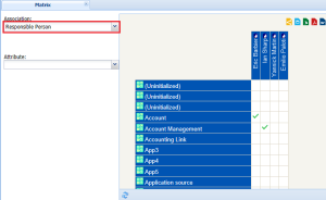
Matrix-type instant report from an object list
From an object list, the user selects a link or query, the source of which is a MetaClass of objects of the list.
In the example below, a matrix indicates which org-units are responsible for selected applications.
• Source MetaClass: application
• Selected link: manager org-unit
In the case of the link you can also choose to display a link attribute, for example the link creation date. The matrix then displays in the cells not a tick but the link creation date.
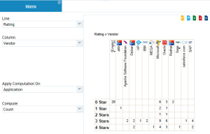
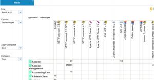
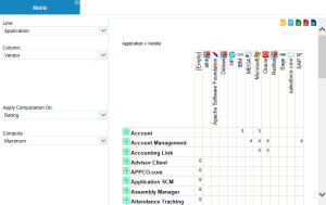
Instant Matrix Type Reports From a Report DataSet
From a Report DataSet, all the Report DataSetcolumns are available to make up the rows and columns of the matrix.
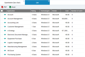
For example, a Report DataSet with an "Application technologies" definition contains the following information for each application selected:
• "Rating"
• "Technologies" (the type of technology used)
• "Vendor"
• "Costs"
• "Number of users".
With this Report DataSet, you can make up the following matrices:
• Matrix 1: each cell presents the number of applications, ranked by vendor ("Vendor" and "Rating").
• Line: "Rating"
• Column: "Vendor"
• Apply Computation On: "Application"
• Compute: "Count"
• Matrix 2: each cell of the matrix presents the sum of costs of an application by technology type.
• Line: "Application"
• Column: "Technologies"
• Apply Computation On: "Cost"
• Compute: "Sum"
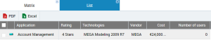
• Matrix 3: each cell of the matrix presents the "Rating" of an application by "Vendor'.
• Line: "Application"
• Column: "Vendor"
• Apply Computation On: "Rating"
• Compute: "Maximum"
You can click in each populated cell of the table to display the rows of the dataset that meet the criteria used in the rows and columns of the matrix.
Example: in the previous matrix 3 example, click in the "Account Management" Application cell of the "MEGA" vendor. You thus obtain other useful information such as its cost.
Quantitative-type instant report from an object list
The quantitative report is based on one or more numerical attributes on which you can perform arithmetic operations. The quantitative report displays a bar chart.
Quantitative-type instant report from a Report DataSet
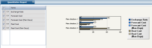
From a Report DataSet, all the columns of the Report DataSet are available to make up distributed data and to define the grouping criterion. The other columns are used to make up series of data displayed in the graphic.
In the same graphic you can add a maximum of five data series. The bars are stacked one on top of each other.
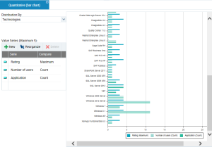
For example, a Report DataSet with an "Application technologies" definition contains the following information for each application selected:
• "Rating"
• "Technologies" (the type of technology used)
• "Vendor"
• "Costs"
• "Number of users".
With this Report DataSet, you can for example aggregate the following bar charts distributed according to the "Technologies" parameter. The following information appears for each technology:
• its maximum rating (Series: "Rating", Compute: "Maximum")
• the number of people that use it (Series: "Number of users", Compute: "Count"
• the number of applications that use it (Series: "Application", Compute: "Count"
You can click in each series (bar) to obtain its complete corresponding characteristics:
Example: in the example for the "Windows 8.1" Technology, click the "Application number" series. You thus obtain other useful information such as its cost.
Breakdown-type instant report
The breakdown report is based on a qualitative criterion to present the breakdown of objects of the list related to this criterion. Presentation can be as a Pie Chart or a Bar Chart.
A qualitative criterion can be of different types, for example:
• a character string (code)
• a number
• a percentage
• a tabulated value attribute
• a boolean
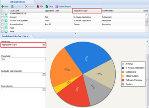
In the example below, a pie chart displays breakdown of selected applications by type.
The selected grouping characteristic is "application type".
Calculations from a grouping criterion
In the context of a breakdown report, when analyzed objects also include numerical value characteristics, you can associate these values with the grouping criterion and simple calculations carried out. The most common calculations are proposed (sum, average, maximum and minimum values).
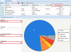
In the example below, the pie chart indicates how application costs are broken down according to their type.
• Grouping characteristic: application type
• Calculation characteristic: expenses
• Selected calculation: sum
This chart enables launch of a new instant report.
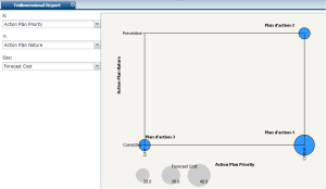
Multidimensional–type instant report
Bubble chart
The tridimensional report relates to a choice of any three criteria displayed in a BubbleChart. You position criteria in X, Y, and Size.
When you choose only two criteria, the number of objects determines bubble size. Each bubble represents a set of objects that can in turn be the source of the report.
When an attribute (numerical) is selected to determine bubble size, each bubble represents a distinct occurrence.

The tridimensional report is only available if objects have at least two attributes.
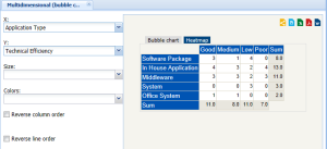
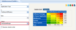
Heat map
The use of two qualitative criteria enables proposal of heat map charts.
This type of chart is only available with discrete values (Enumeration type MetaAttributes)
You must select X-axis and Y-axis values to make the Heat map tab appear.
A heat map presents effectiveness (Good, Average, etc.) of a list of applications according to their type (office system, system, etc.).
The order in which attribute values are presented depends on two check boxes:
• Column Order
• Line Order
You can configure colors to clearly indicate lowest scoring applications (in red for example).
By default, the colors displayed in the heat map are calculated as shading between three colors. Default colors are:
• Green
• Yellow
• Red
This chart enables launch of a new instant report.
Time report
Objects are used to constitute a Gantt chart. The time report is only available if all objects have a life cycle.
This chart does not enable launch of a new instant report.